After completing a live brief for the band Member State, my fascination with creating music-inspired artwork deepened. However, I do have a passion for the research and discovery part in the initial stages of a project; this learning helps to lay a foundation for the rest of the project. With the discovery in mind, I decided to embark on a new creative journey: developing a zine centered around the Woodstock 1999 Festival.
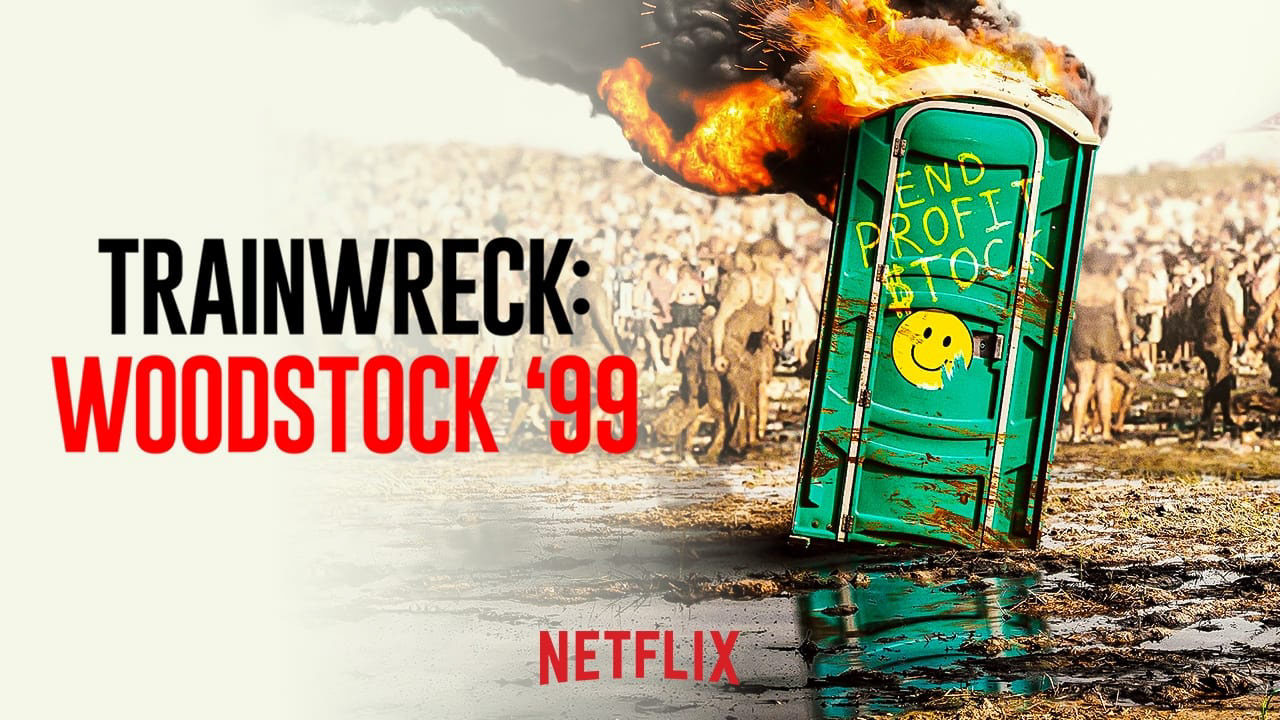
The reasoning behind picking this particular topic was sparked when I watched the newly released Netflix documentary, which delved into the disastrous events of the 99' Festival. this documentary not only captured my attention but also served as a catalyst for some more in-depth exploration of the historical event. I wanted to uncover the truth of what happened at Woodstock and how I could immerse myself further into the topic.
I meticulously combed through each episode, diligently jotting down notes. Additionally, I broadened my perspective by watching other documentaries like 'Woodstock 99: Peace, Love, and Rage' by HBO and various clips on YouTube. This diverse array of sources, coupled with extensive reading, provided me with a solid foundation of knowledge. Armed with this understanding, I delved into the creative process, sketching and crafting small DIY zines.
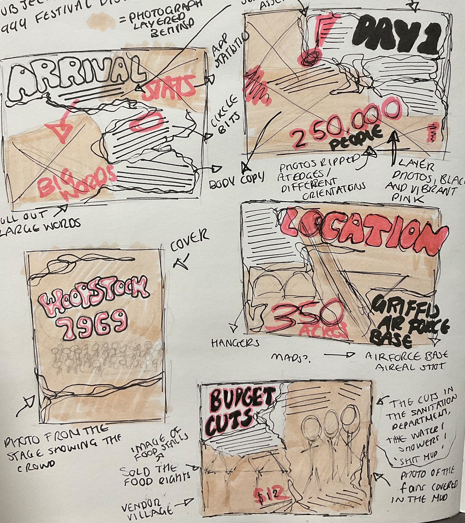
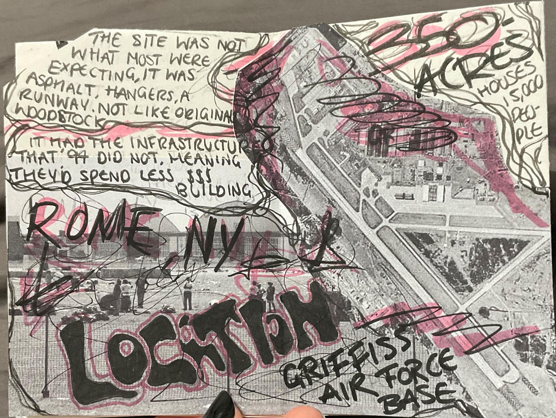
I initiated the creative process by sketching a series of thumbnails, envisioning a traditional DIY hand-drawn theme for my zine. Armed with a black felt-tip pen and a pink highlighter, I began sketching.
My goal was to capture a sense of chaos, busyness, and disorganization, mirroring the essence of the Woodstock festival itself. I wanted the visual representation of the zine to resonate with the festival-goers, conveying the atmosphere of the event.
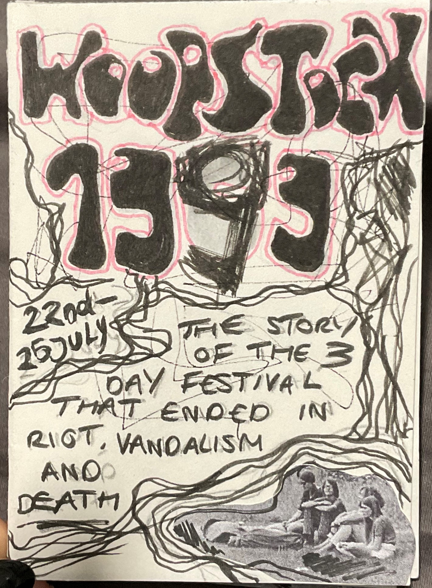
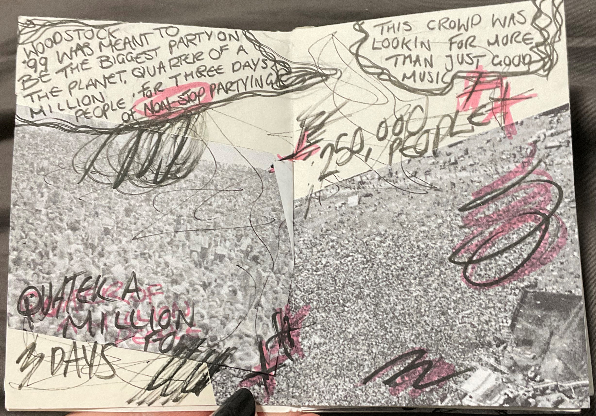
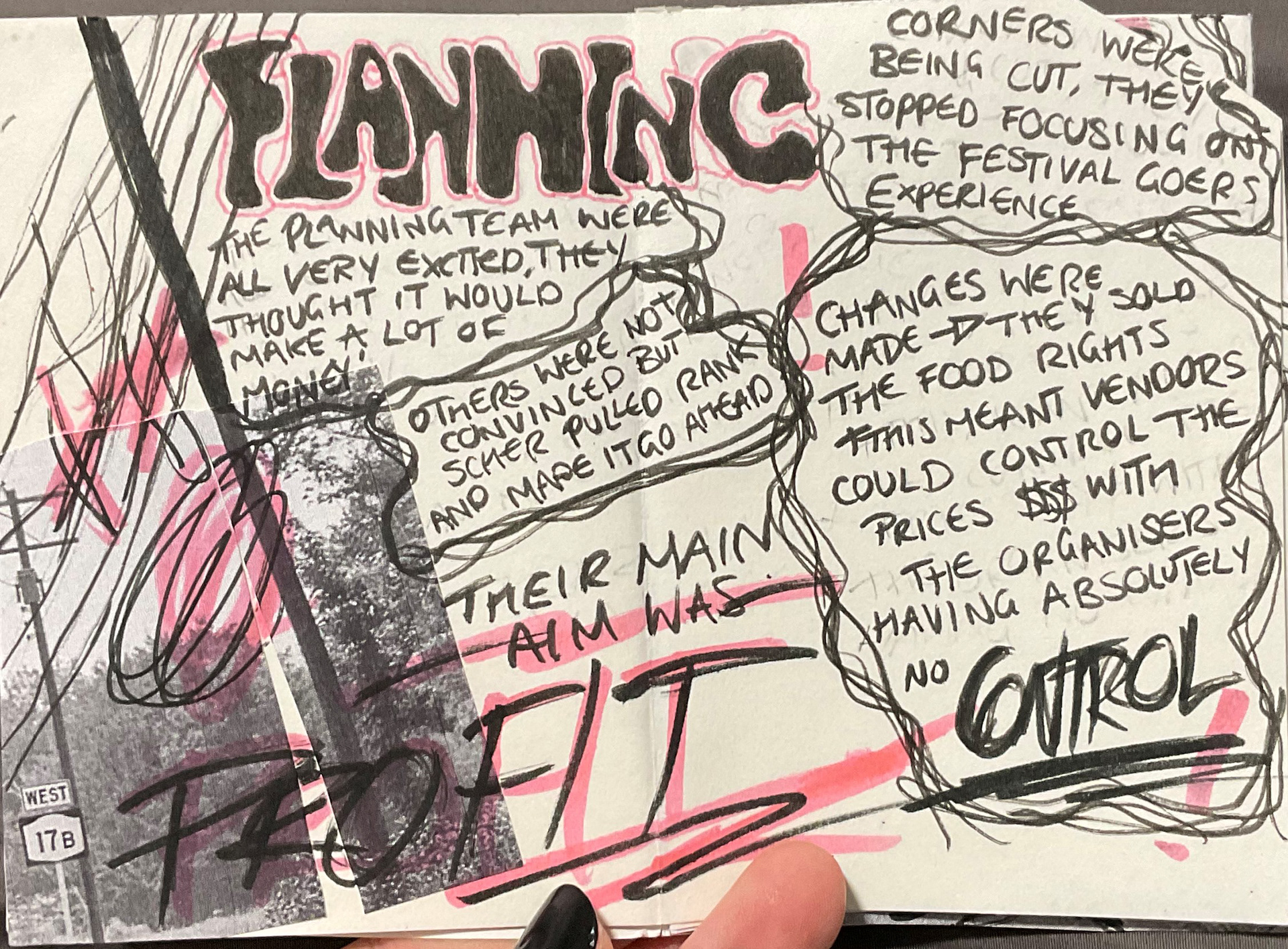
Deciding on a blend of the chaotic punk vibe from Woodstock '99 with the original psychedelic ambiance of Woodstock '69, I incorporated scratchy, loose body copy and drawings. Headings were rendered in a psychedelic bubble typeface with a vibrant pink color.
In the progression below, you can witness the expansion of these initial sketches. As I gauged the available space for text, I originally planned for an 8-page zine using a folded piece of A3 paper—a simple, traditional punk DIY zine. However, after sketching out a few pages, I realized that it wouldn't accommodate all the necessary information. Instead, I decided to write out all the information, segment it into subheadings, and estimate the required number of pages. This approach resulted in around 20 A5 pages, including the front and back covers.
At this juncture, I recognized that the traditional fold binding wouldn't suffice. I shifted towards exploring alternative binding methods, with the final decision to be made later. For now, my focus was on designing the pages.
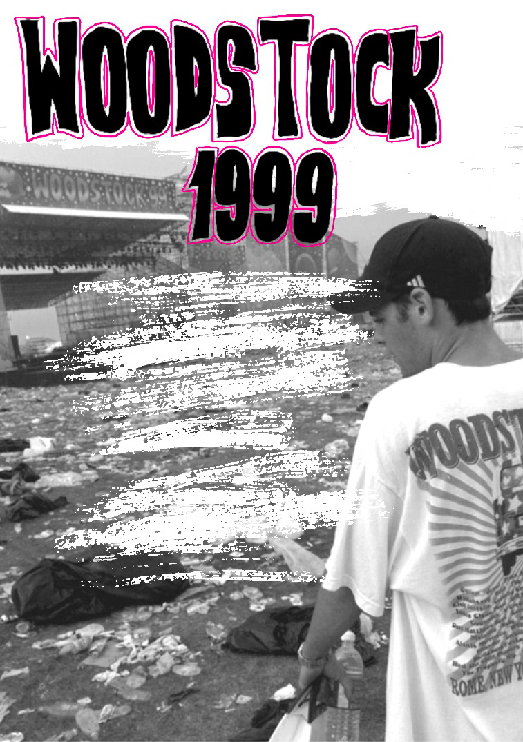
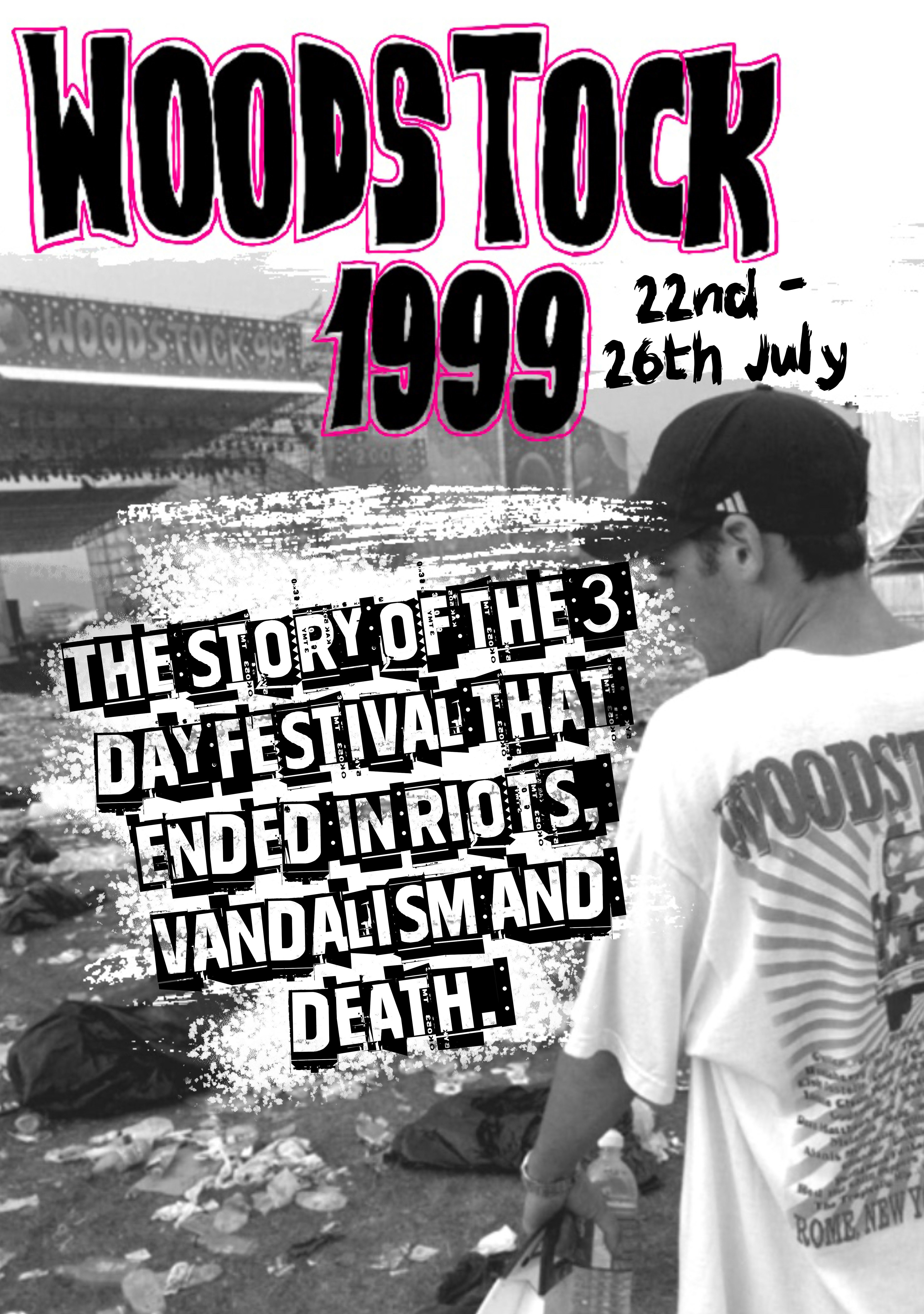
I chose to initiate the digital development of these pages, experimenting with typography, various fonts, and the strategic layering of imagery. The initial attempt at the front cover didn't precisely align with my vision, but this exploration of a single page provided valuable insights into which layering elements were effective and which were not. Encouraged by this, I delved into digitally creating double-page spreads and refining a distinctive style for the zine.
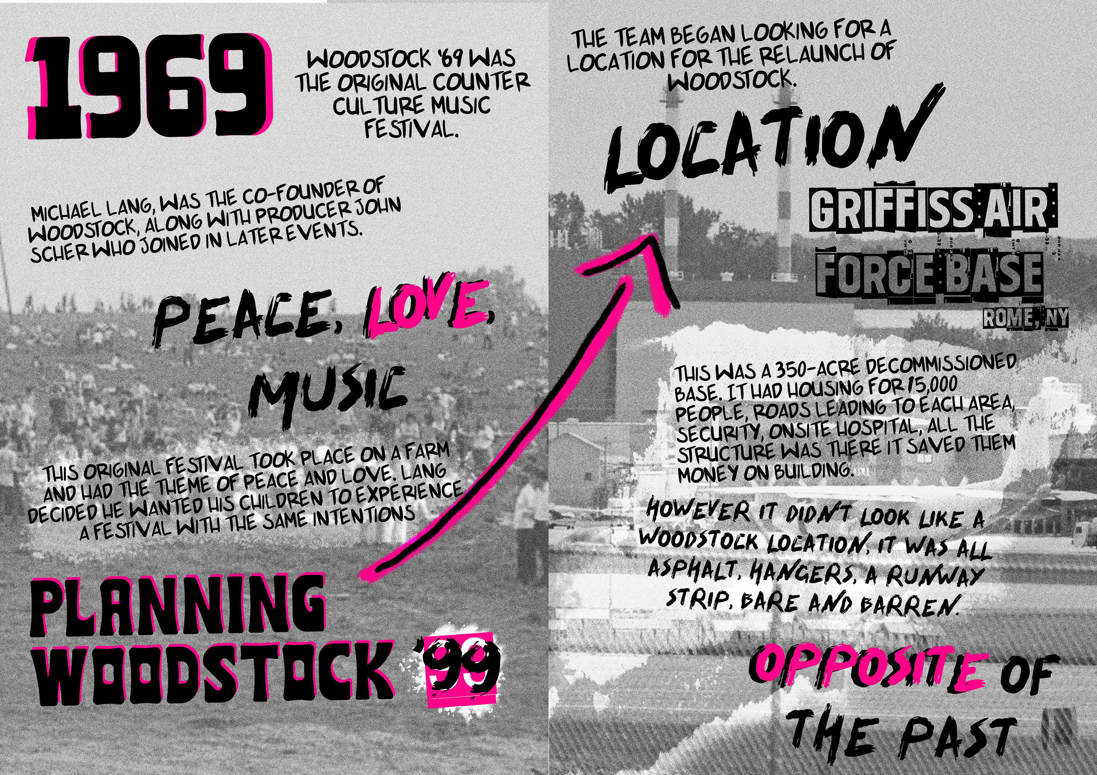
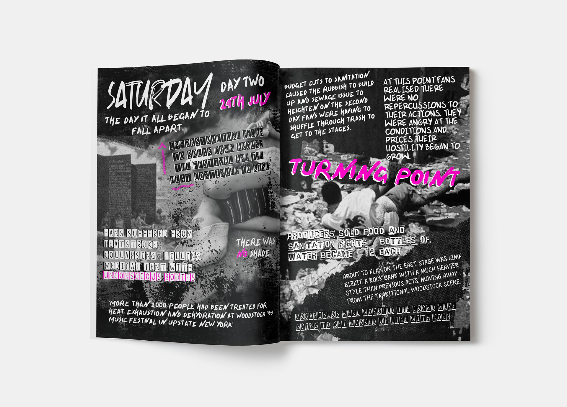
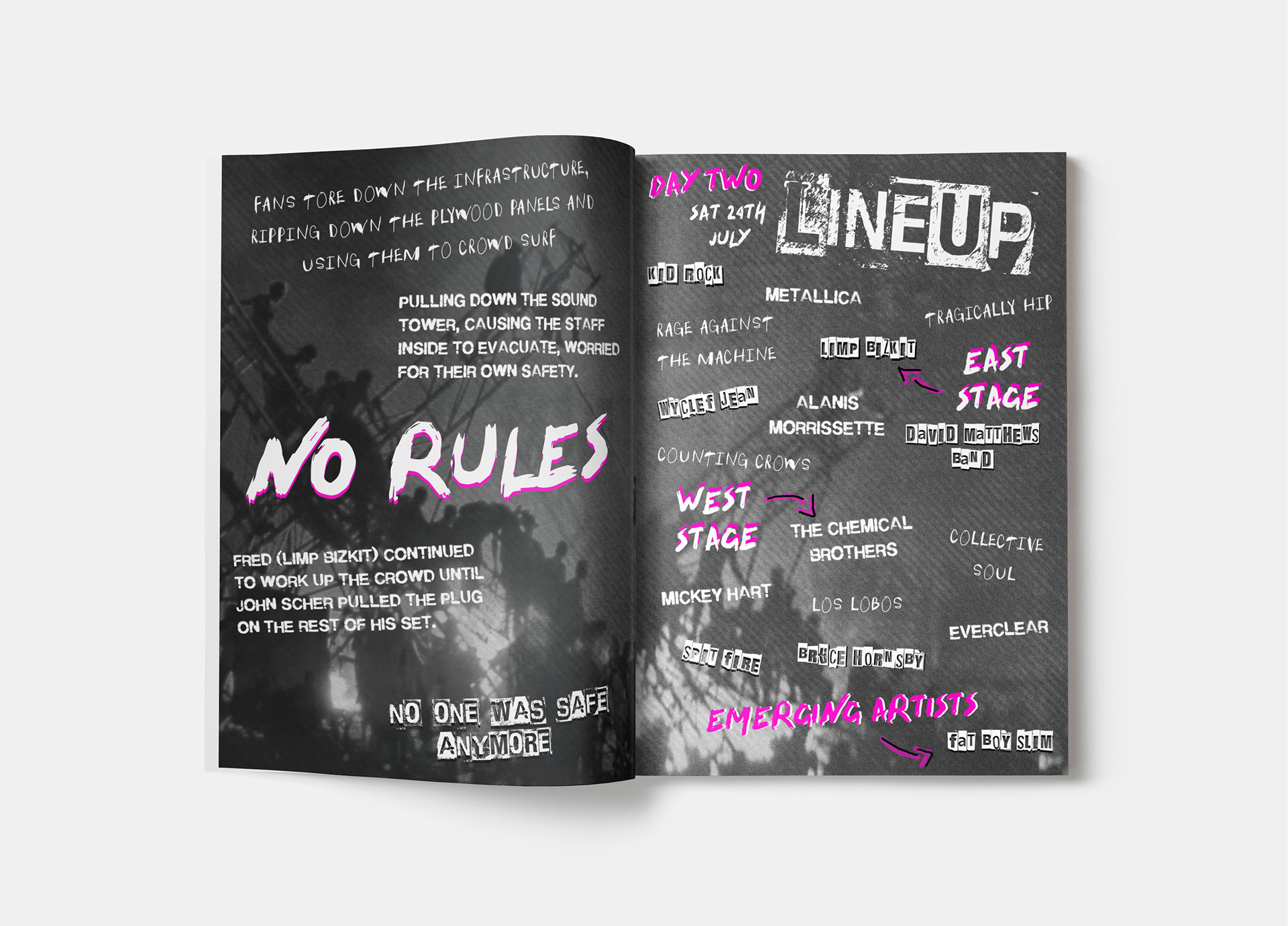
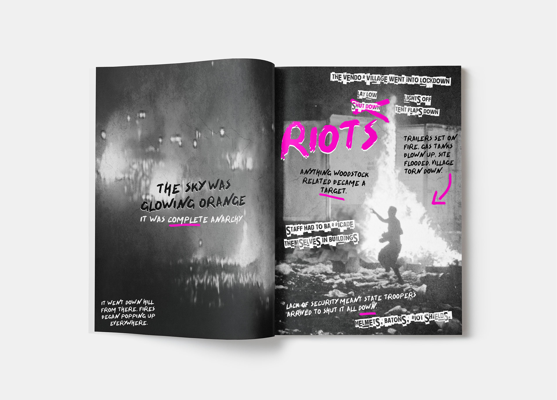
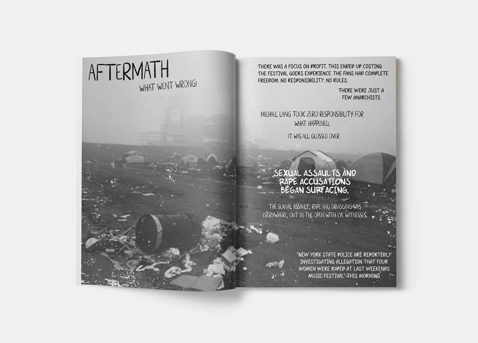
In the progression below, you can observe the evolution of the style characterized by the interplay of black-and-white imagery, gritty black lettering, and vibrant pink type. While I designed the layouts as spreads, during production, I split the pages to ensure proper printing and alignment.
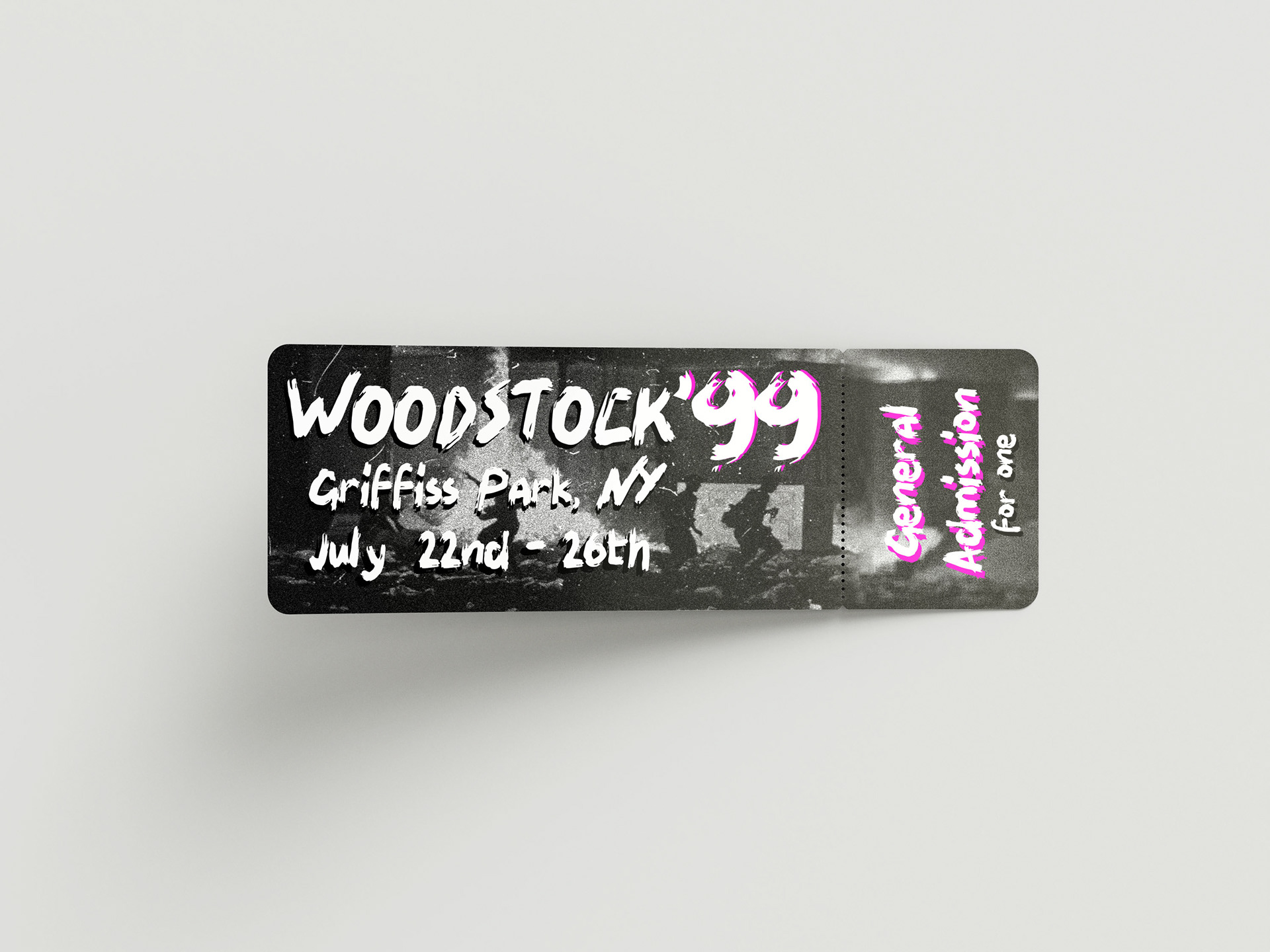
The following set of images showcases the spreads as they appeared in their printed and bound form—ultimately, a 20-page zine. This zine, measuring A5 in size, was bound with staples at the center. As a last-minute addition, I opted to include a unique element: a recreated version of the original 1969 Woodstock Festival ticket. This reproduction, infused with the punk 1999 style developed for the zine, serves as an additional freebie tucked into the zine, providing customers with a little extra something.
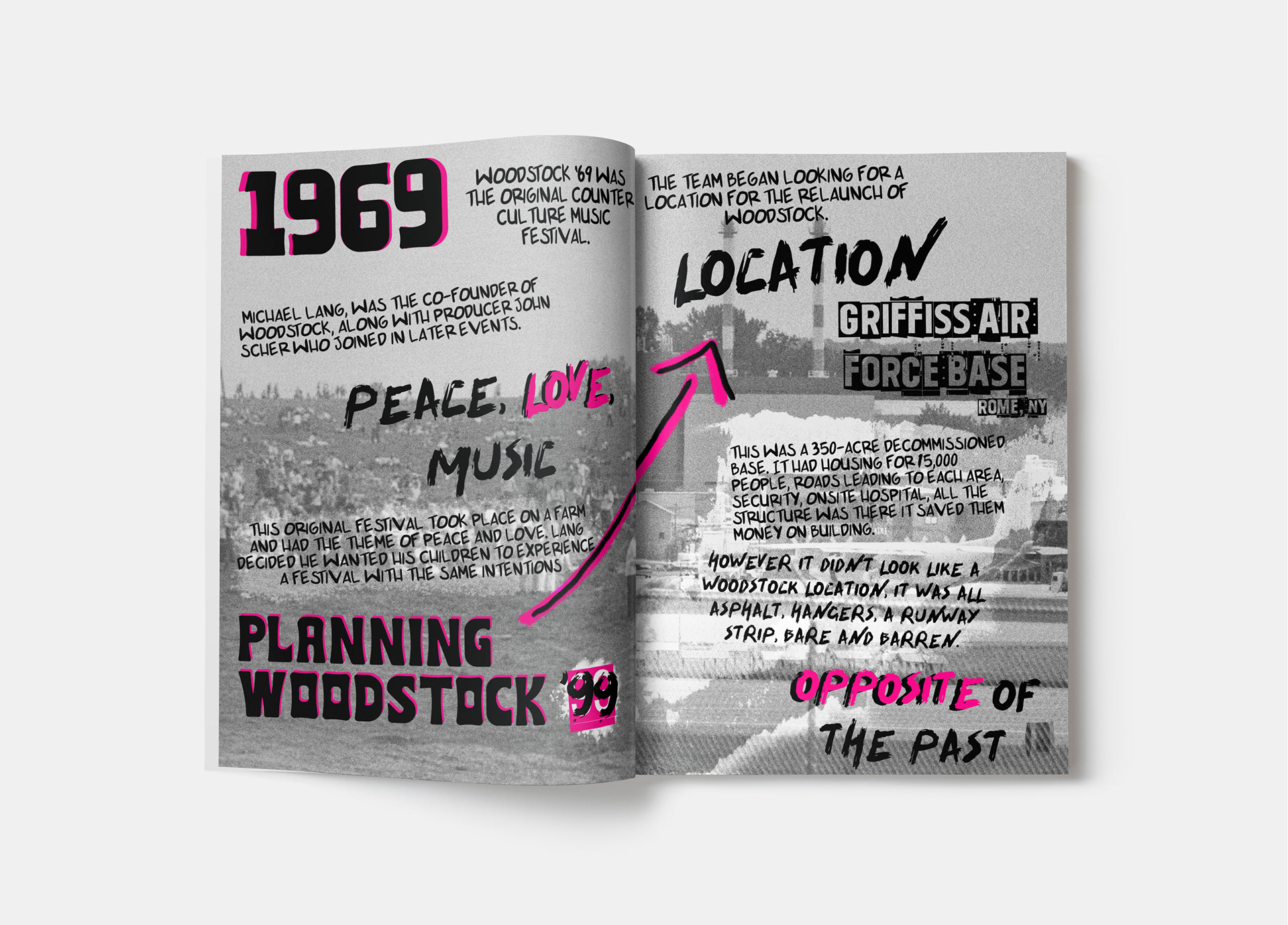
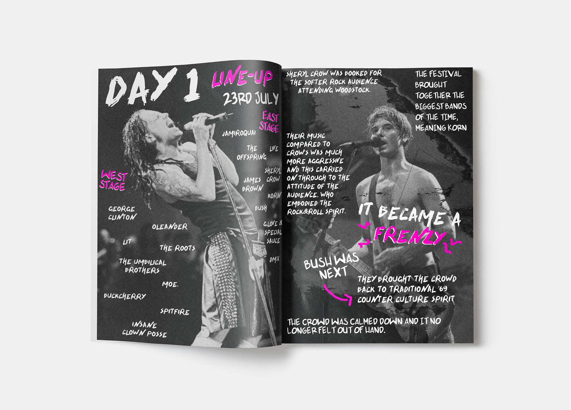
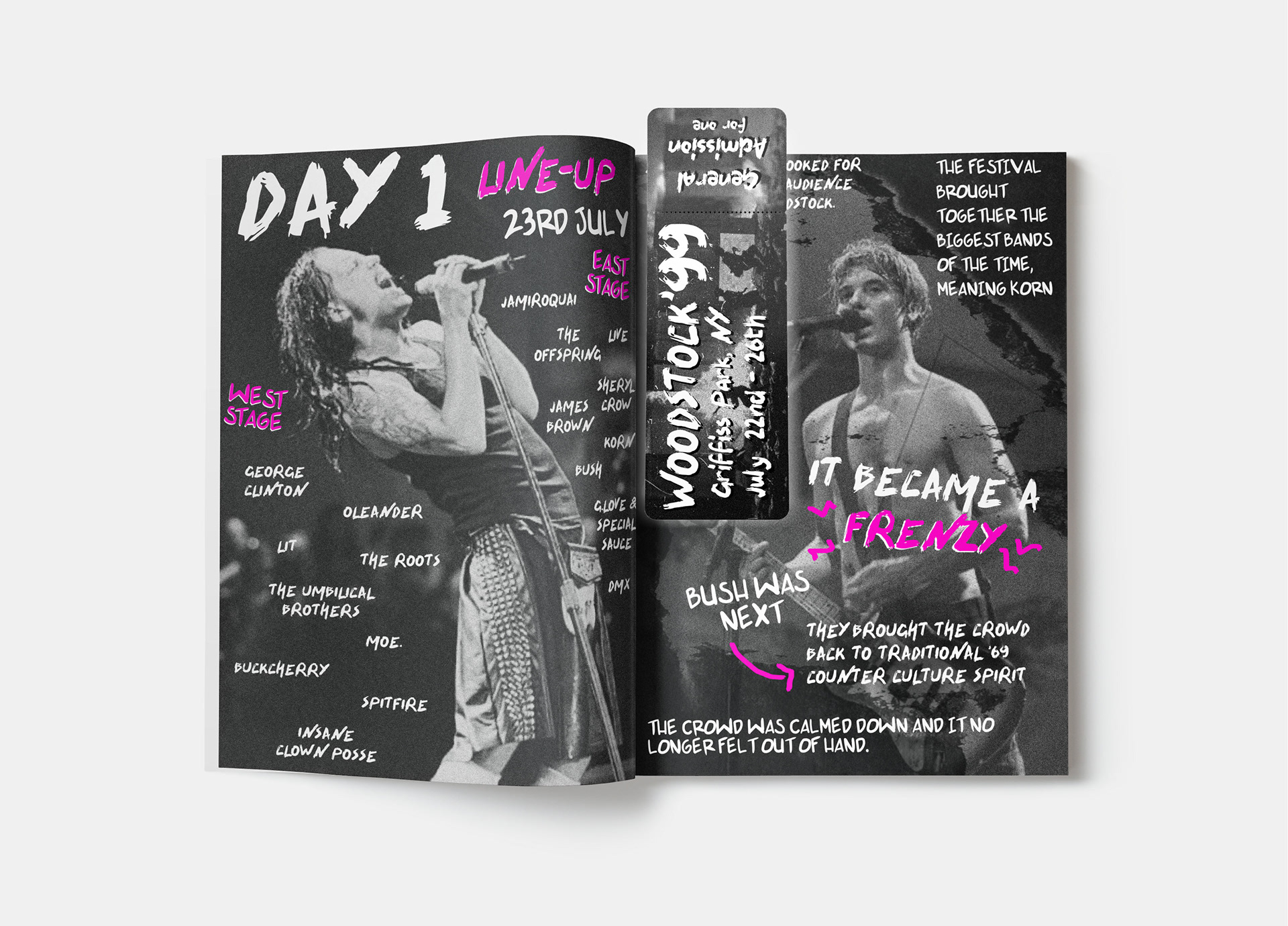
Please note that the grid displayed above doesn't encompass all the pages within the zine. It merely highlights a select few to offer a glimpse of the final design outcome.