This project, assigned at university for our entire course, required collaborative branding for our collective. As a group, our objective was to craft branding that would encapsulate our diverse design styles and serve as a unified identity for selling our individual designs on a Redbubble site.
Approaching this as a collective assignment, we initiated the process with a brainstorming session, leading to the birth of the name 'Random Acts of Design.' We believed this name adequately reflected the varied design styles within our group, leaving no particular aspect untouched.
Regarding the branding style, each member of the group independently created a logo or design. We then presented our concepts to the group, collectively discussed them, and cast votes to determine our favourite. The chosen design became the cornerstone of our visual identity, representing the collective spirit of our group as we ventured into the world of online design sales.
I initiated the process by sketching specific logo concepts, then delving into a range of fonts and colours, exploring and expanding upon the design possibilities.
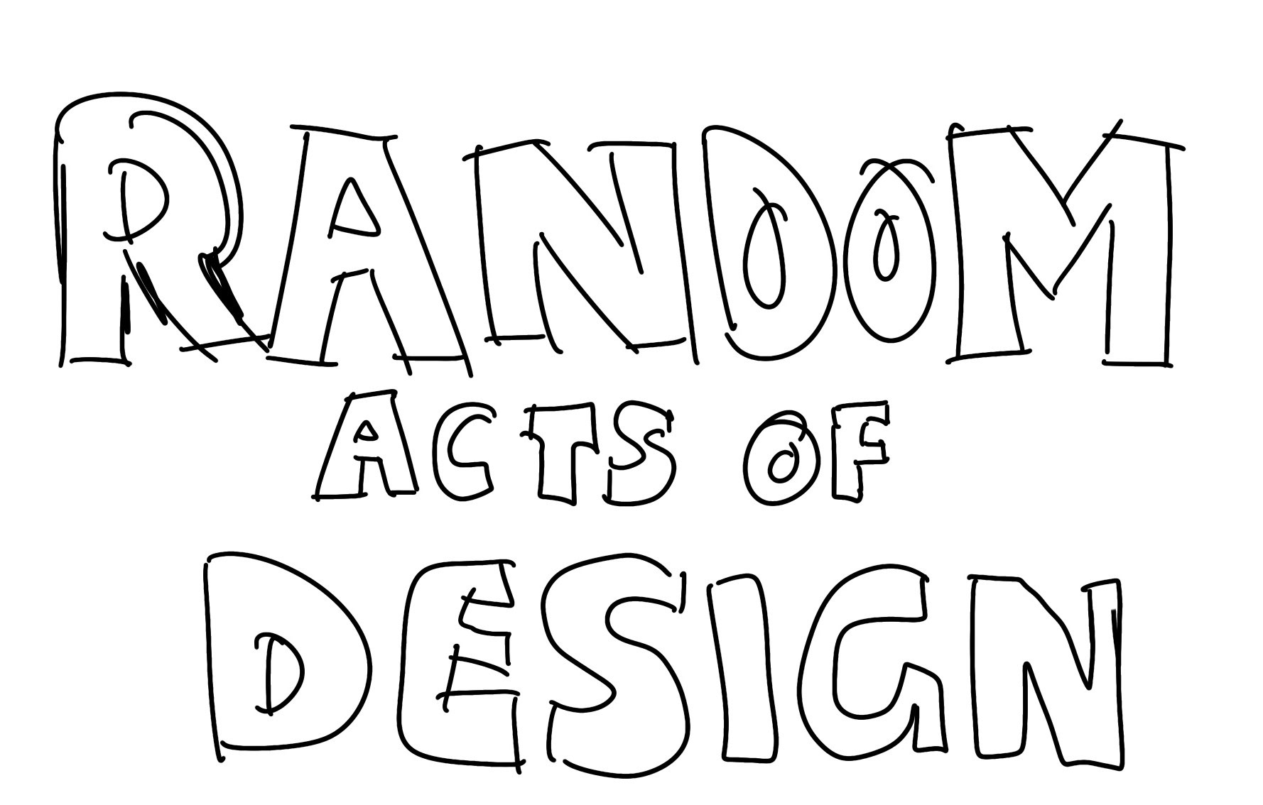
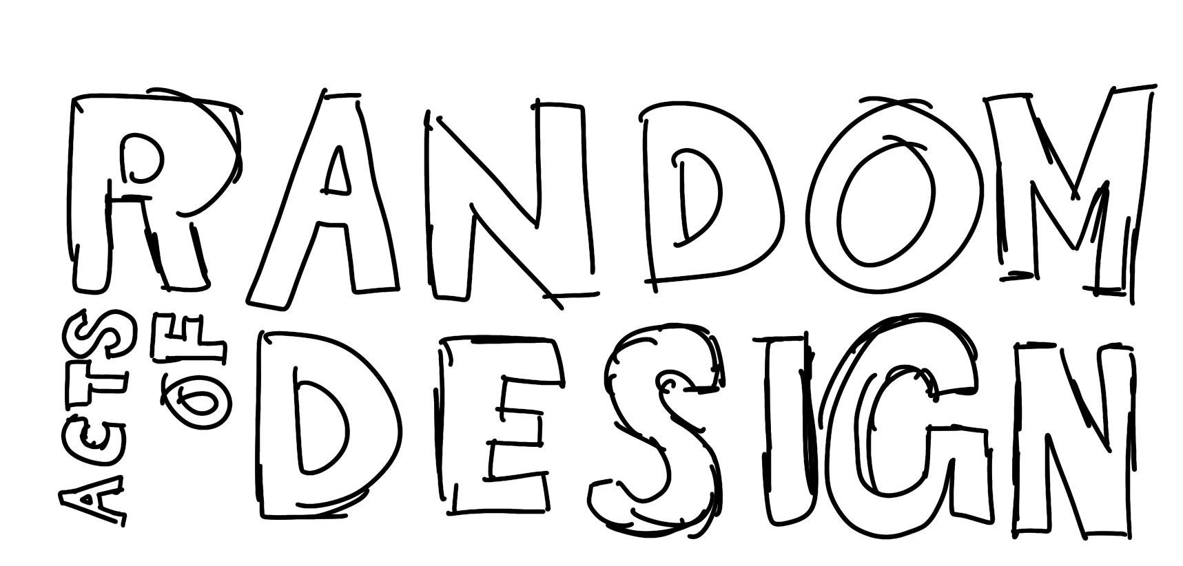
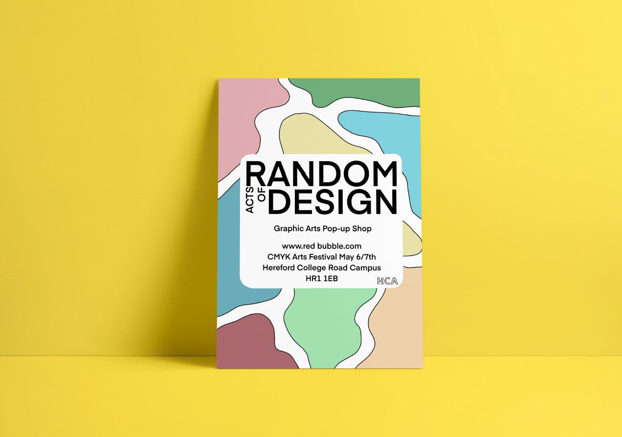
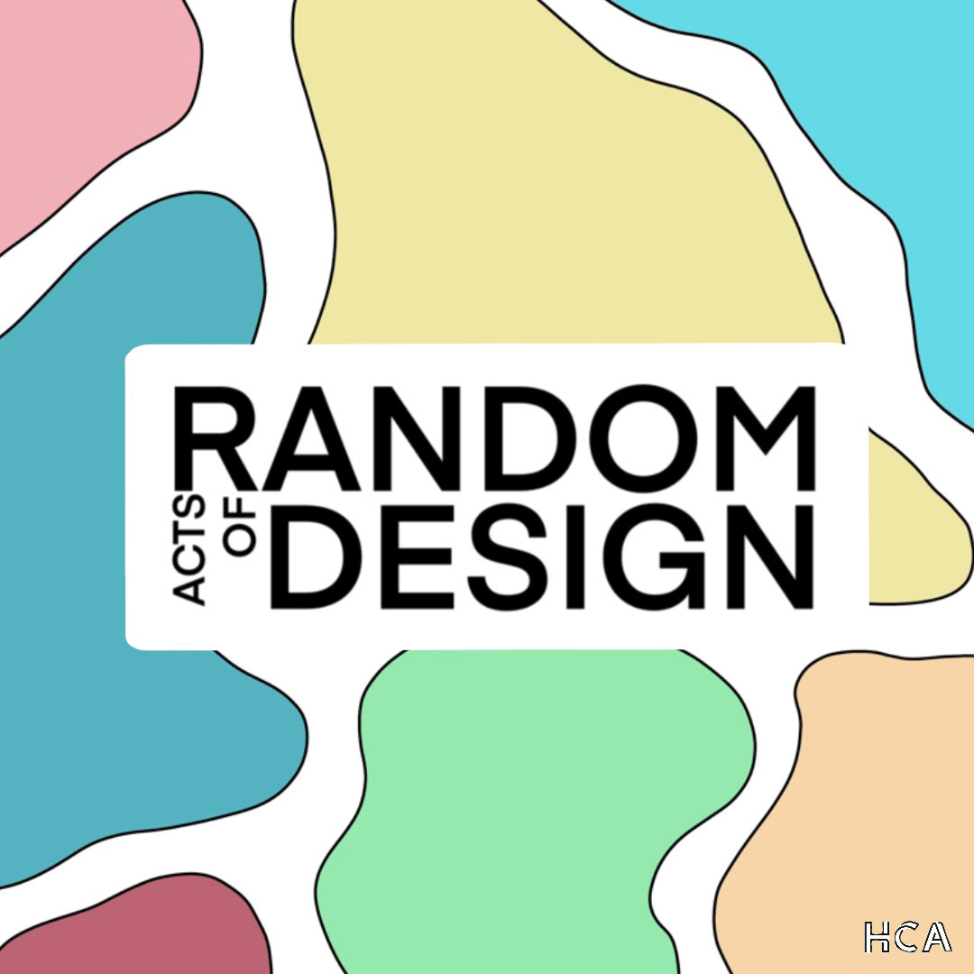
Here is the chosen logo and typeface. My subsequent move involved sketching patterns or backgrounds that I intended to incorporate into the brand's visual identity.

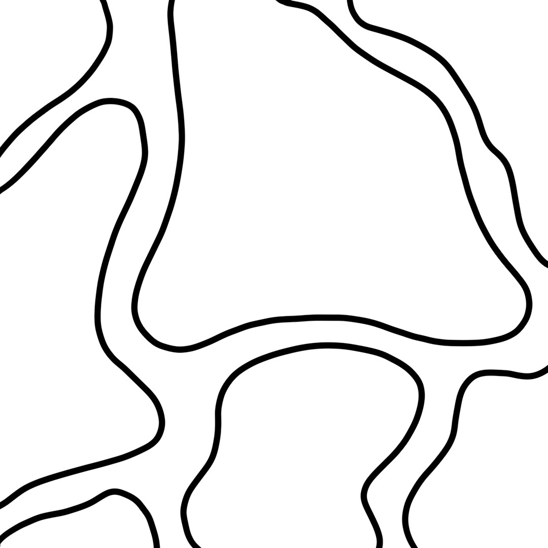
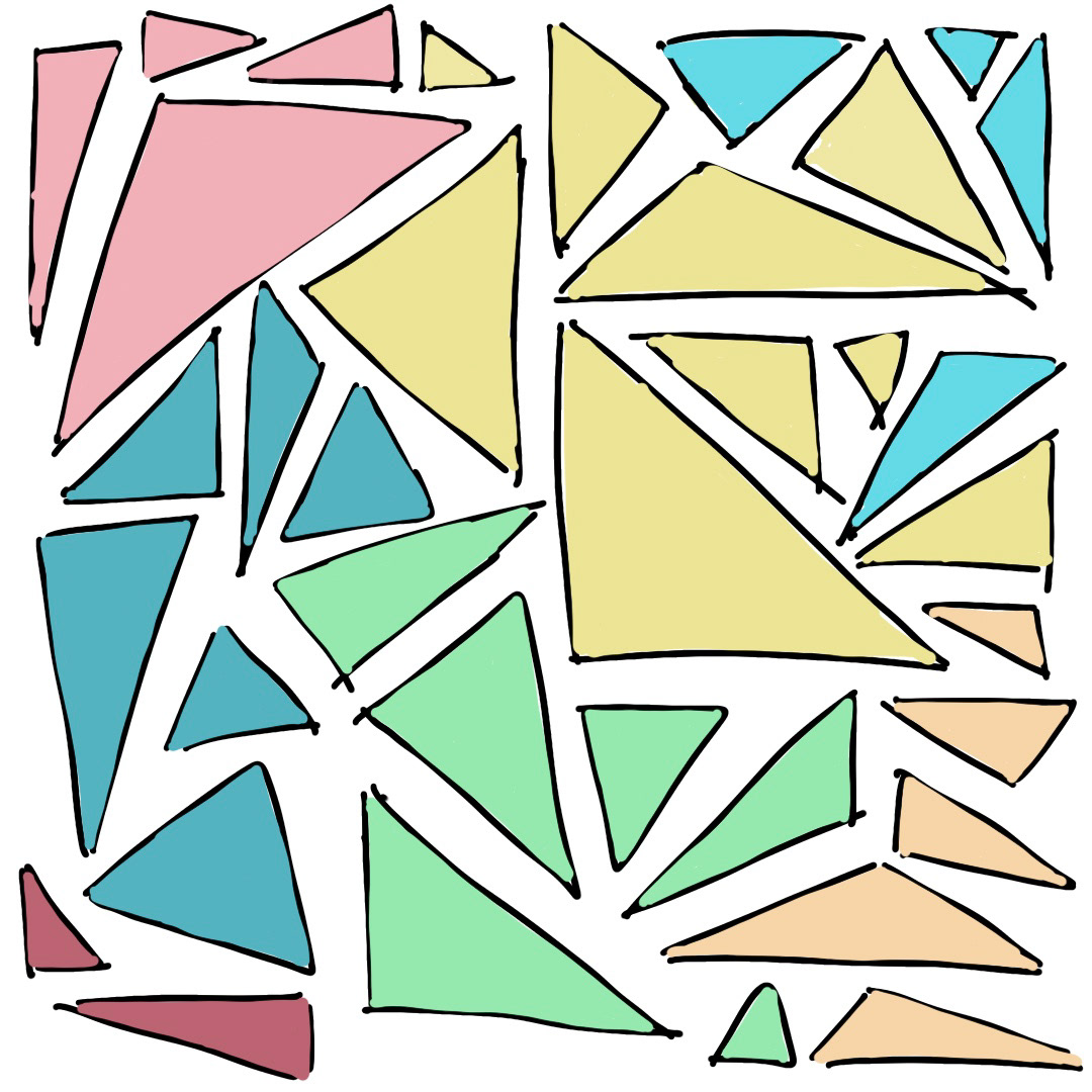
I opted to sketch several distinct patterns before experimenting with a range of diverse color palettes. My aim was to create a palette that would encompass the entirety of our design styles. Initially considering a collection of various colors or a rainbow-inspired version, it took some experimentation to pinpoint the most effective approach.

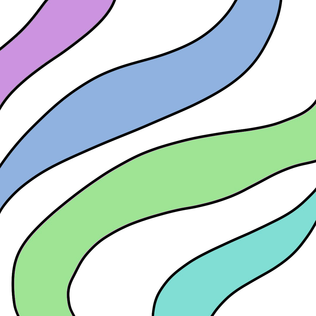
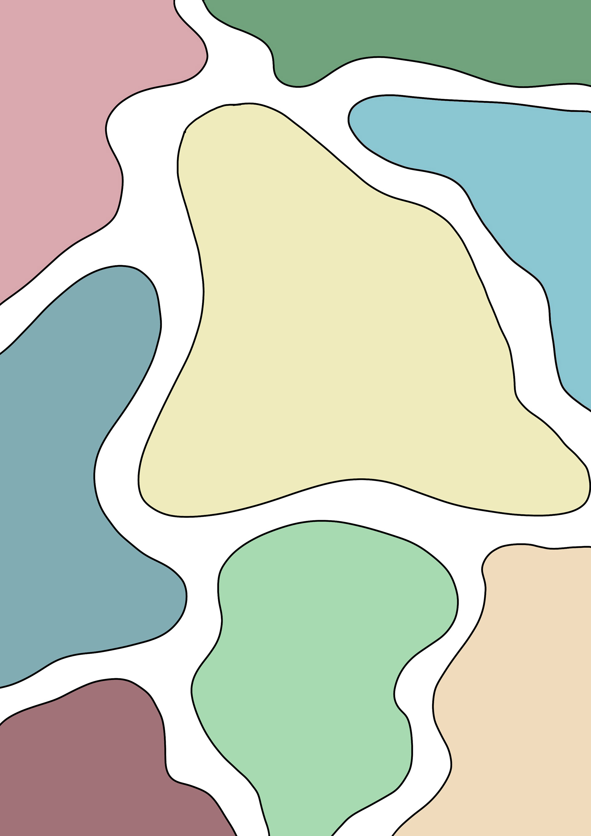
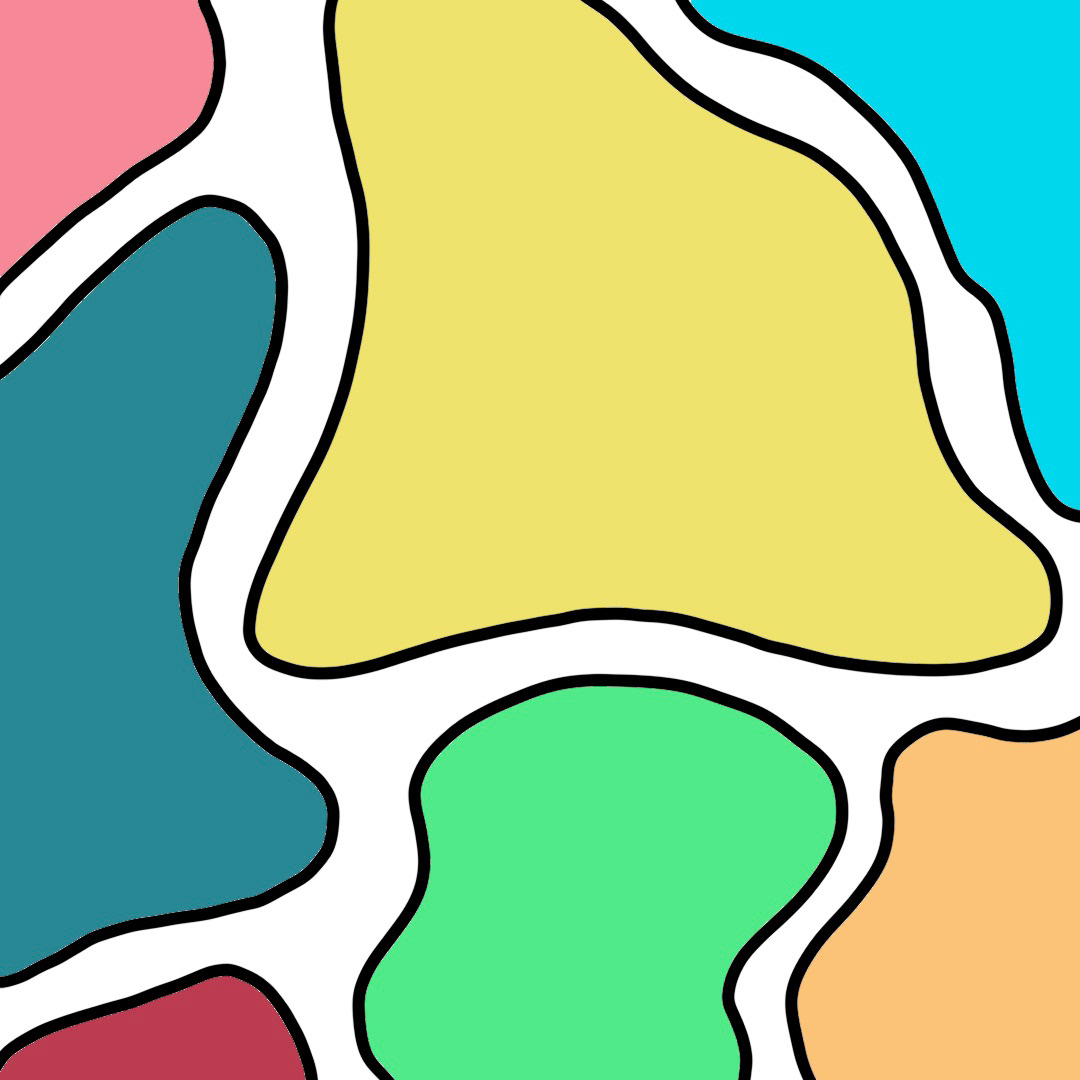
Progressing from this point, I started layering the type over my preferred design to determine the most fitting colours when the design elements were combined. I was leaning towards a pastel rainbow or some shades of purple.

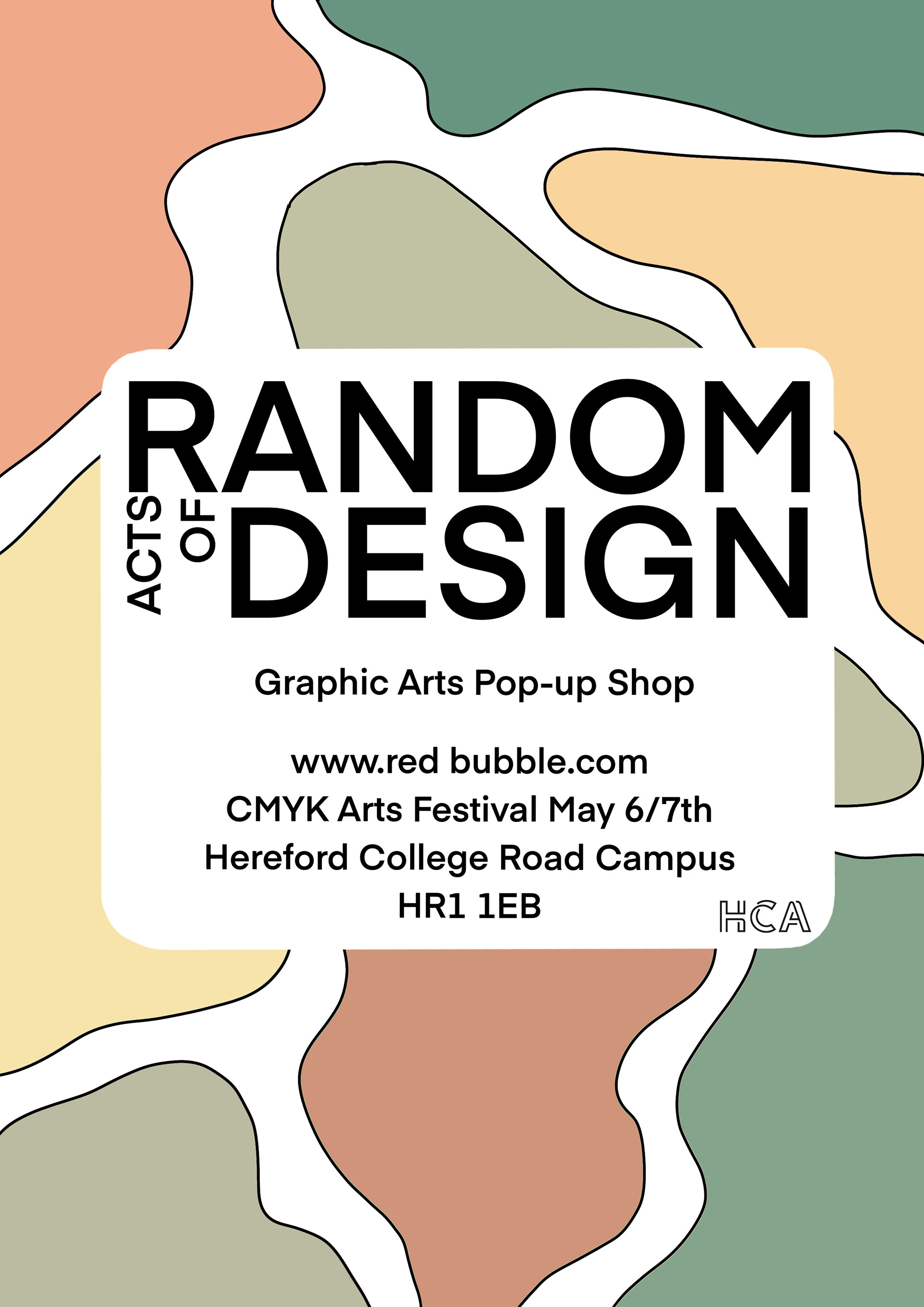
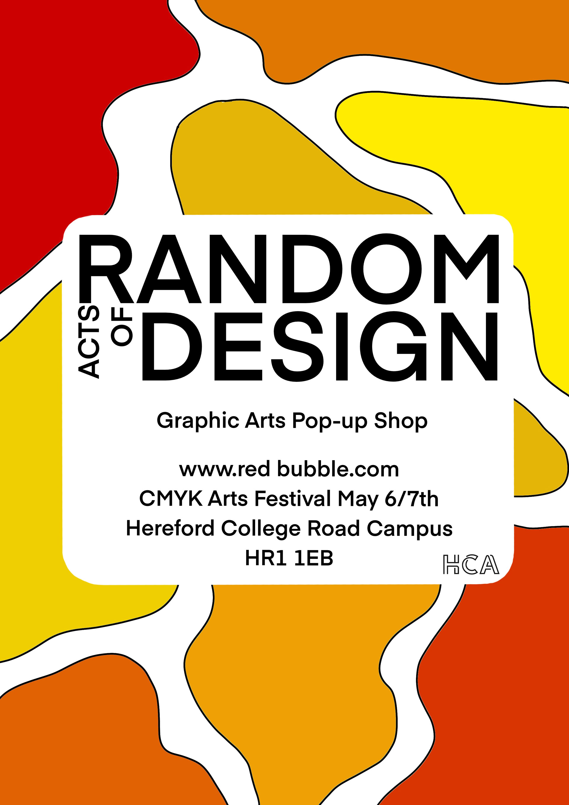
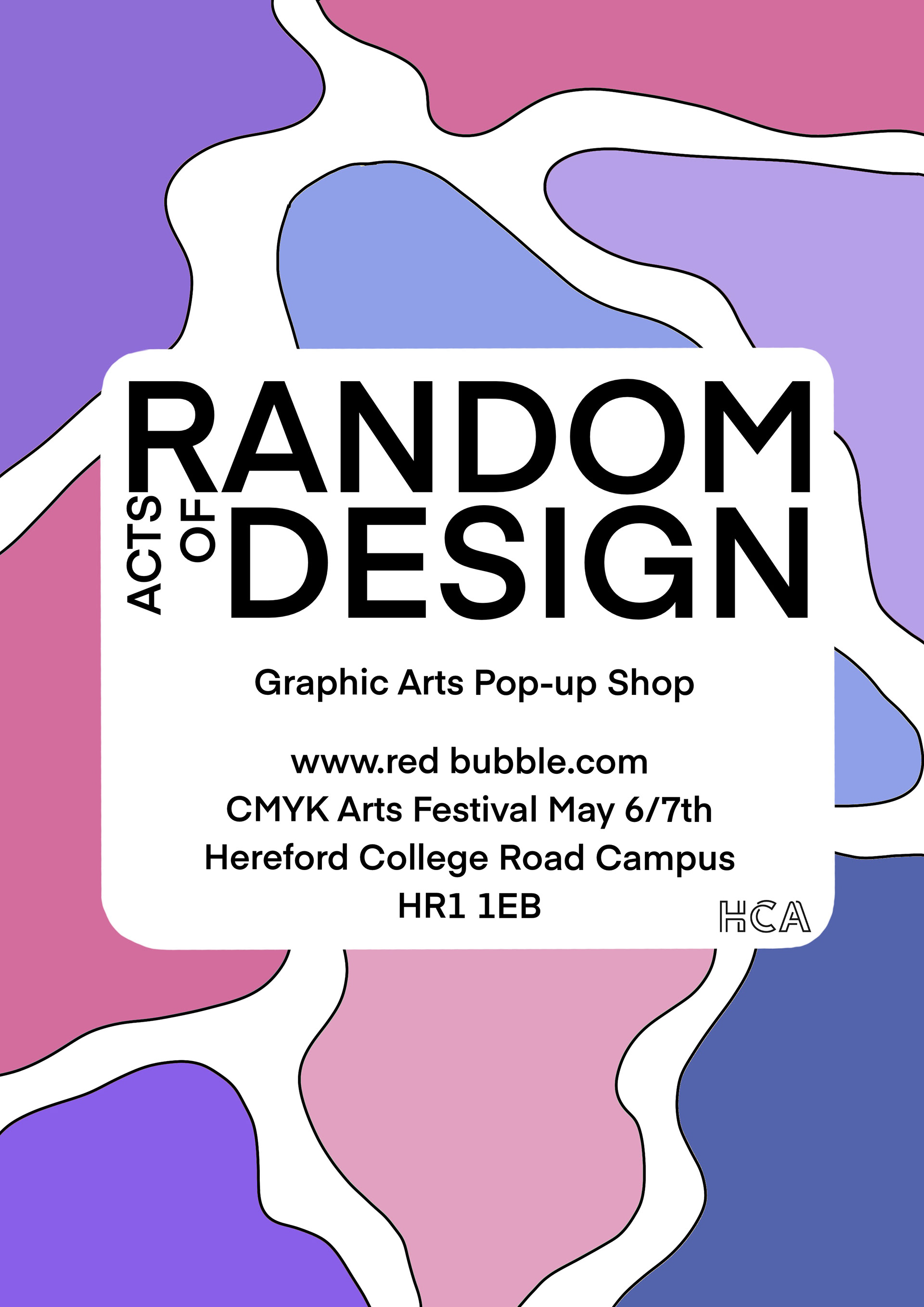
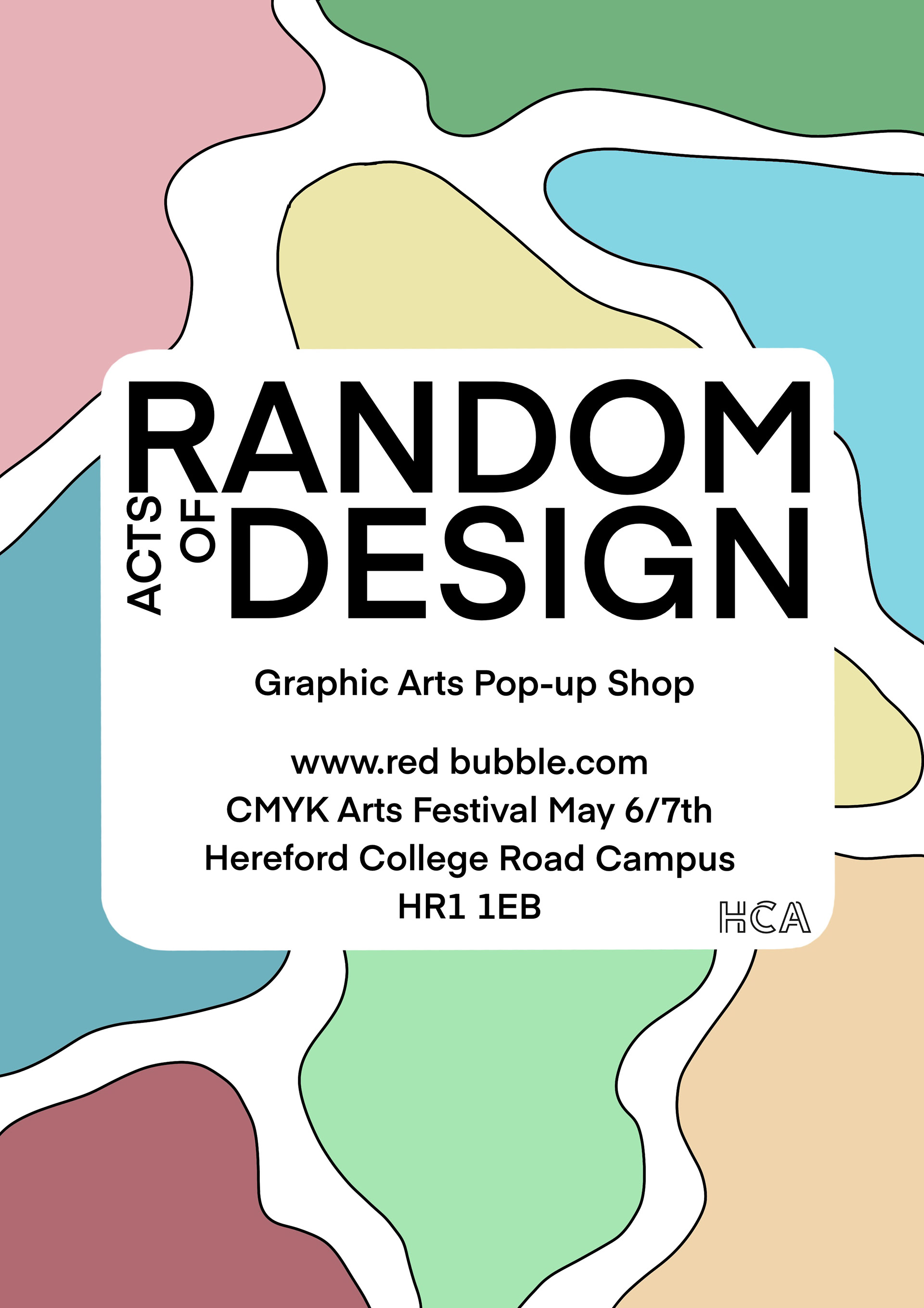
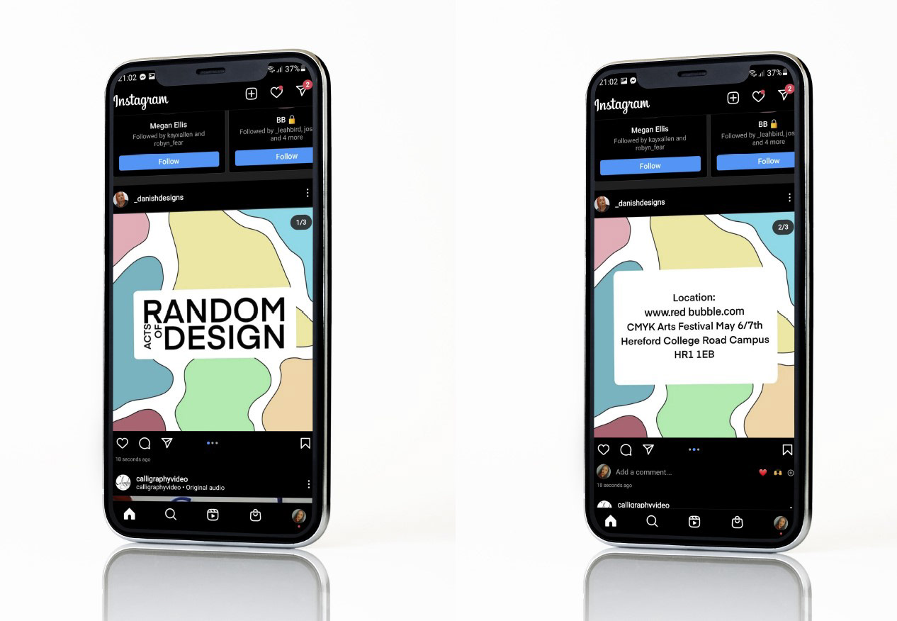
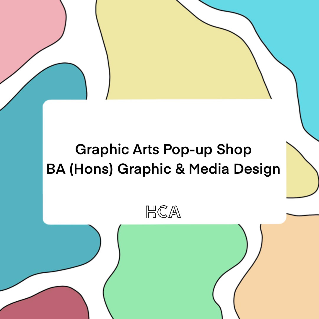
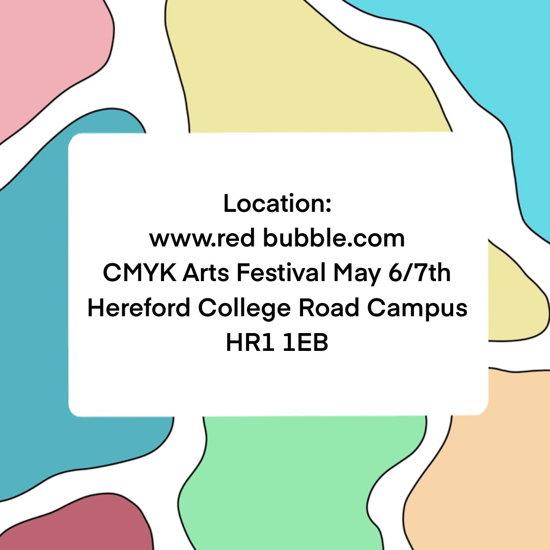
Ultimately, I opted for the pastel rainbow colour scheme. However, in comparison to the original pastel colours I experimented with, I chose to make them slightly dustier to avoid being too vibrant and overpowering. For my presentation, I developed the logo, colour palette, posters, and social media posts. This comprehensive approach aimed to provide my peers with an overview of how the branding elements worked together, rather than just presenting the logo in isolation on a blank page.