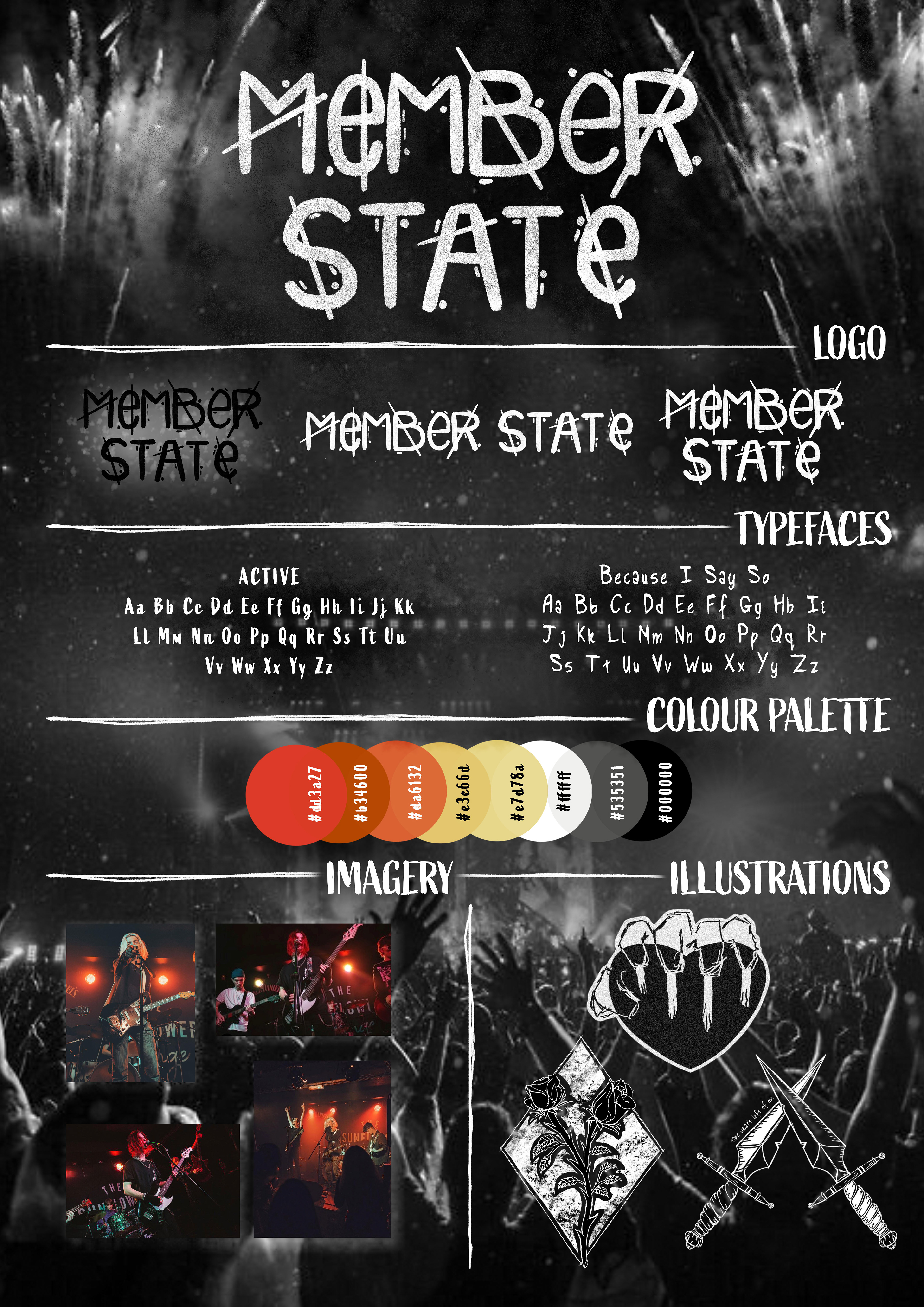
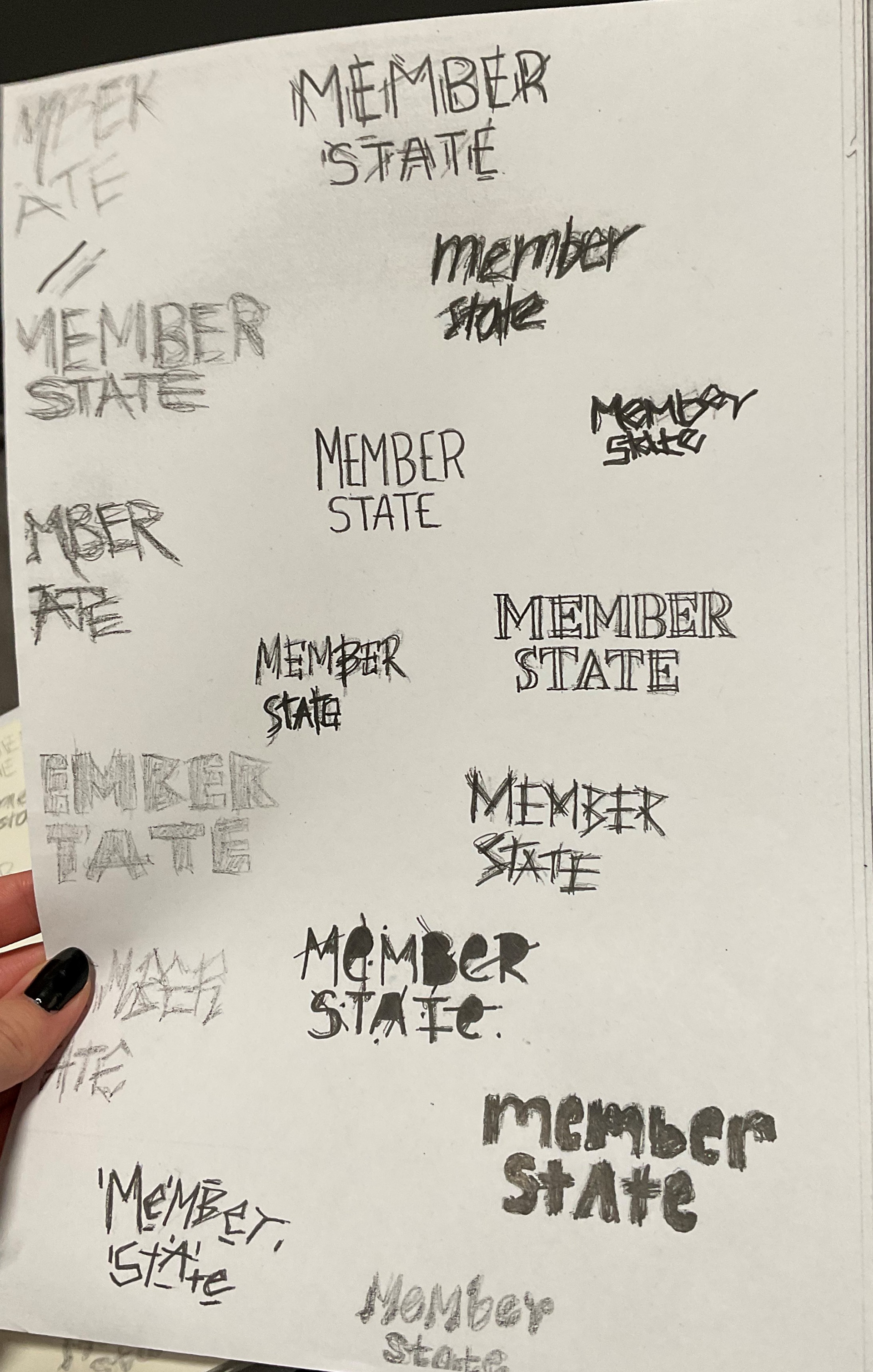
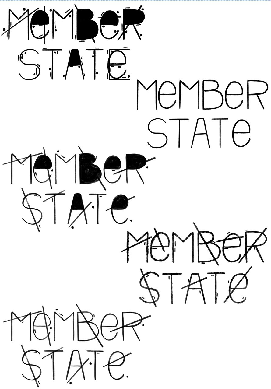
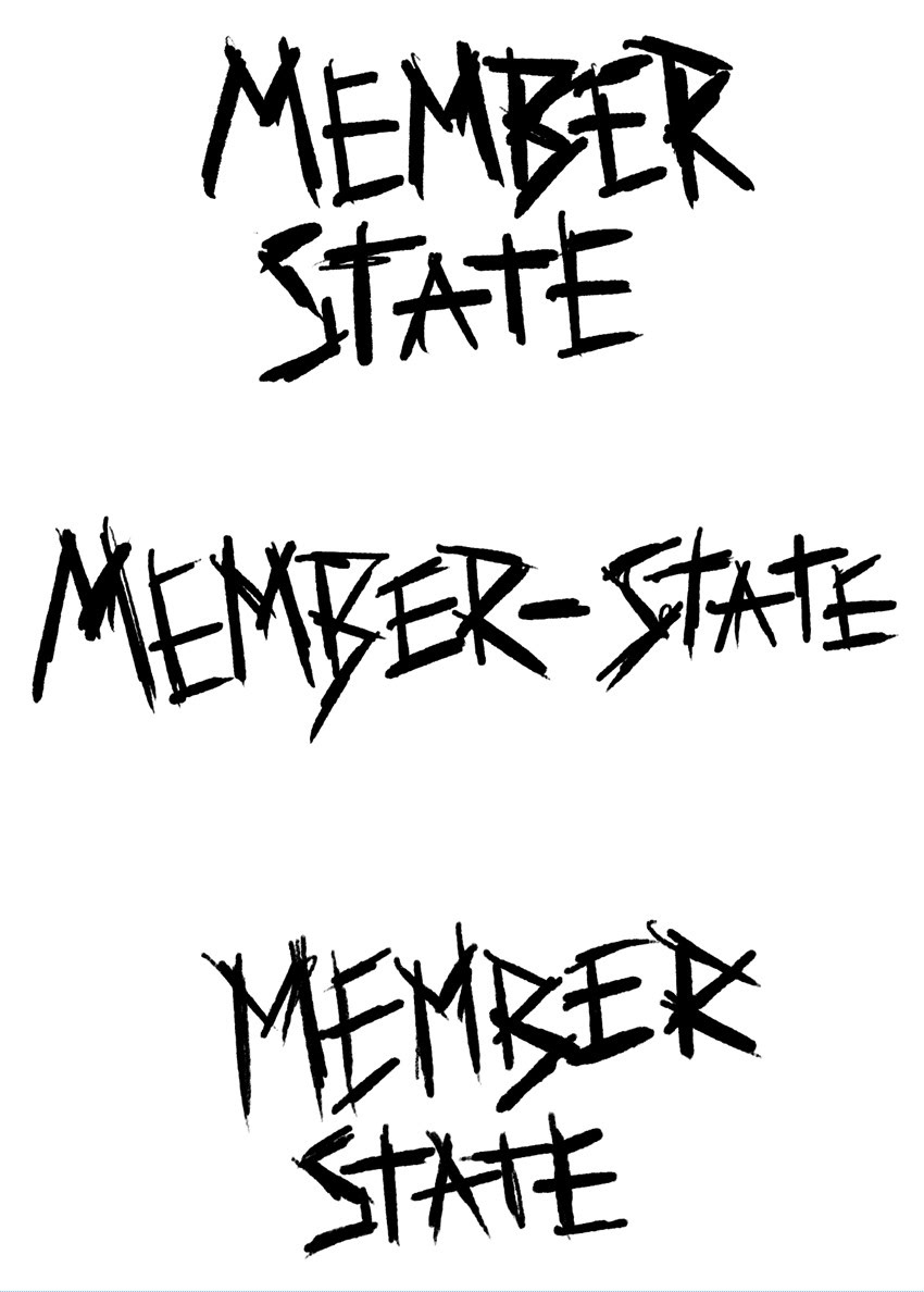
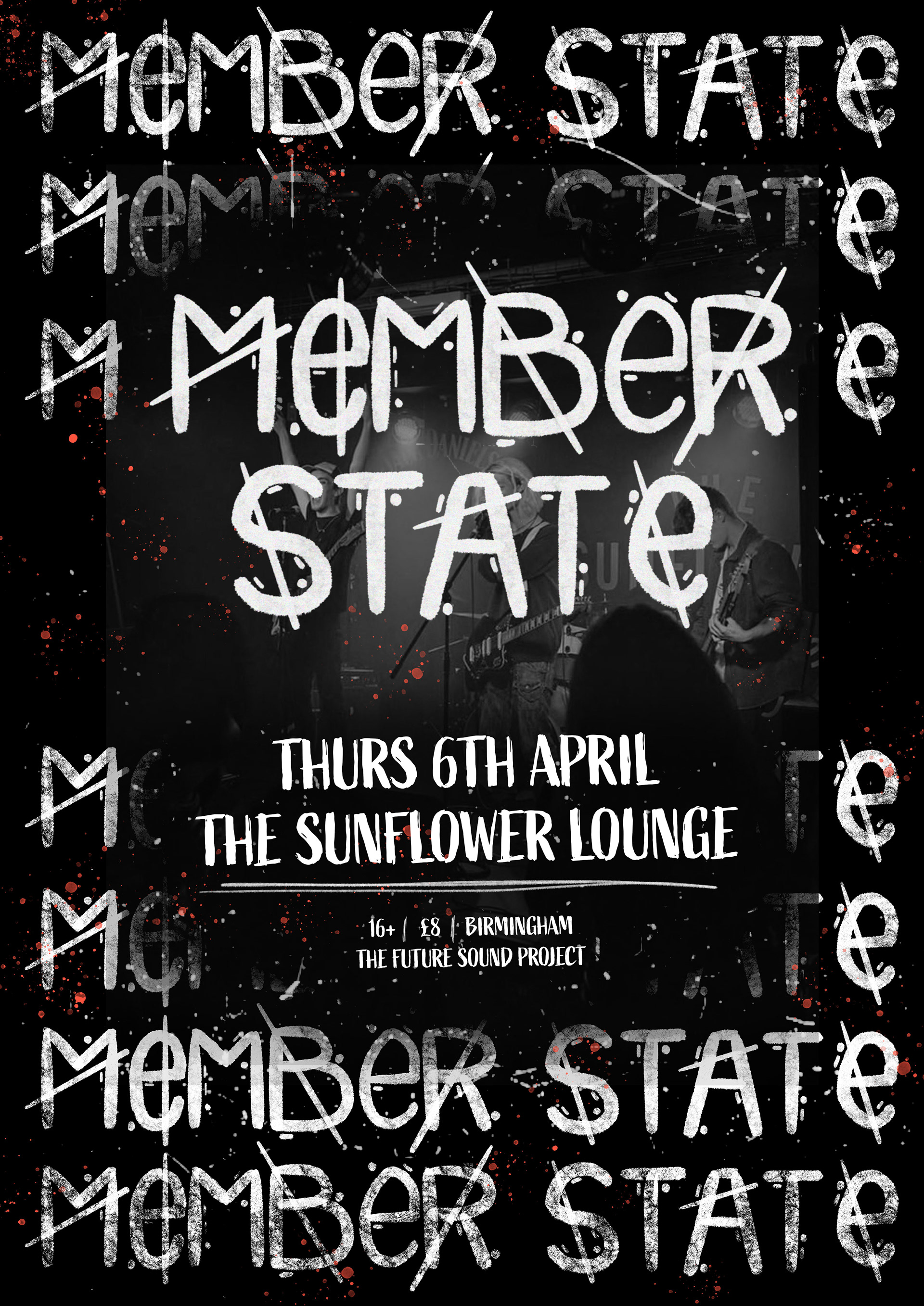
In my pursuit of enhancing my branding abilities this year, I proactively approached a local band to inquire if they were interested in revitalizing their branding. As a result, I crafted a distinctive visual identity for them, beginning with the creation of a logo that I designed
The idea behind this logo was to illustrate how this emerging band aims to challenge the conventions of the rock music genre by offering their unique perspective on alternative music. The intersecting lines within the logo symbolise the breaking of boundaries and pushing past existing limitations within this industry. .

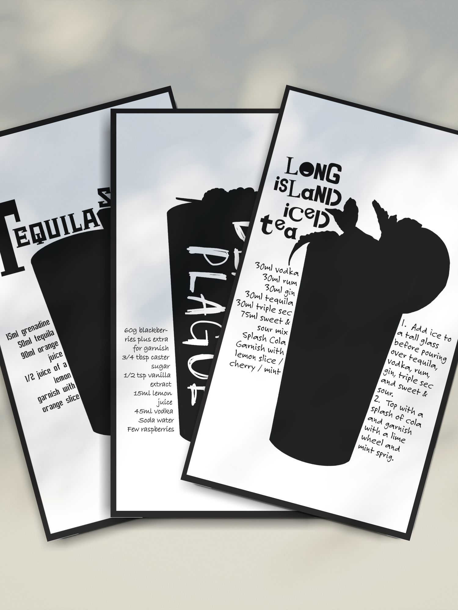
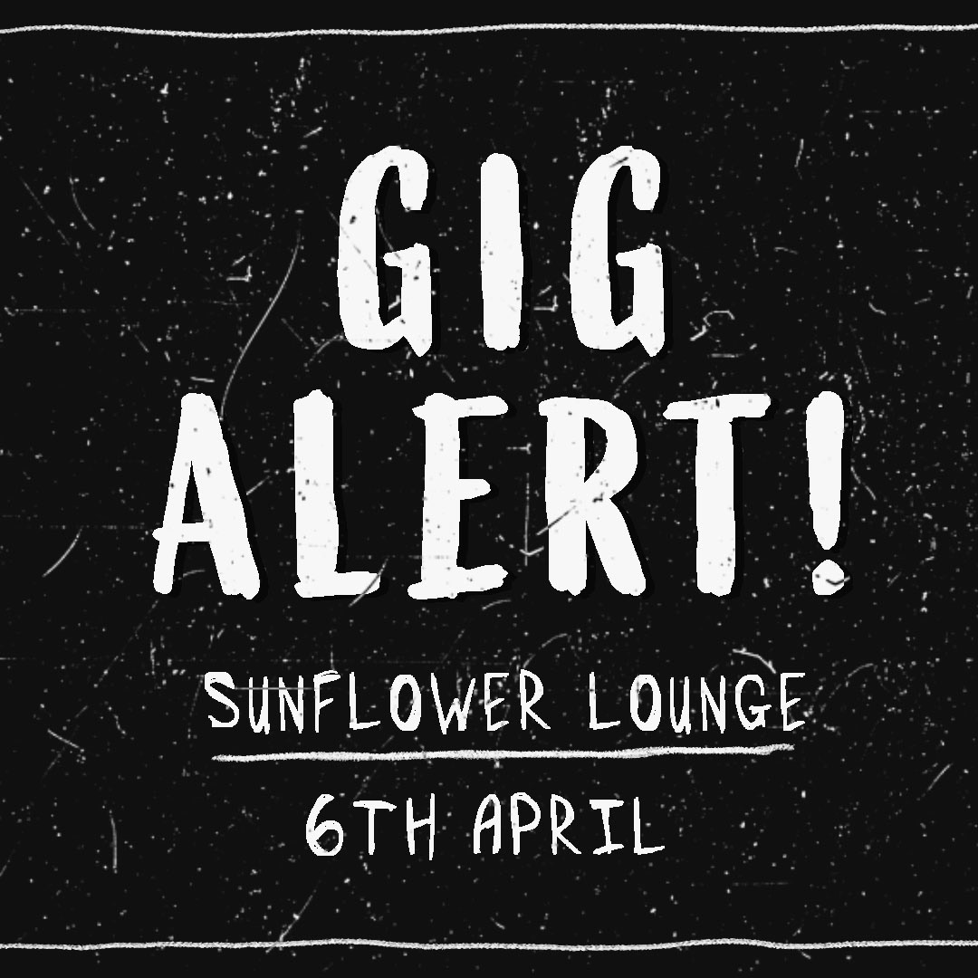
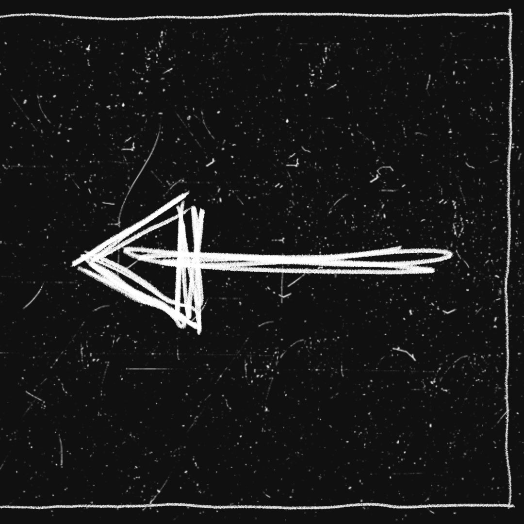
To begin with, I initiated the creation of a series of posters aimed at keeping their fan base informed about upcoming gigs and events. It is worth emphasizing the consistent incorporation of hand-drawn elements with digital typography and imagery throughout this journey.

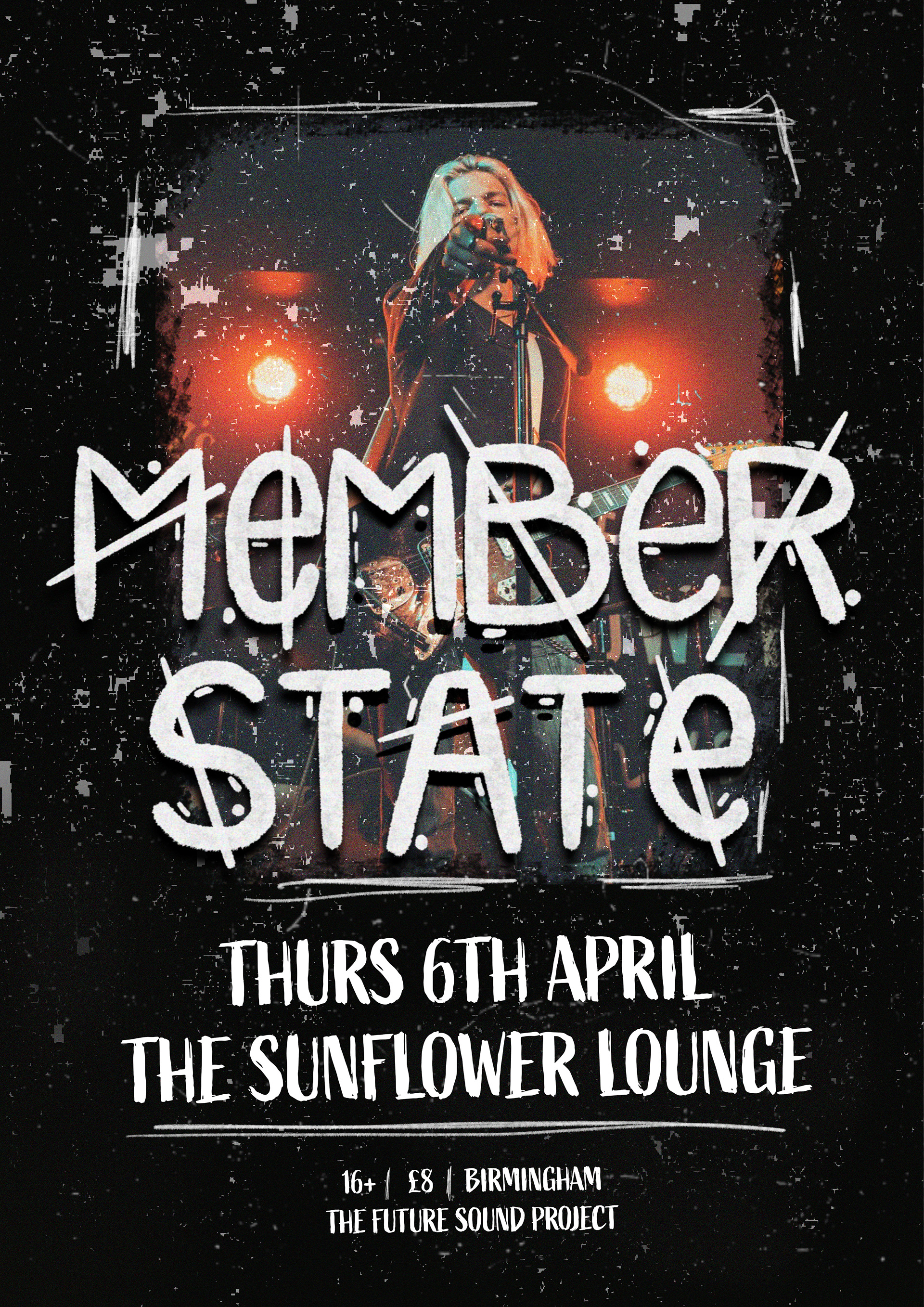
While crafting the identity for this brand, my primary emphasis was on their advertising strategies and the effective promotion of their upcoming gigs and events. Once had some album covers I moved onto the social media specifically so I could accomplished this task. The plan was top later address other aspects of their identity that would contribute to a cohesive and expandable brand presentation in the future.
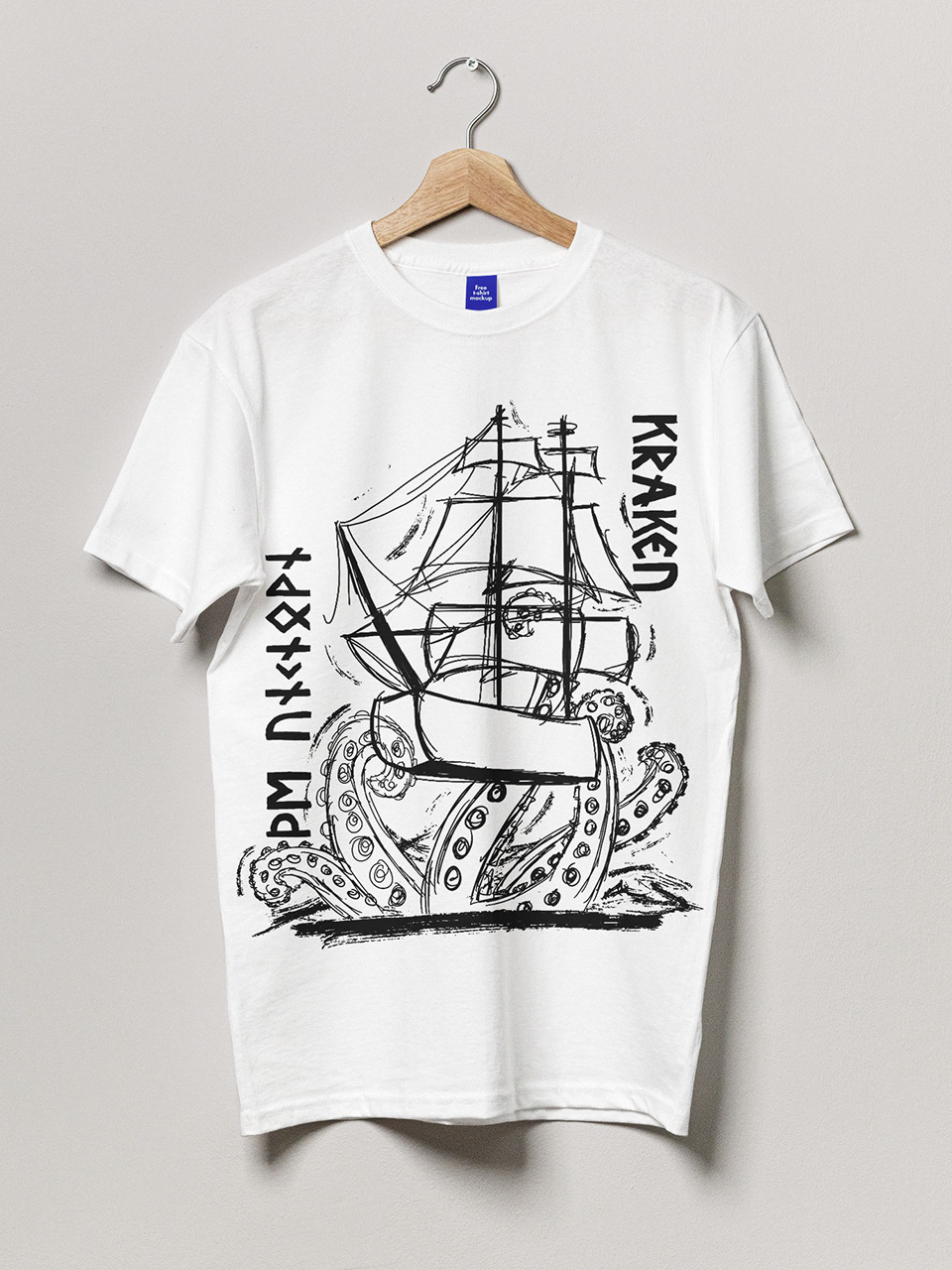
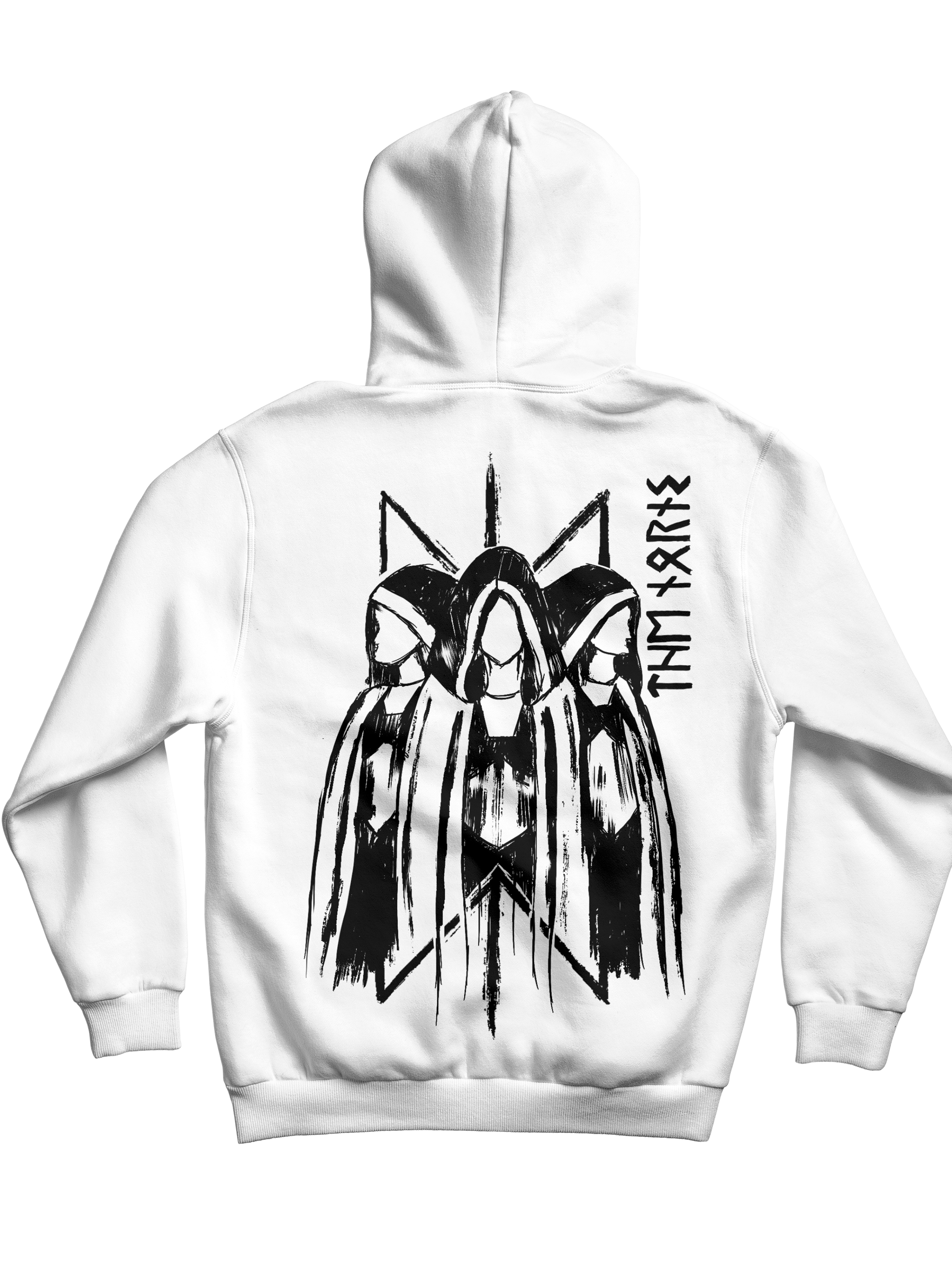
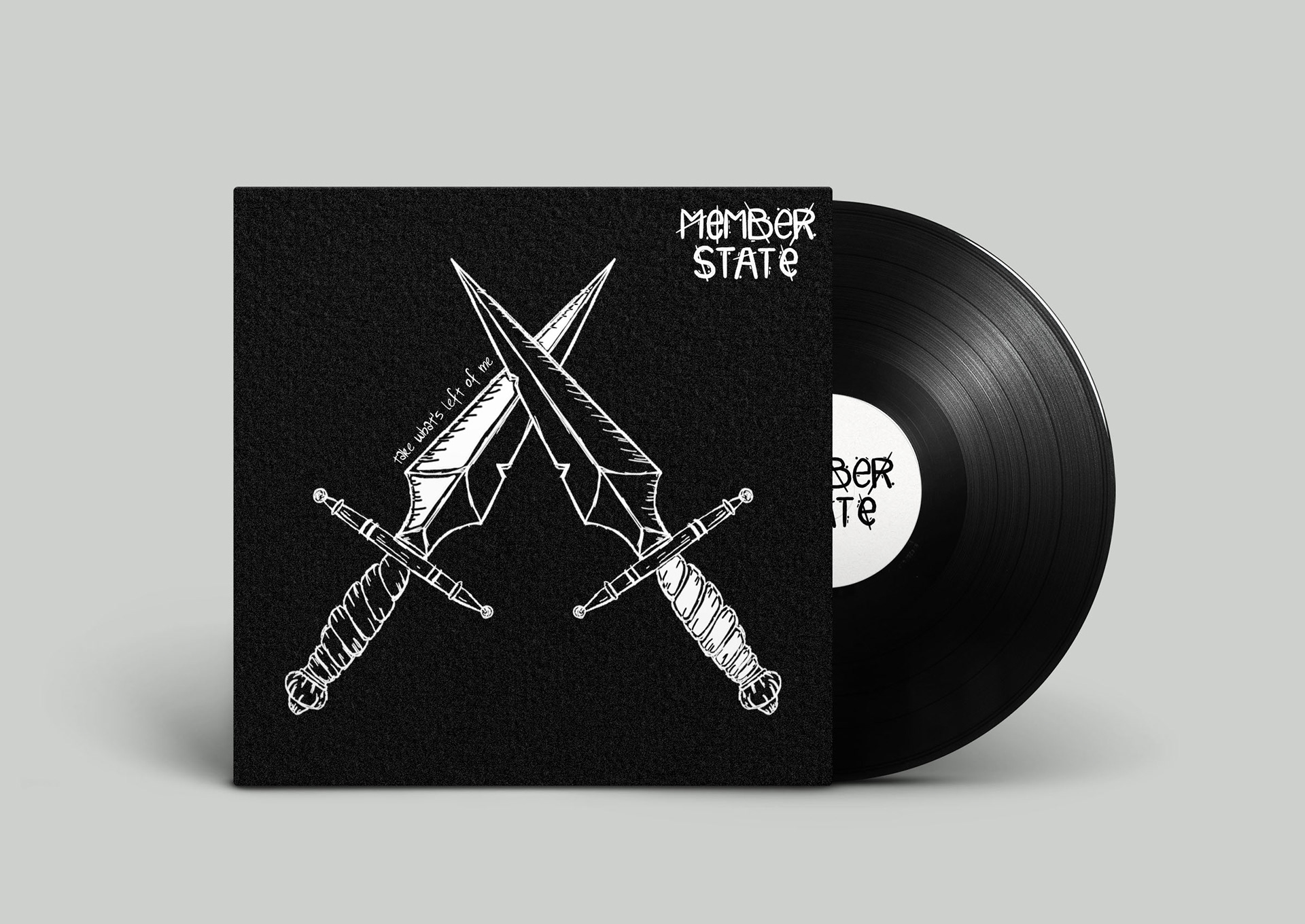
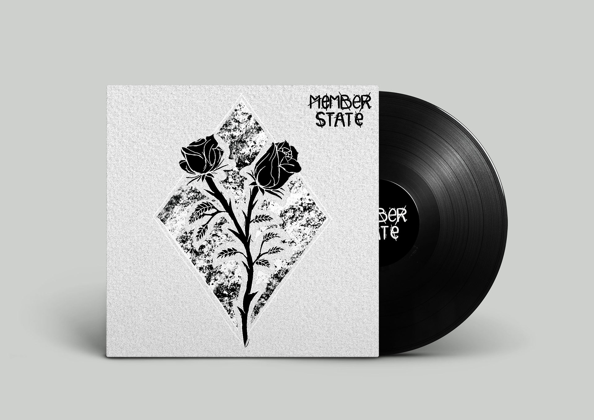
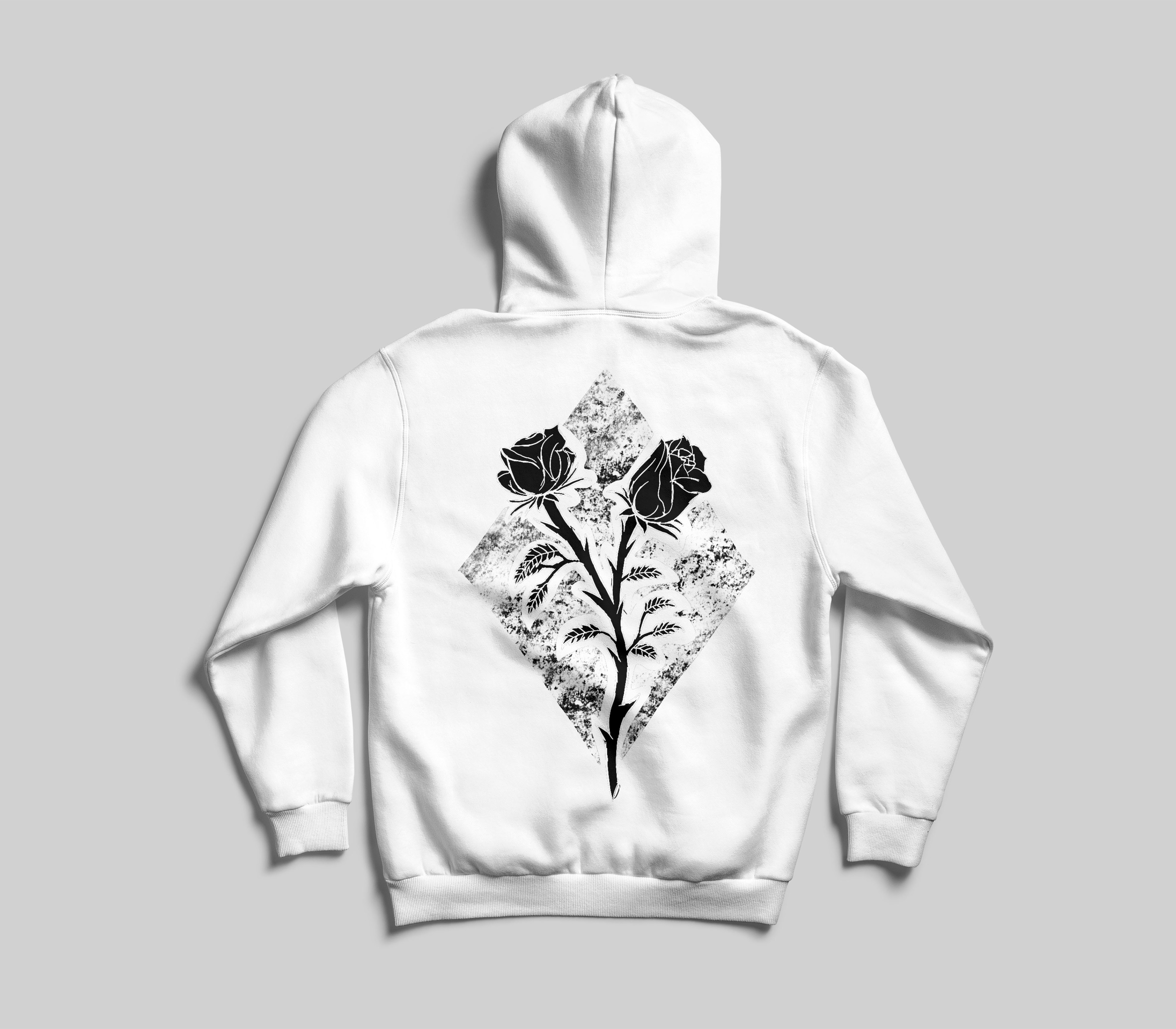
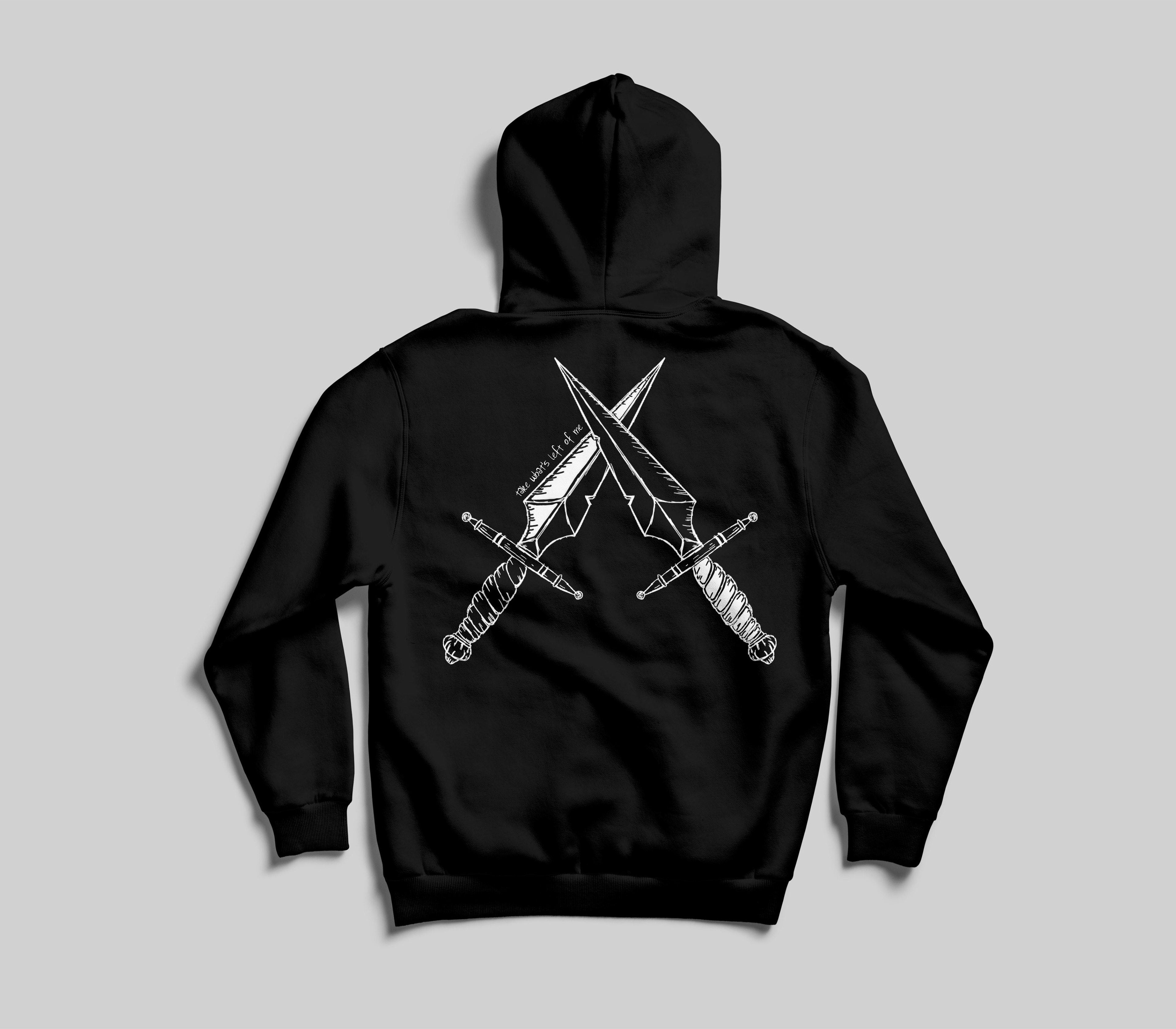
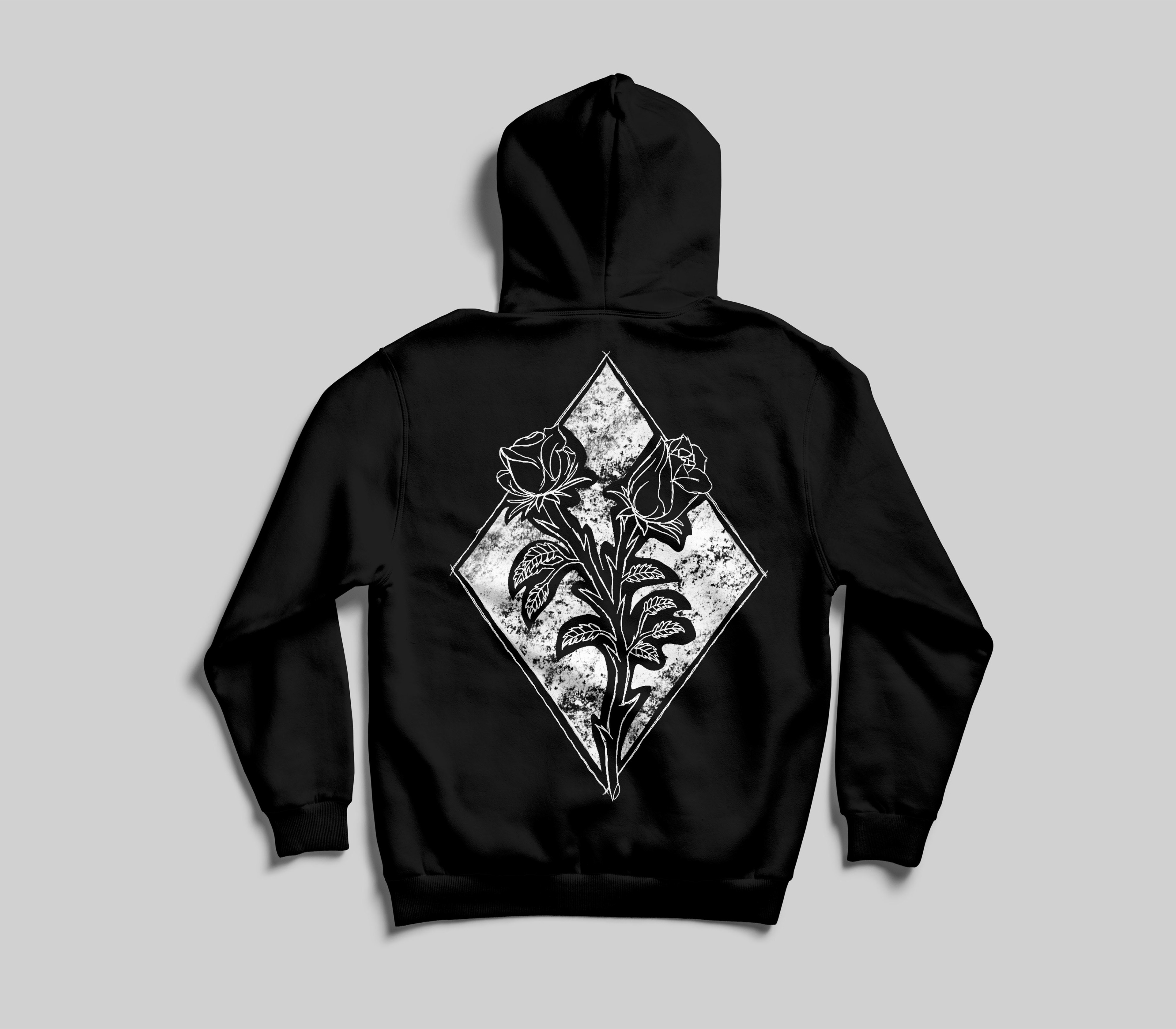
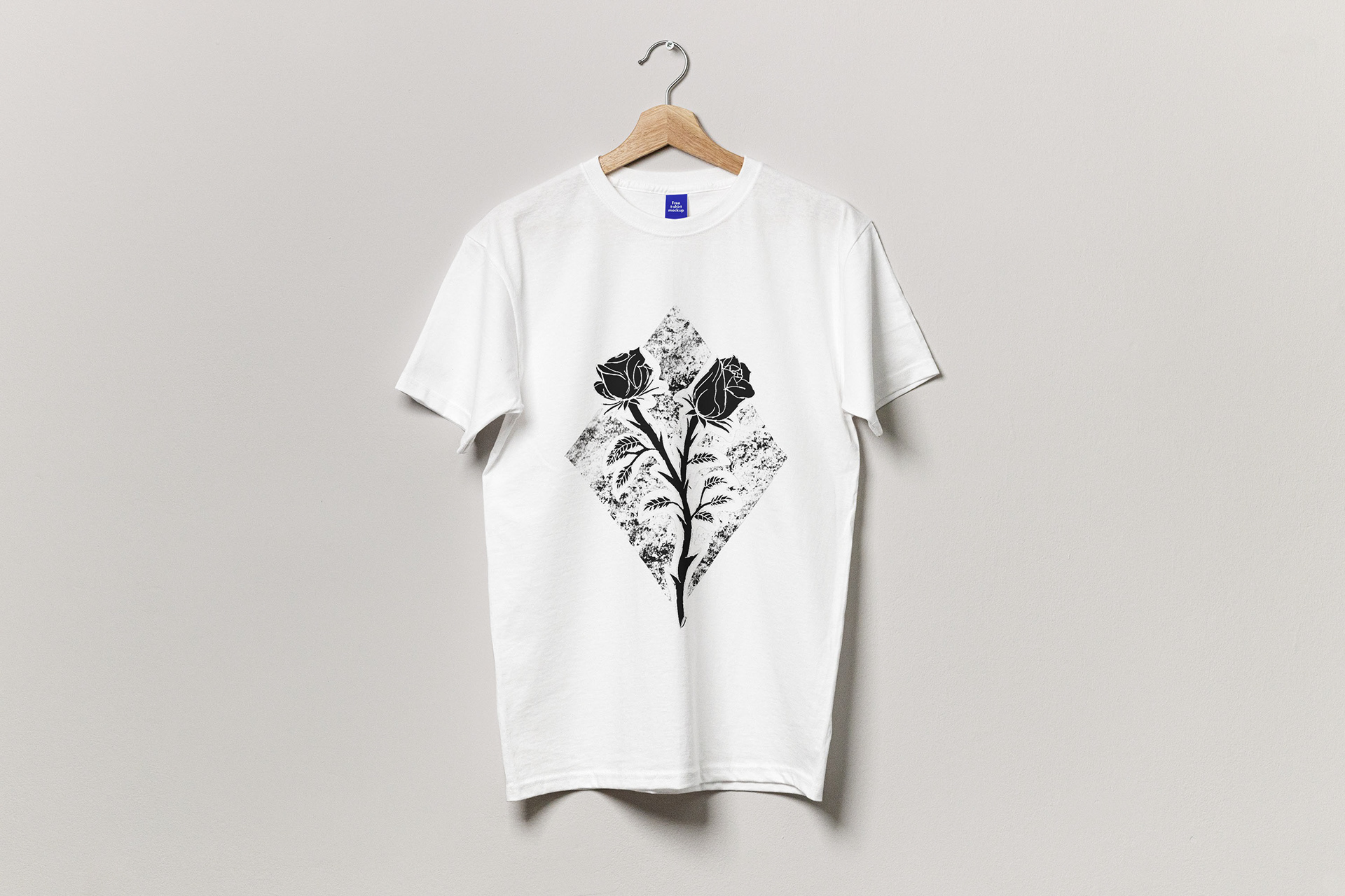
To initiate this phase of the design process, I began by creating album covers. Throughout the journey, I incorporated a range of illustrations, each inspired by the lyrics of specific songs provided by the client. My intention was to establish a distinctive style that could be consistently maintained with each subsequent single or album release. The key elements of this style were the black and white colour palette and the utilization of hand-drawn line illustrations.
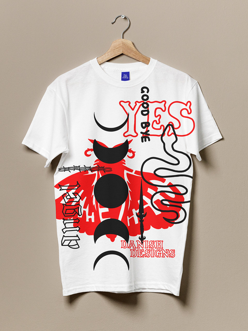
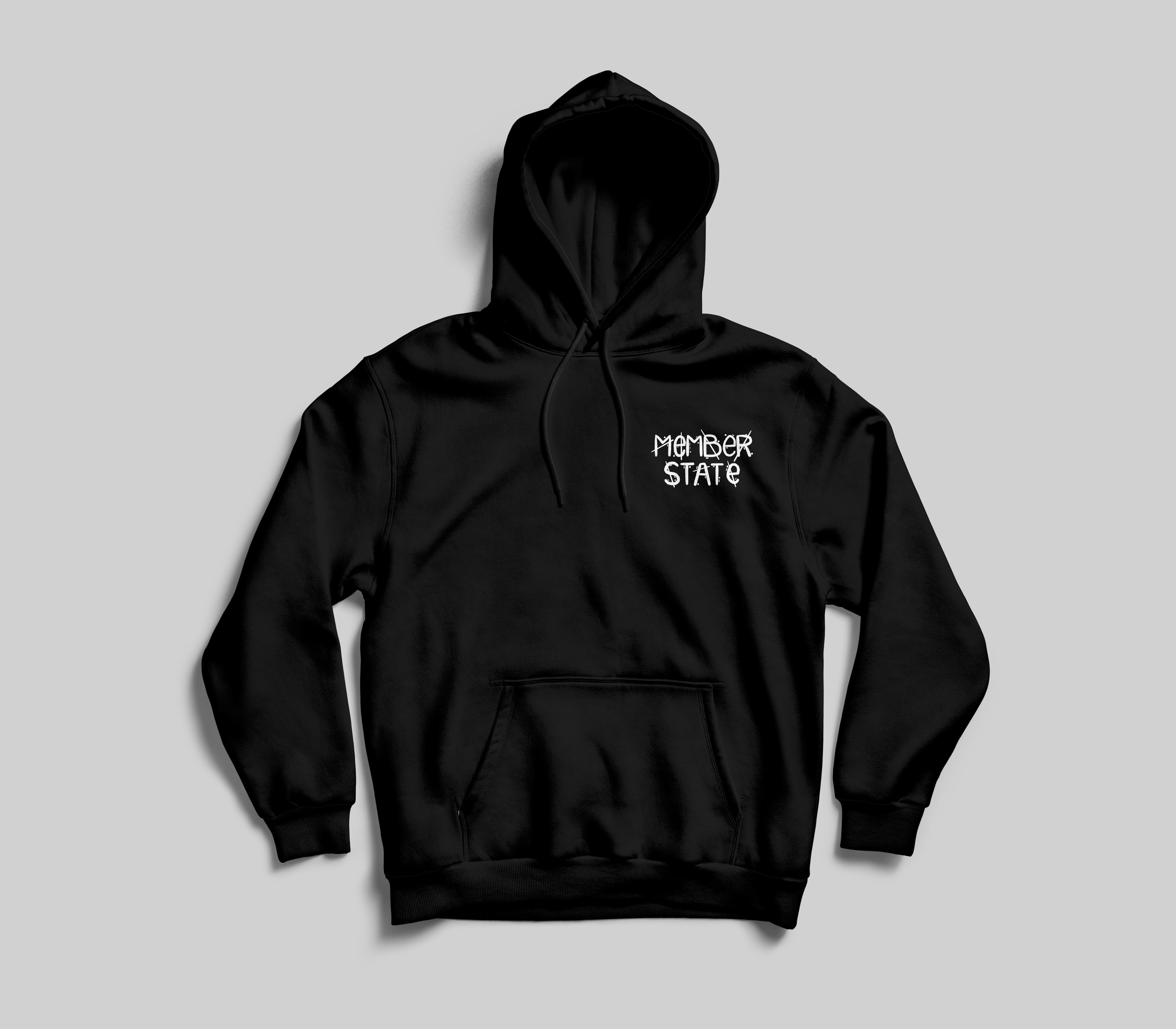
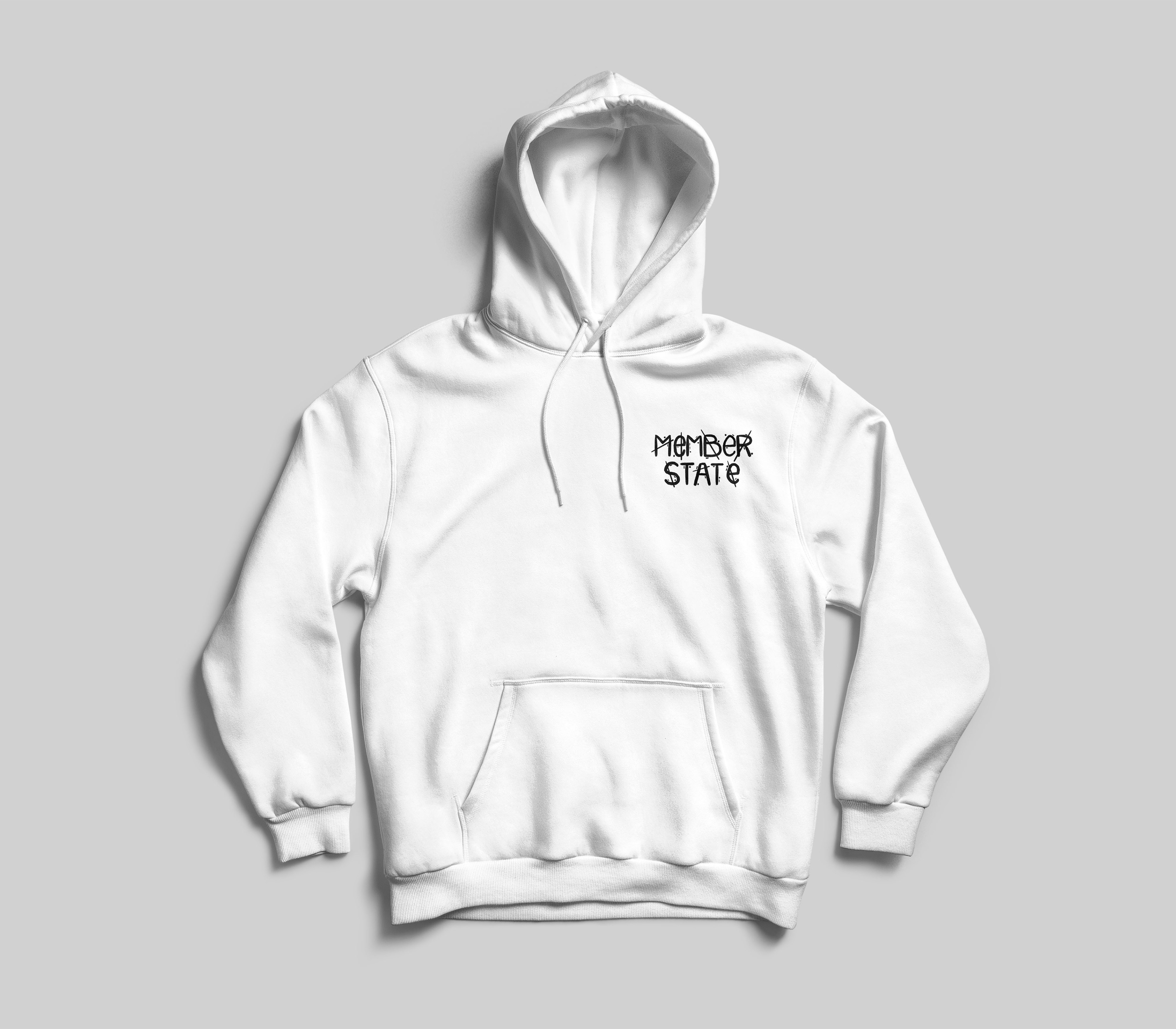
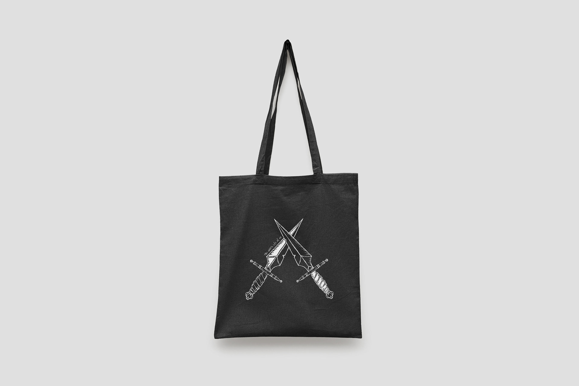
Following the completion of the album covers, my next undertaking was to design apparel items that would resonate with the alternative band's target audience. This encompassed a wide range of possibilities, including t-shirts, hoodies, and even bags – essentially anything that aligned with the band's style and would appeal to their fanbase. As previously mentioned, all the illustrations I created were inspired by the lyrics of the songs provided by the client. I integrated these illustrations into the apparel designs to establish a visual consistency throughout the project.
Throughout the process of design development, it became evident that the hoodies possessed the strongest visual impact compared to other product types. Both the client and I hold the hope that, in the future, these designs can be transformed into actual products that fans can enjoy.
Once I established a cohesive brand identity, my focus shifted towards building the client's social media presence and solidifying their brand identity. This process culminated in the creation of a concise brand style guide, which serves as a reference for future endeavors. Even if I do not continue to handle their design work, the style guide ensures that the brand maintains a consistent visual identity and remains aligned with its established aesthetic.
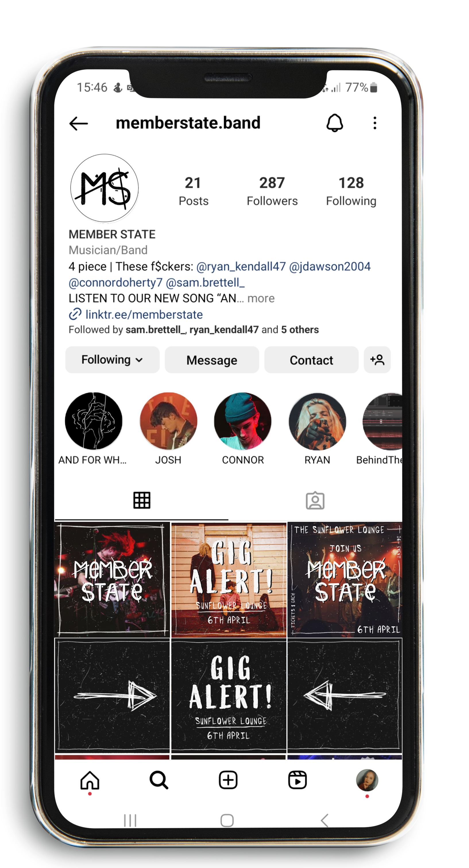
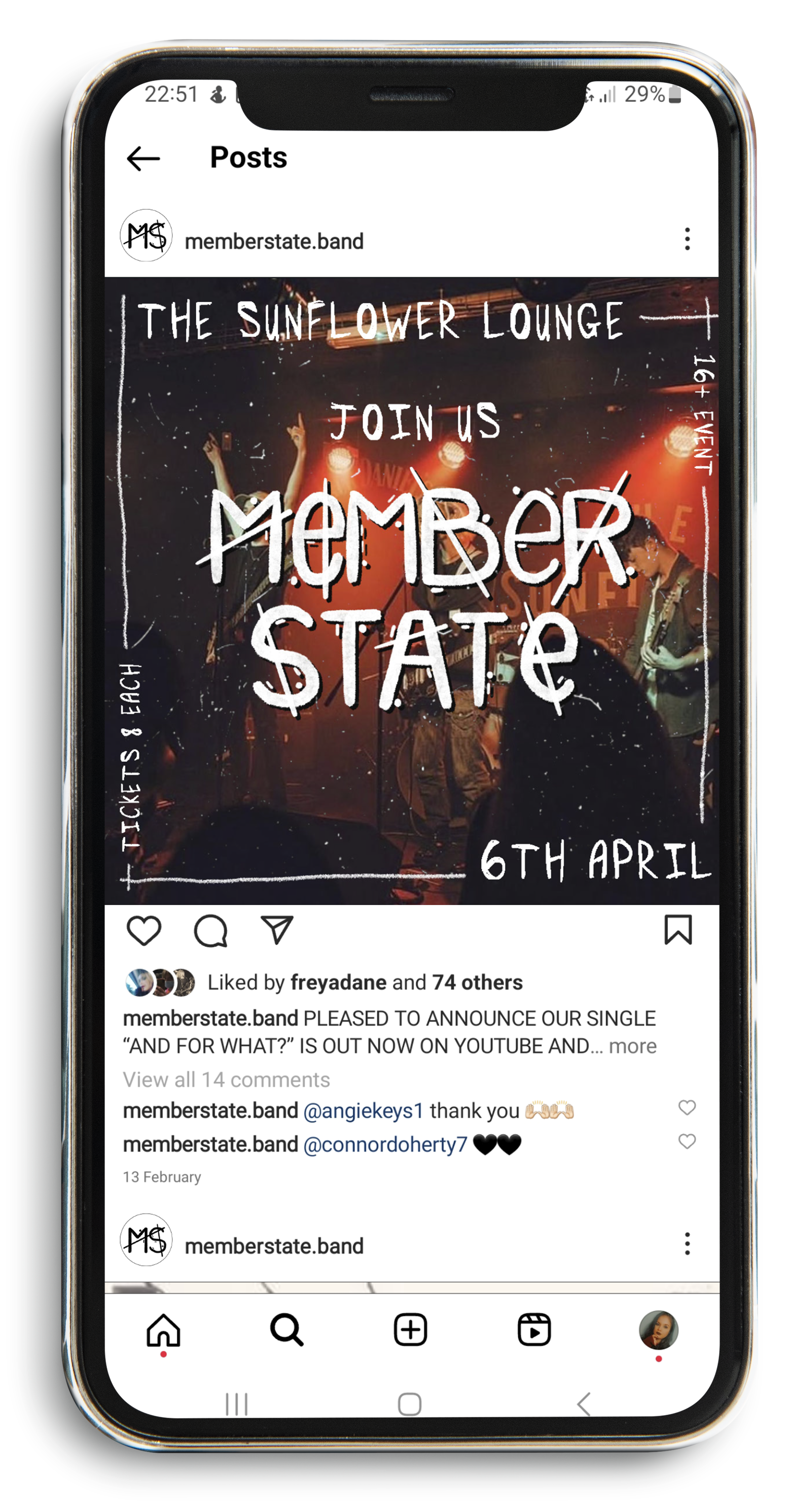
My aim was to provide this client with a complete visual identity, enabling them to gain a clearer understanding of how they can establish their brand and market themselves effectively in the future. A significant aspect that required improvement was their Instagram presence, which initially appeared disorganized and featured random images. After revamping it, the images now harmonize with each other, the page adheres to a specific colour scheme, and it has been rebranded to present a cleaner and more professional appearance.