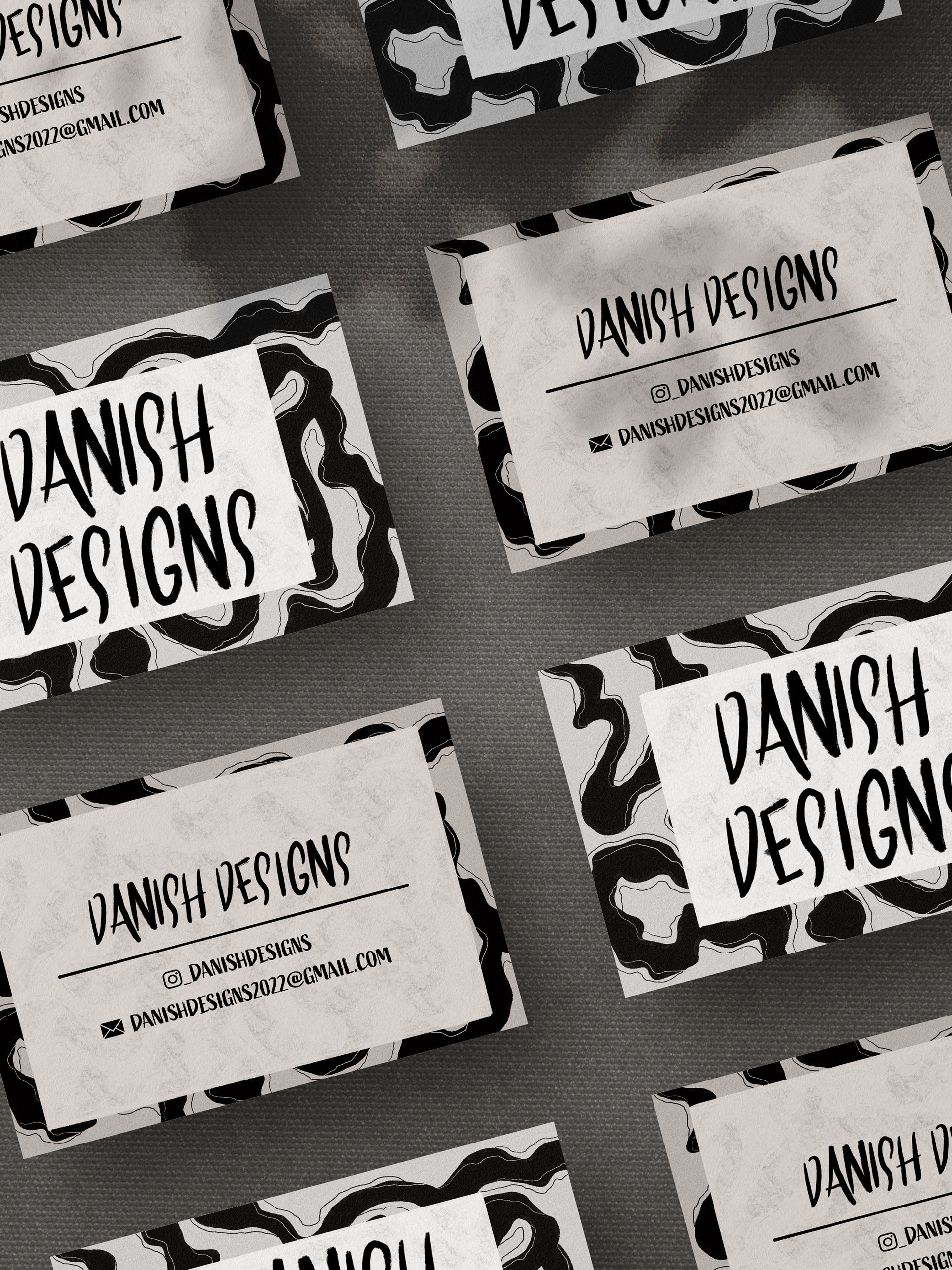
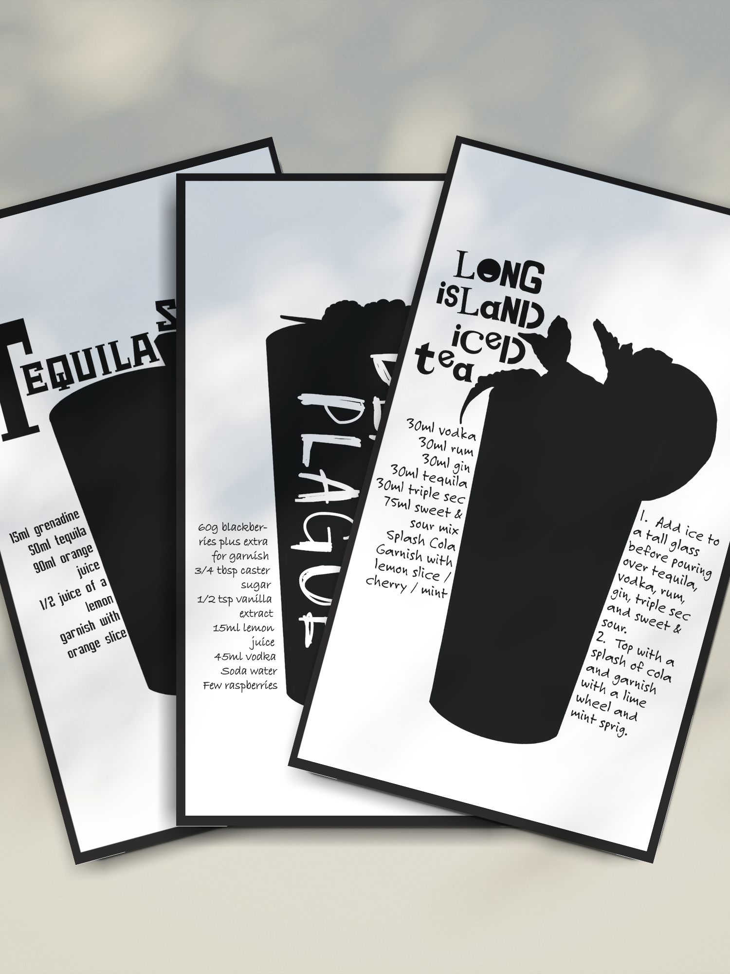
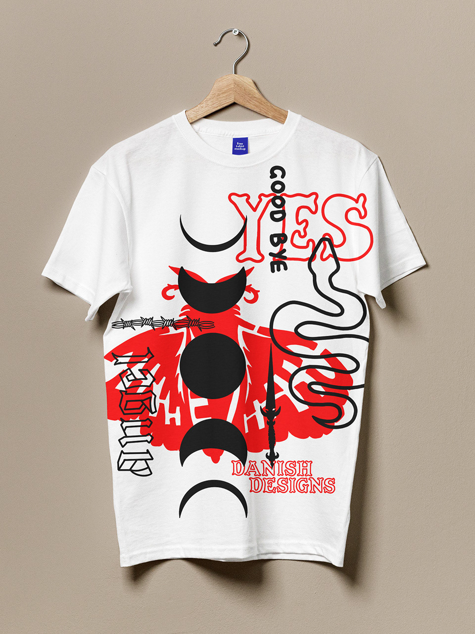
On the left is the client's previous branding. She approached me with a vision to refresh her existing identity to better reflect her personal style. The brief was as follows:
• Update the current branding
• Enhance typography for better harmony
• Maintain a similar colour palette
• Create a logo with a more illustrative style
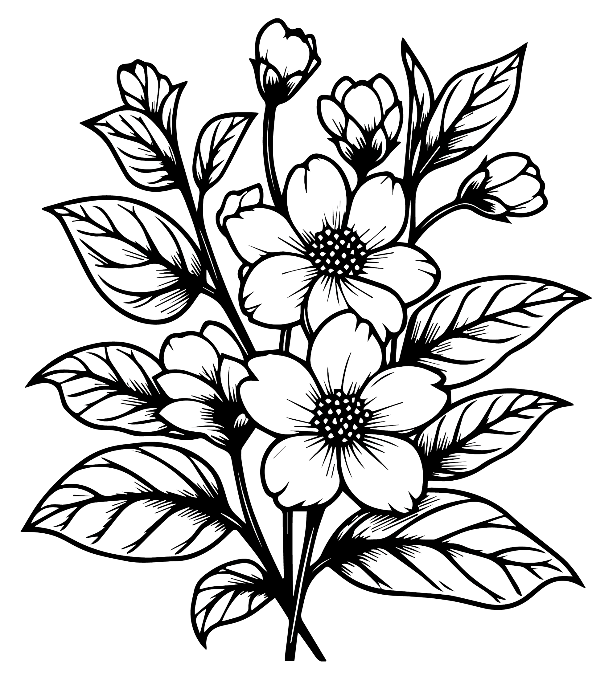
• Incorporate jasmine flowers into the logo
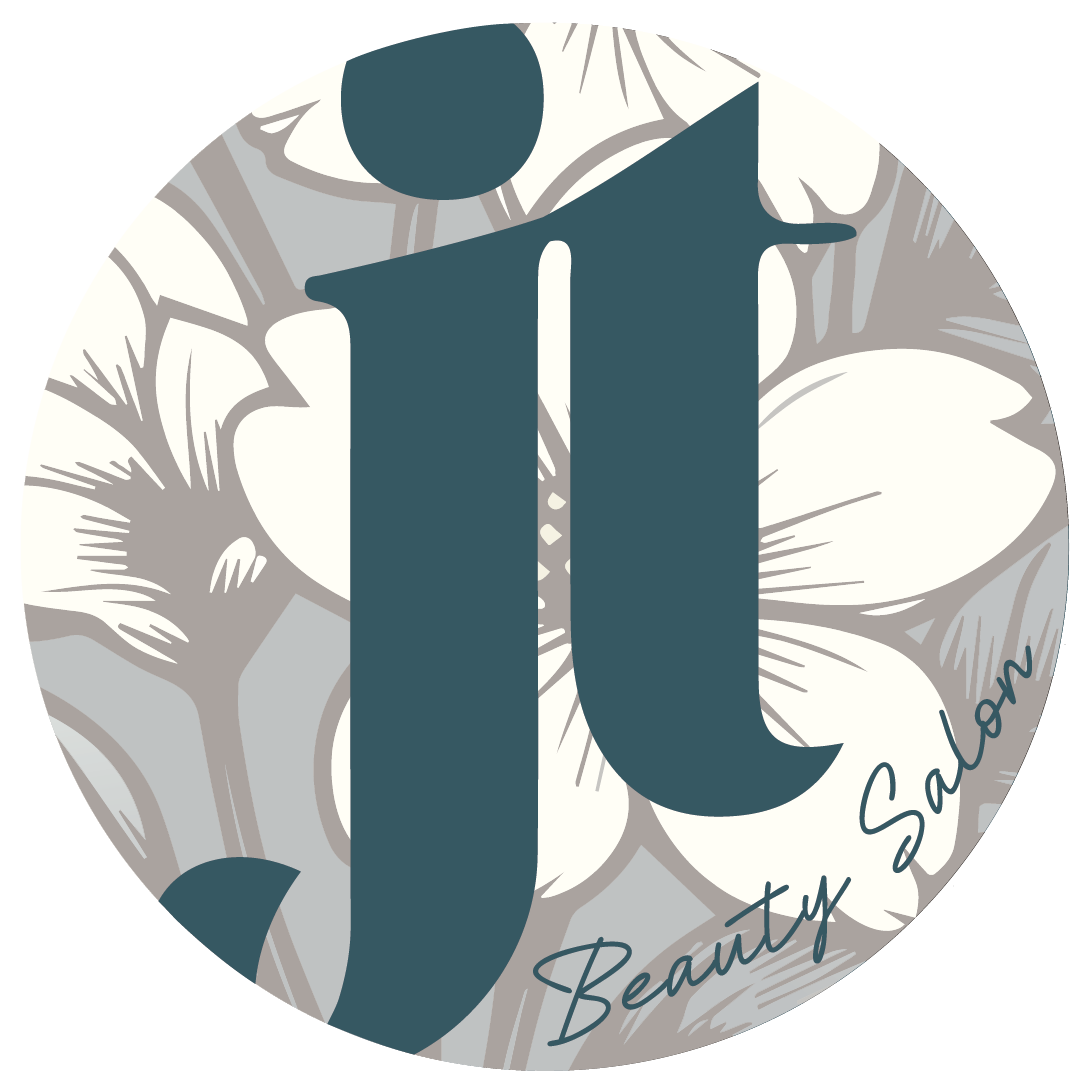
Here is the logo design I created for the client. The following images showcase the logo on both black and white backgrounds, demonstrating its versatility on simple colours before further development.
Below is the finalised logo in its intended use. This includes the client-requested illustrative version, along with simplified typographic designs suitable for smaller-scale applications.




Additionally, I provided the client with each individual illustrative logo element separately (such as the flowers), allowing them to use these elements in social media or print marketing to help create a cohesive visual identity.
The client requested a more harmonious font pairing compared to her original selection. After a few discussions, it became clear that she wanted the main font to be bold yet elegant, paired with a secondary font that was handwritten and delicate. This is the combination I ultimately selected for her.
As outlined in the project brief, the client wanted to retain the essence of her original colour theme. To align with this, I created a refined palette that stayed true to her existing style while introducing contrasting elements to make the branding truly stand out.
As always, I provided the client with the hex codes for their color palette, ensuring they can easily replicate the exact shades for future use.
Social media plays a crucial role in promoting businesses today, especially for small businesses trying to connect with a specific audience. For my client, a nail artist, it was important to create a branding strategy that would resonate with her target audience. To start, I designed a collection of profile circles tailored for various social media platforms.
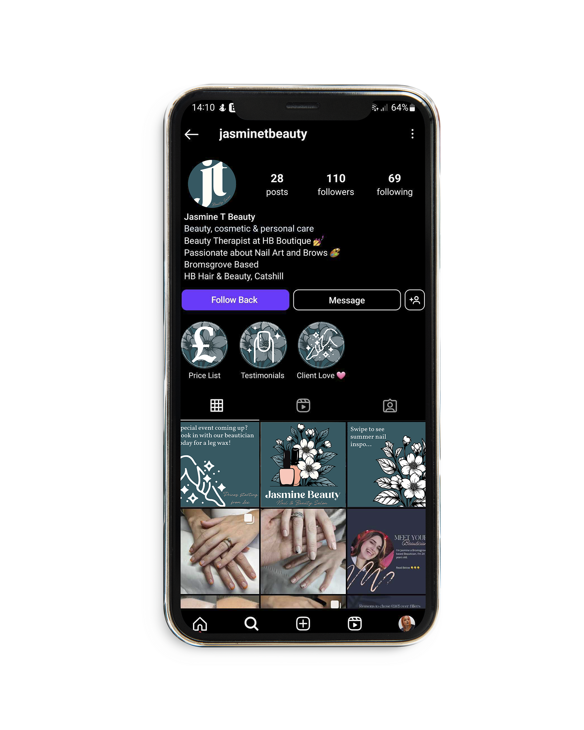
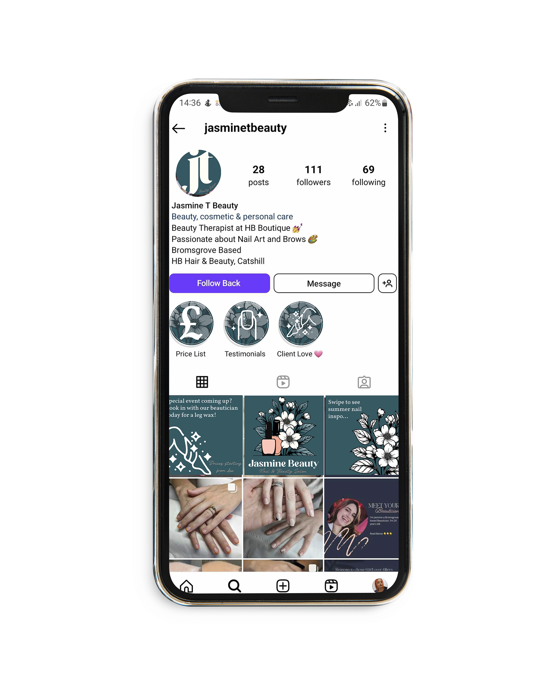
In addition to the profile circles, I created Instagram Story highlights to give her page a more cohesive look. These icons were designed to clearly represent each treatment, as the small size of the story bubbles doesn't leave much room for text. This simple yet effective design approach helps her audience easily navigate her services.
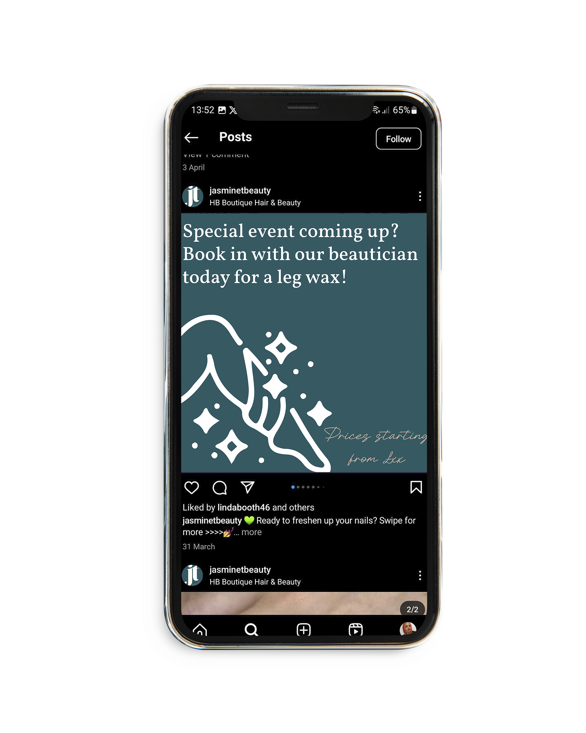
Lastly, I developed a few social media templates to give my client a framework on which to build. These templates provide her with the tools needed to elevate her online presence and maintain consistency across her platforms, all while using the design elements we’ve created to enhance her visual identity.

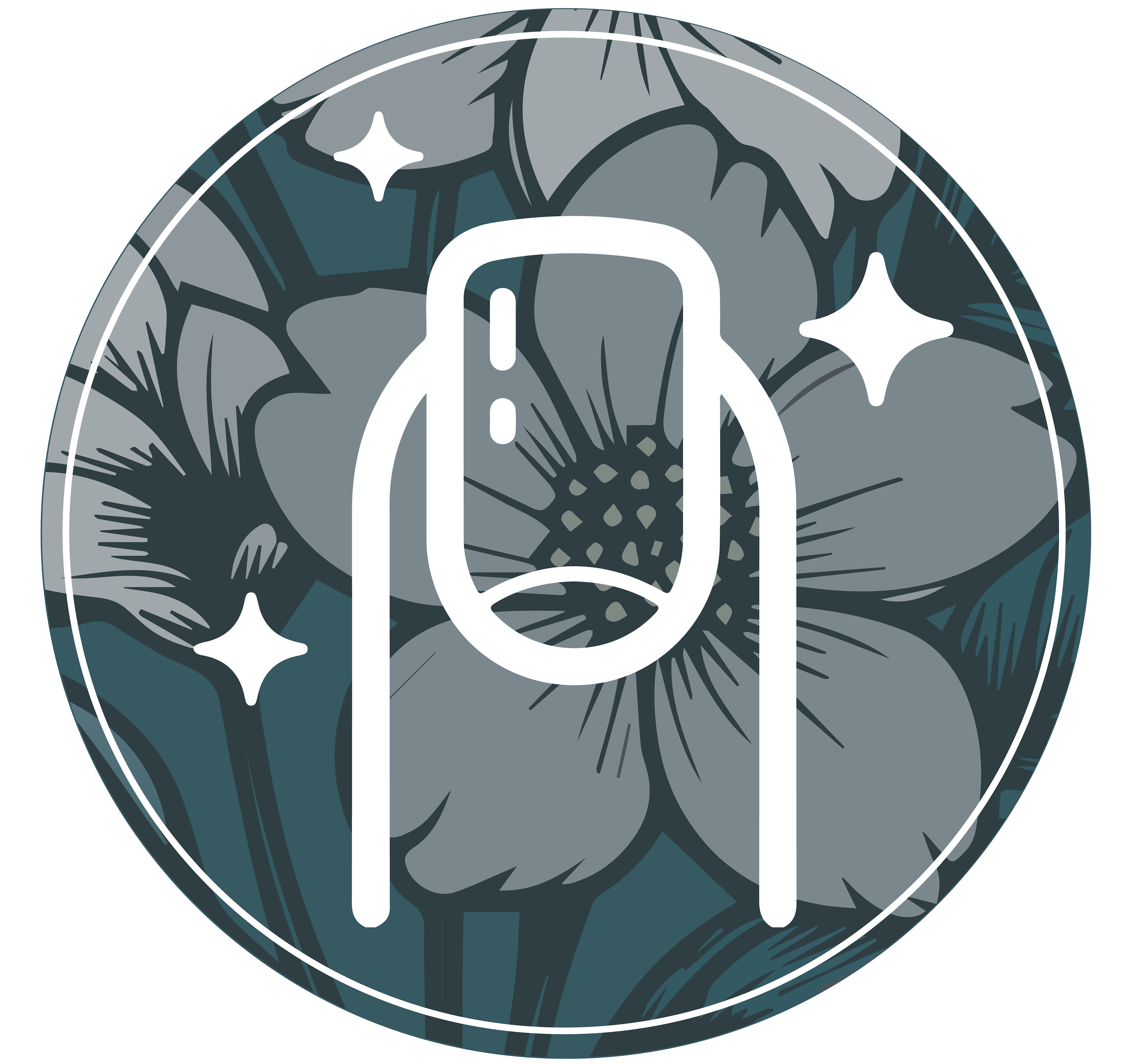
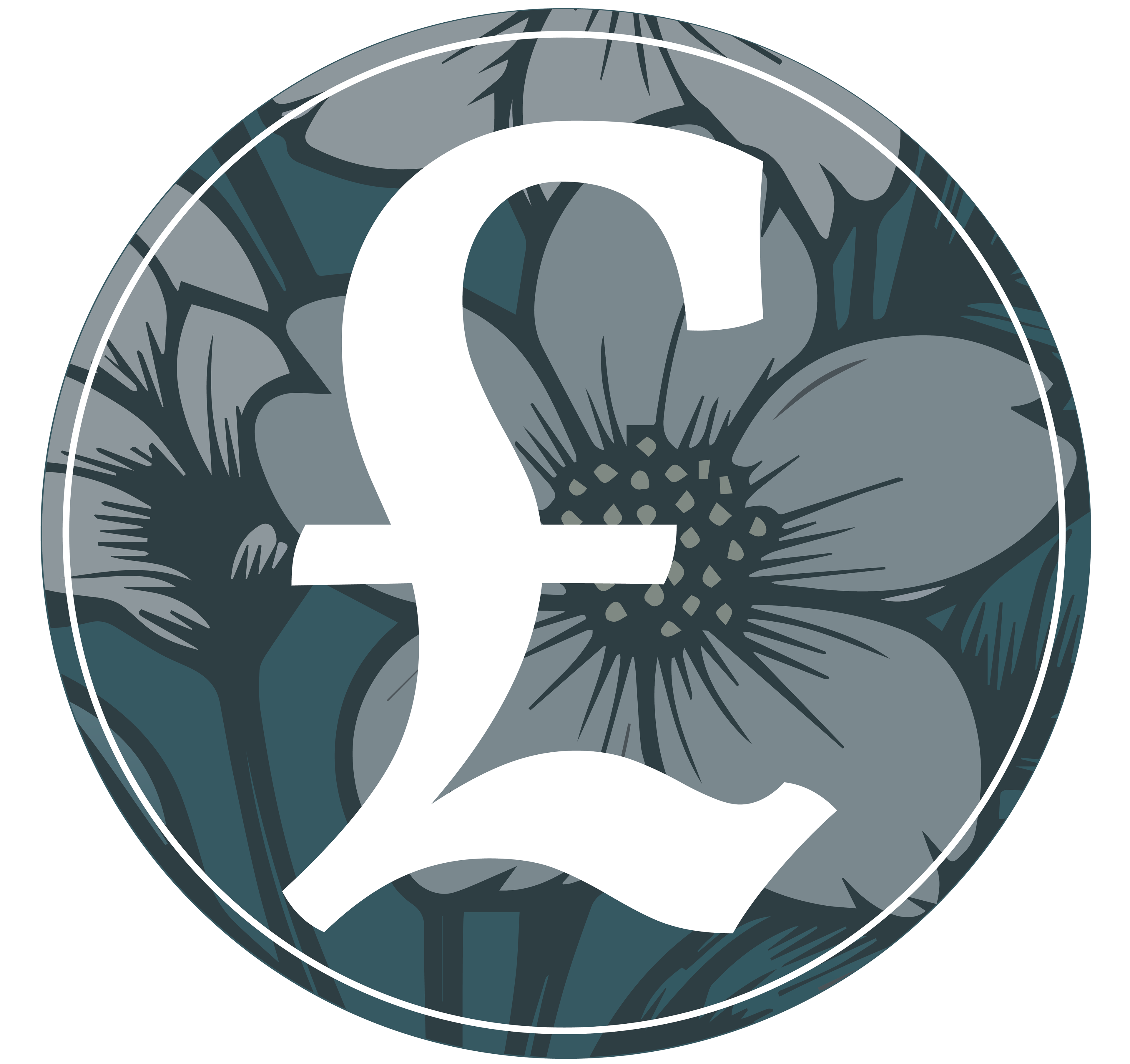
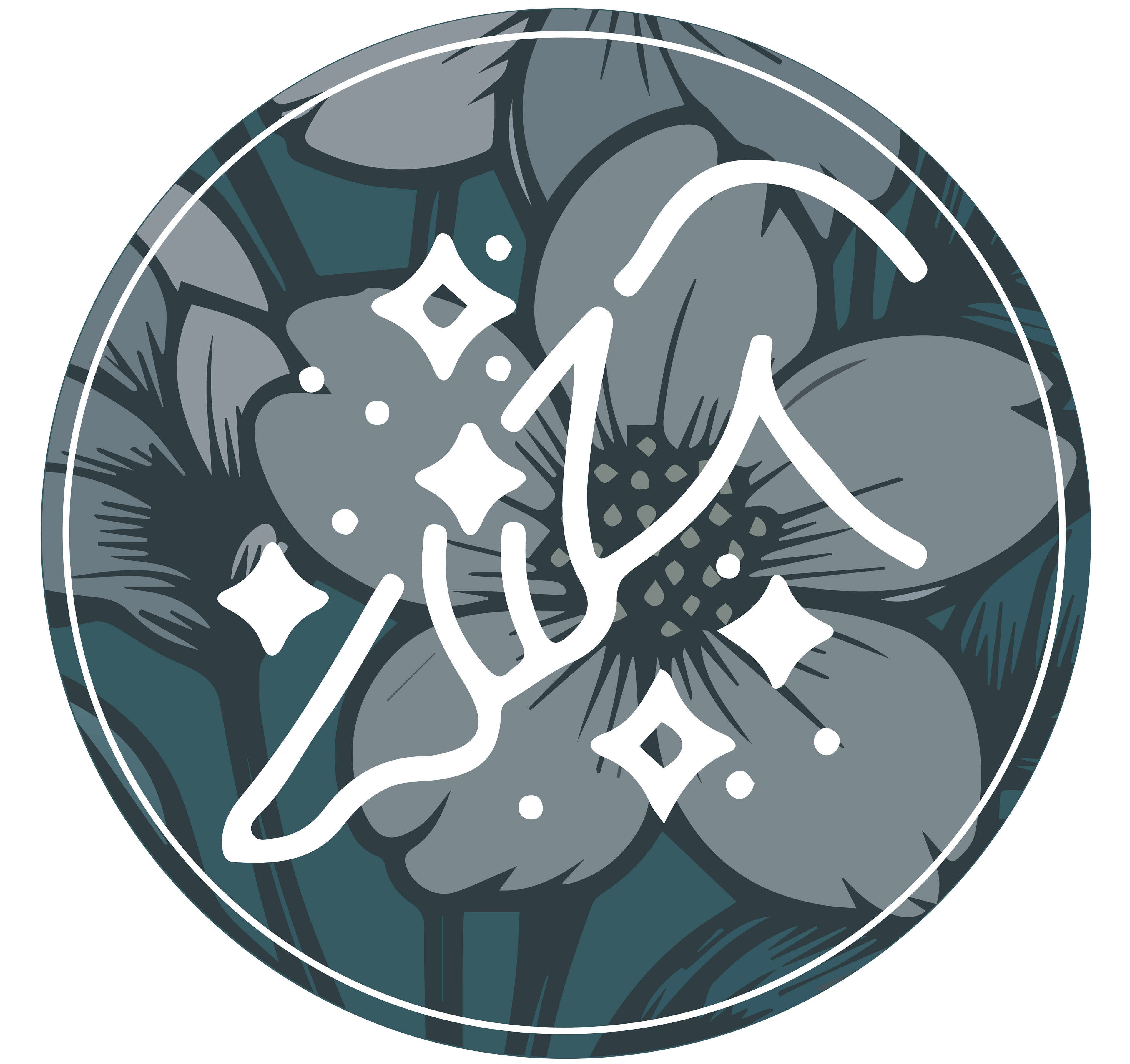
These are the Instagram highlight bubbles, examples for:
Nail work, price list, and waxing.
On the right, you can see all the icons I created for these highlight bubbles.
They vary slightly, but we wanted to try to stay within the same illustrative style, keeping it simple for the small scale.






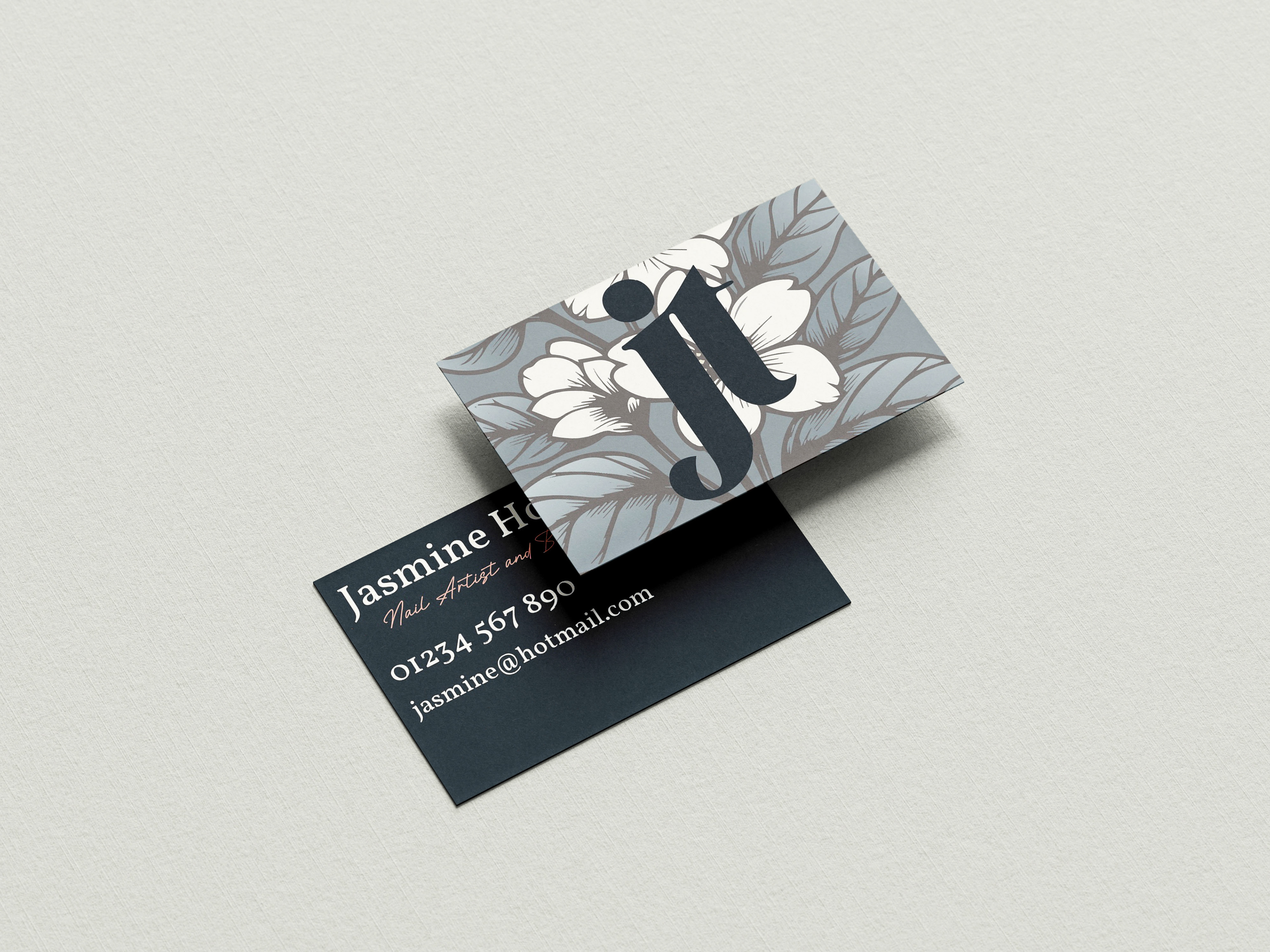
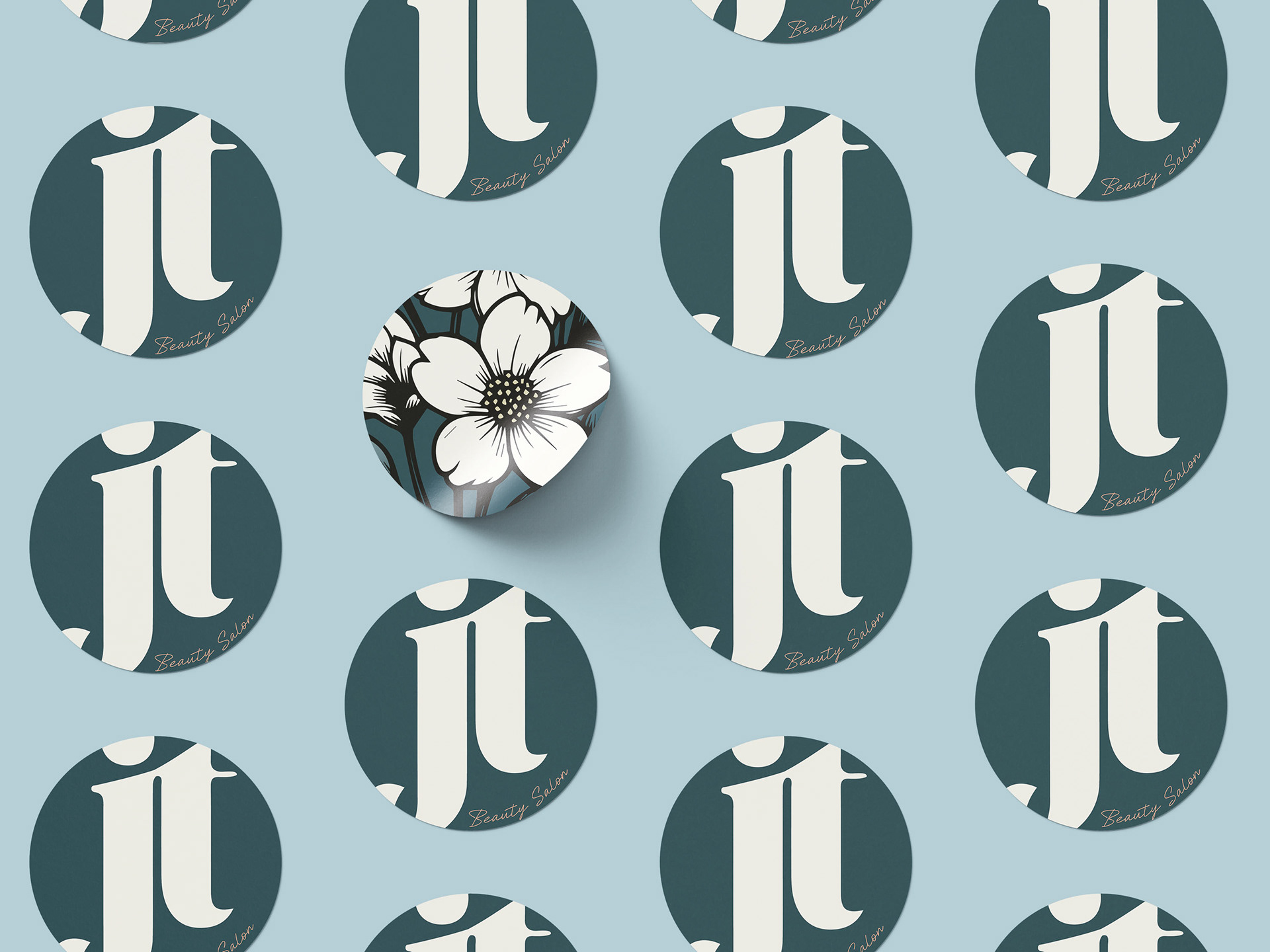
Taking a more traditional approach to brand promotion, I also designed business cards and stickers for my client. These tactile elements serve as a great way to connect in person and leave a lasting impression. The business cards are designed to be memorable and professional, while the stickers add a fun, playful touch that can help reinforce her brand identity in the physical world.
