While at university, I stumbled upon the art of screen printing. Immediately intrigued, I made it a personal mission to delve deeper into the intricacies of the process and explore how I could incorporate it into my projects. In the second year, as part of an entrepreneurial project, our group was tasked with creating sellable items online through Redbubble.
Fortunately, around the same time, our university hosted an illustration festival. Recognising an opportunity, I decided to elevate the project and venture into selling screen-printed items, with a particular interest in printing on clothing.
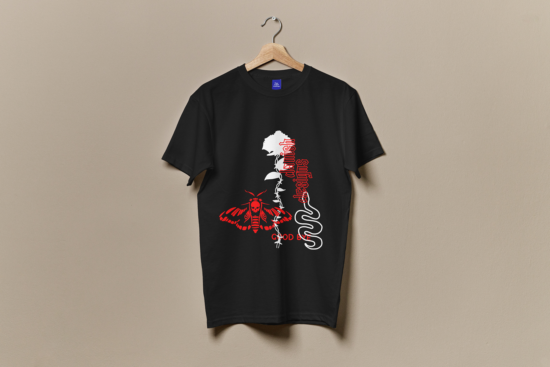
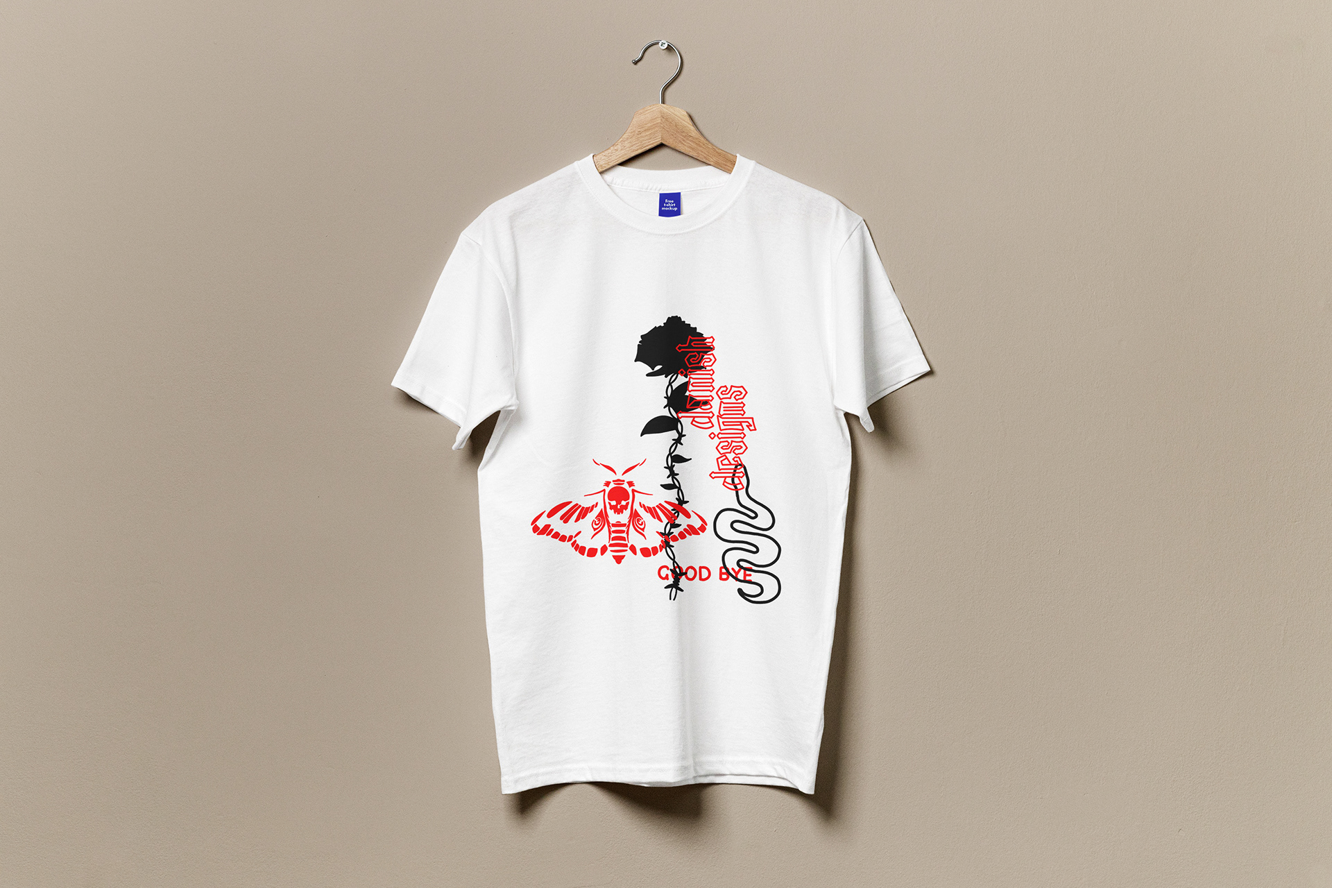
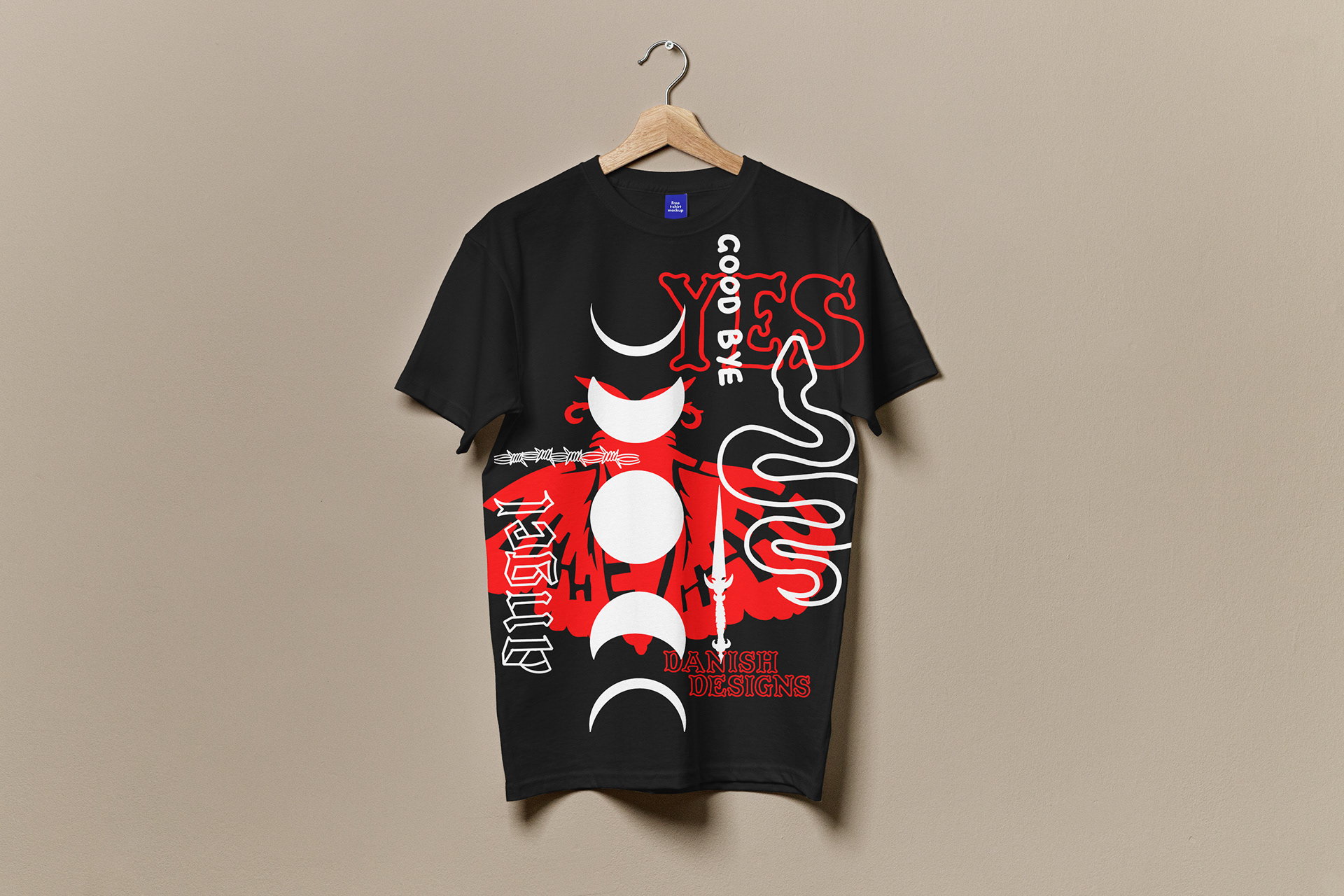
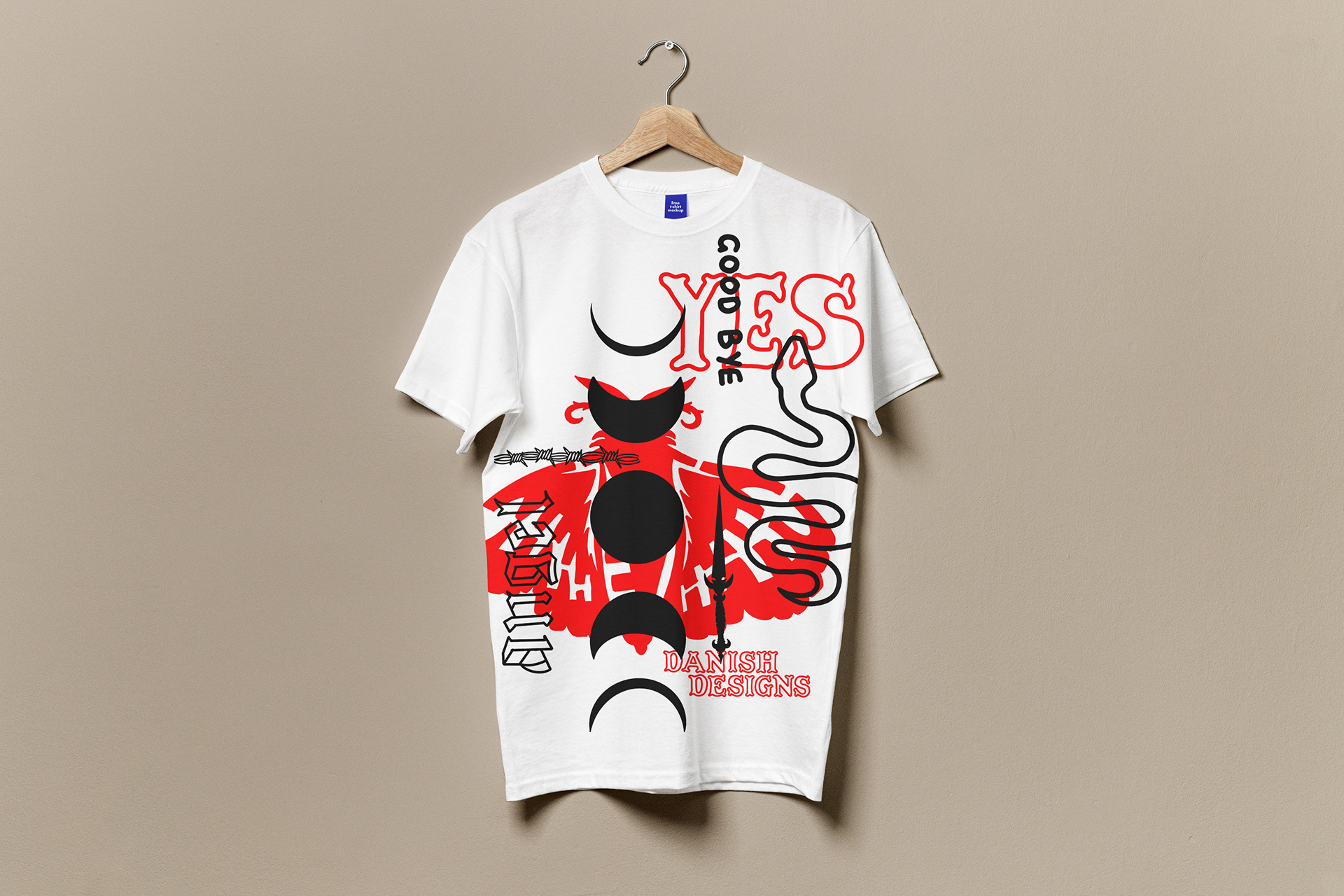
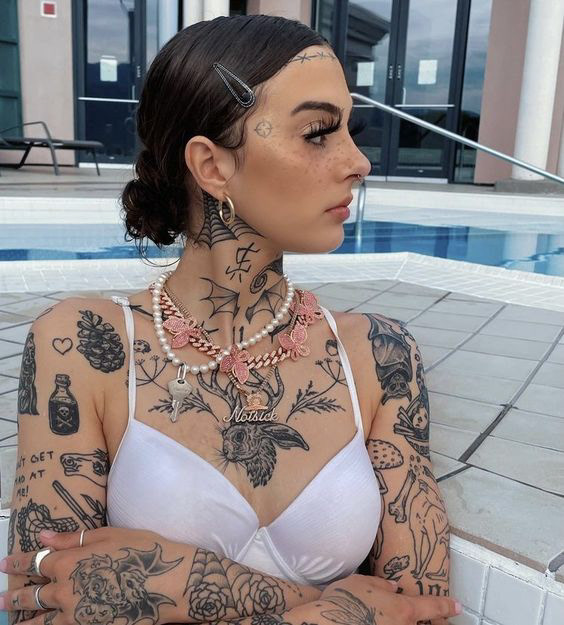
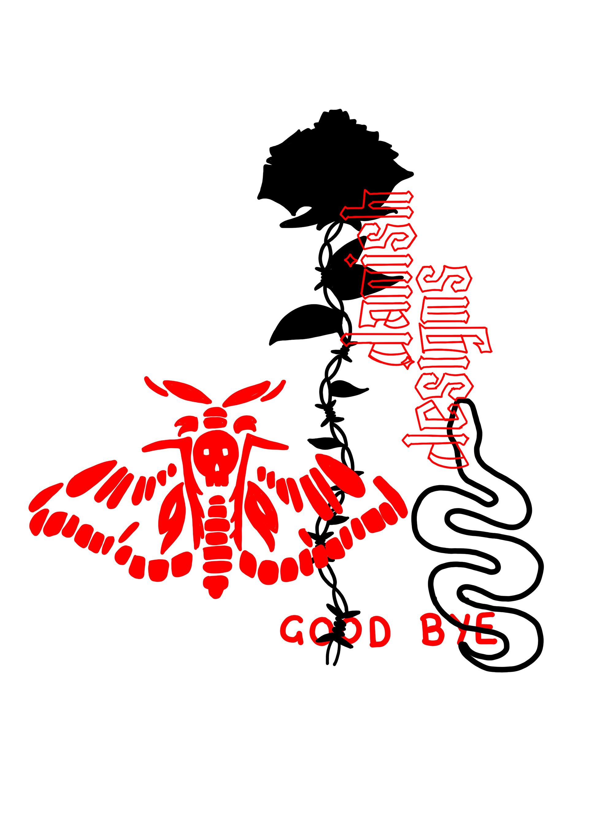
This marked the first occasion where we enjoyed complete creative freedom. Eager to infuse the project with my design preferences and aesthetic, I immediately began sketching out designs inspired by the 'patchwork tattoo' aesthetic, as seen in the inspiration images below.

Drawing inspiration from the images above, I crafted my own sketches, which are showcased below.

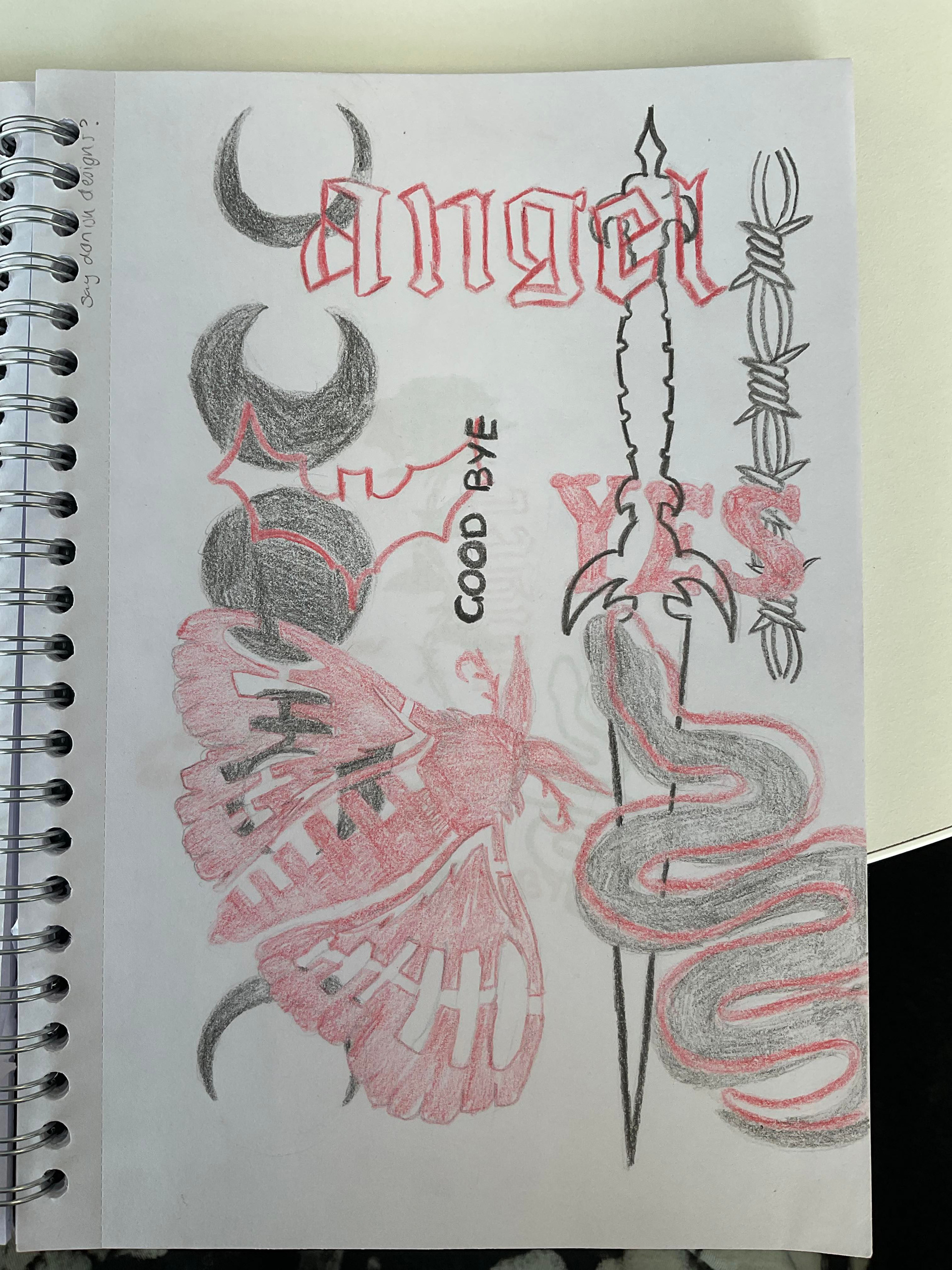
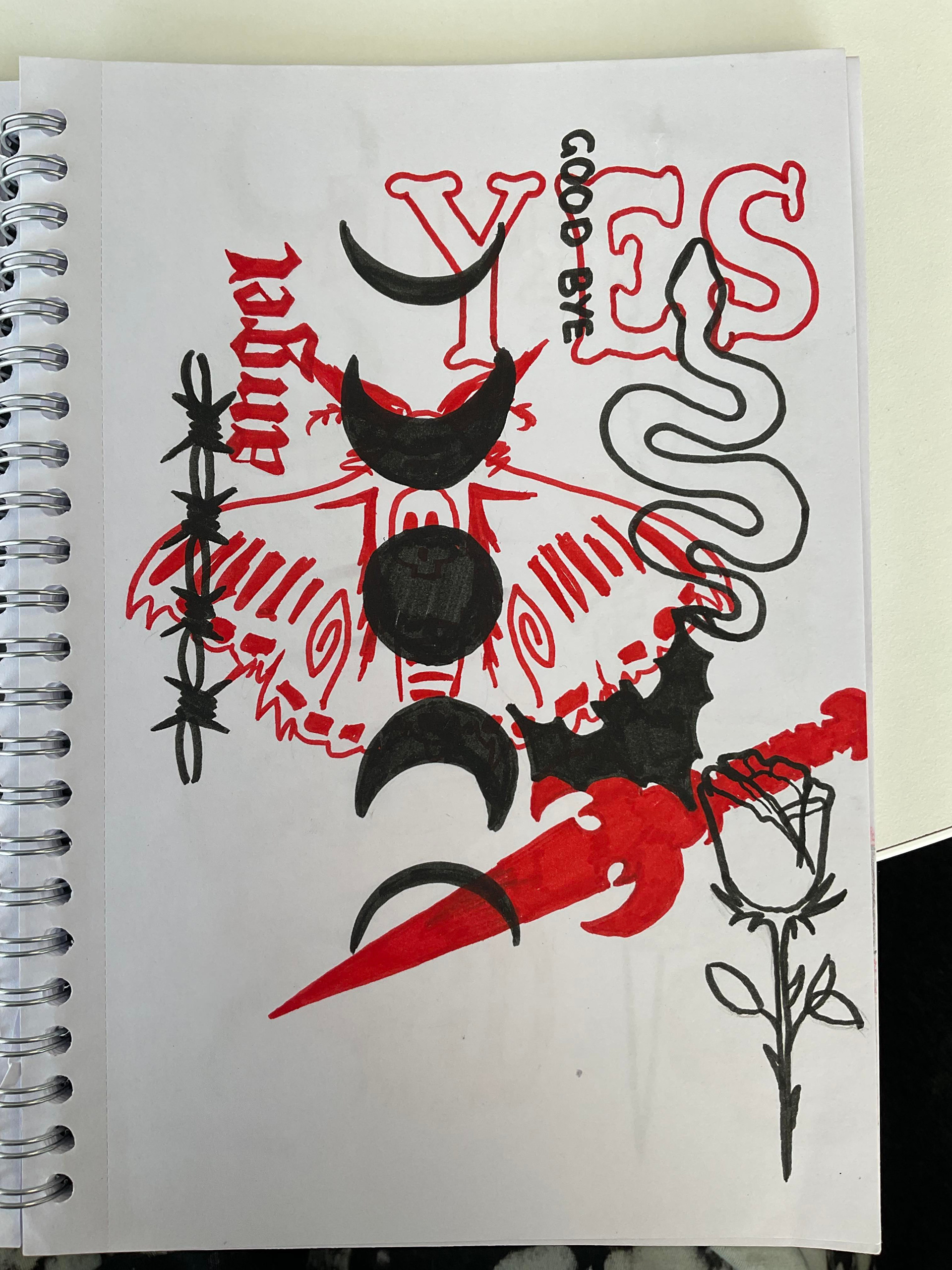
In these sketches, you can observe my exploration of a layering effect utilising bold black and red shapes, coupled with typography. It was crucial to me that the type incorporated either a traditional tattoo style or an Ouija board aesthetic, aligning with the chosen illustration style.
Transitioning from these initial sketches, I ventured into digital development, refining and cleaning up the illustrations. To maintain flexibility in arranging the elements, I opted to draw each component on a separate layer. This approach allowed me to easily modify their order and placement without the need to redraw the entire concept, ensuring a more efficient design process.
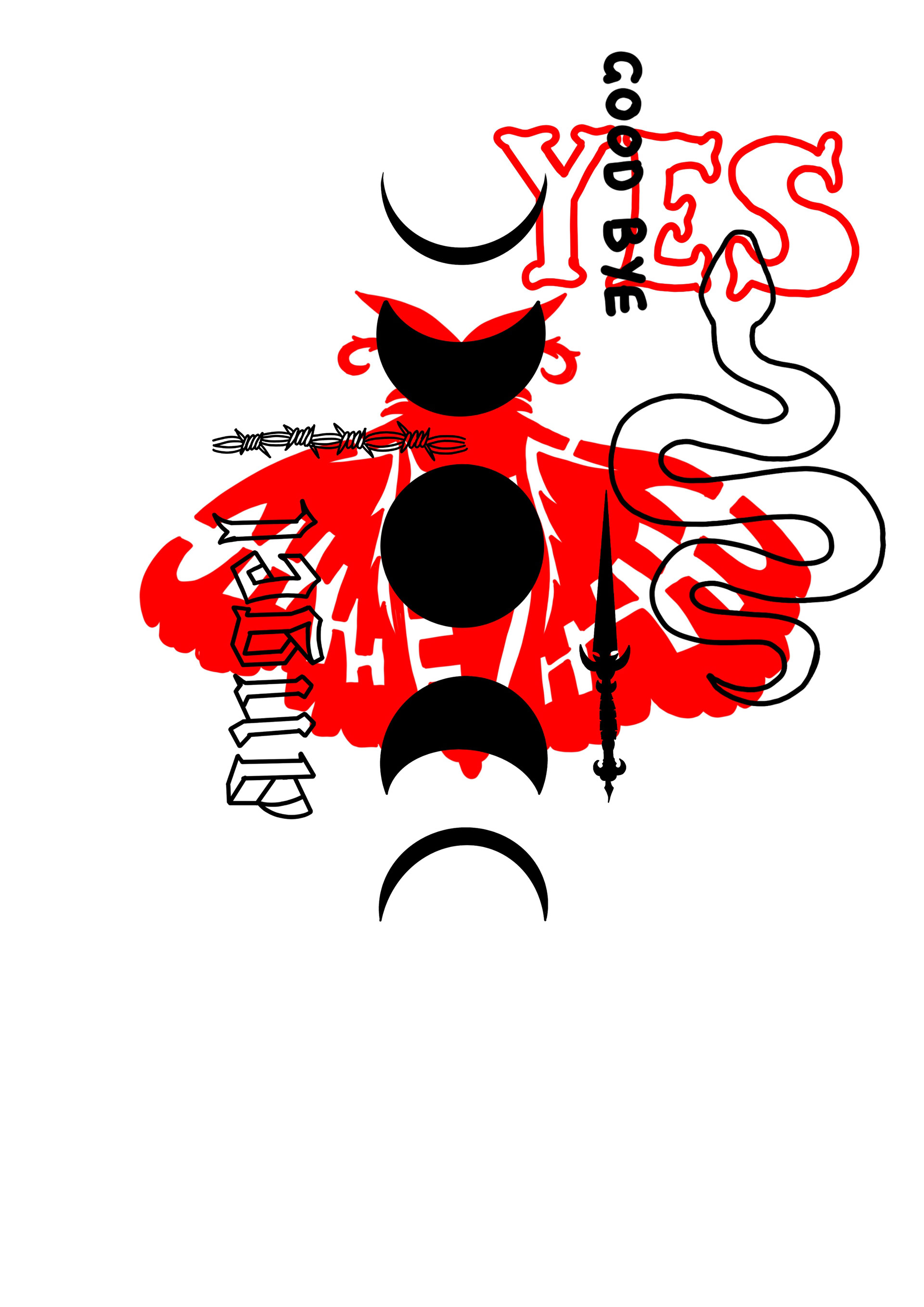
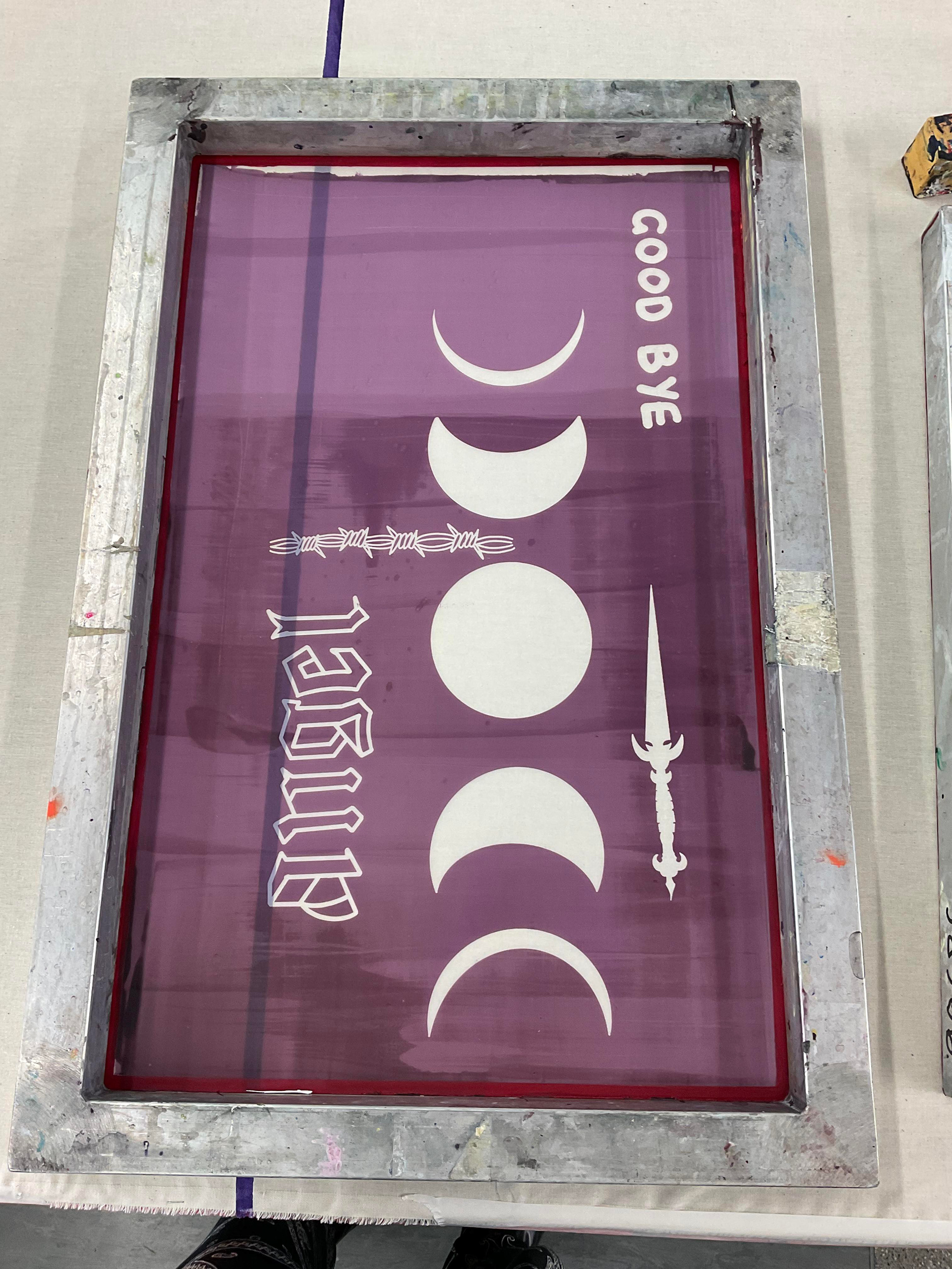

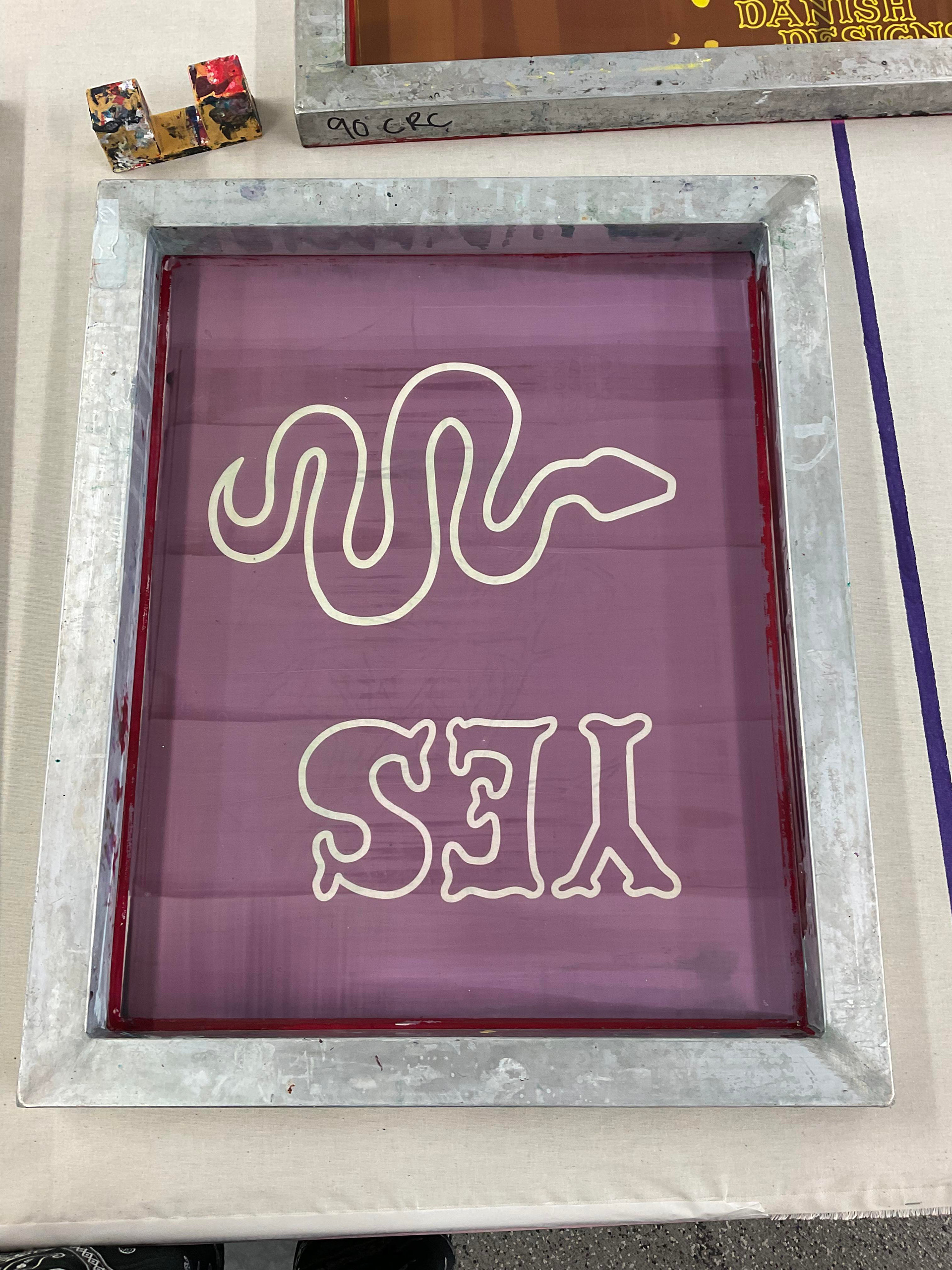
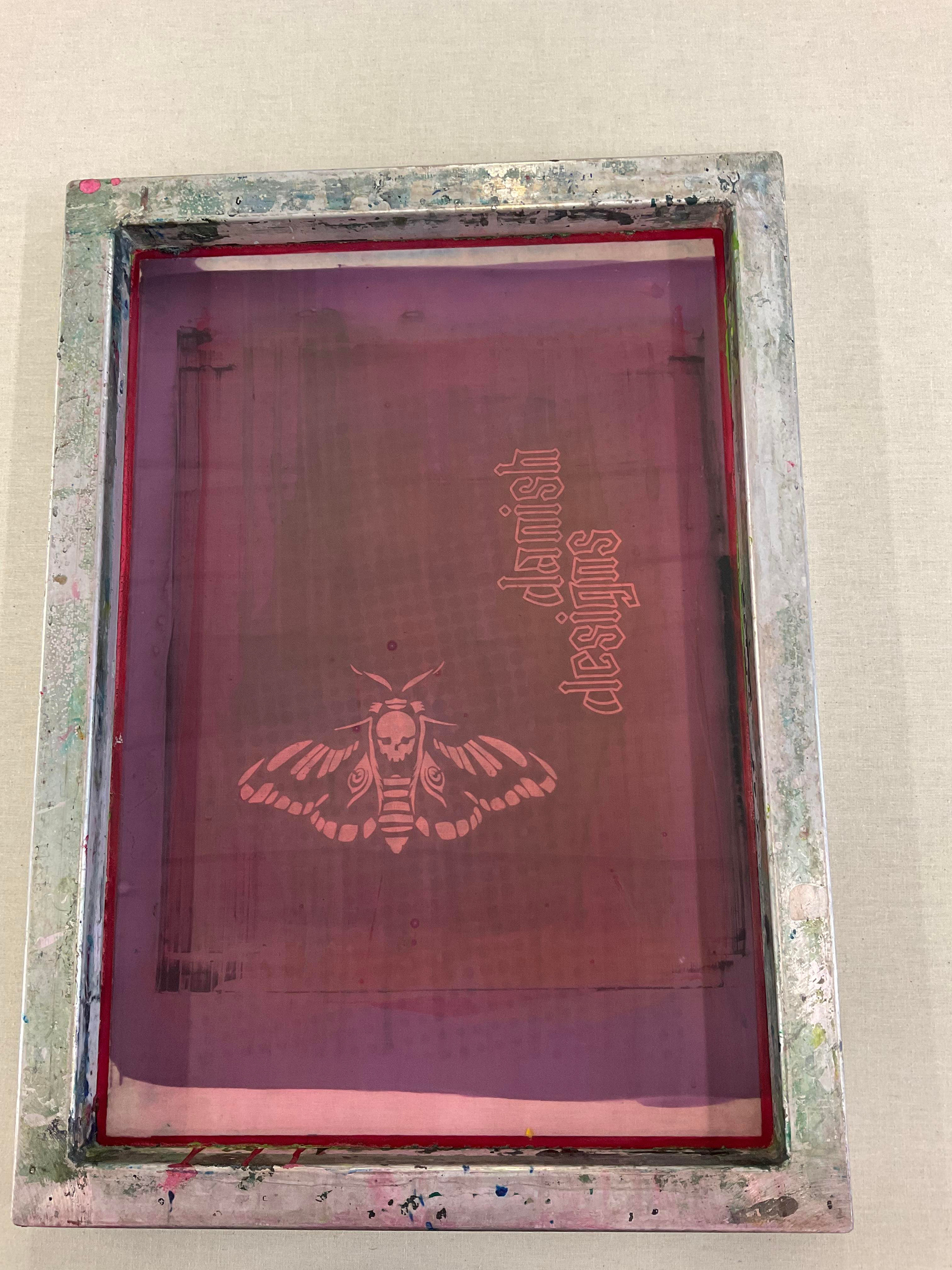
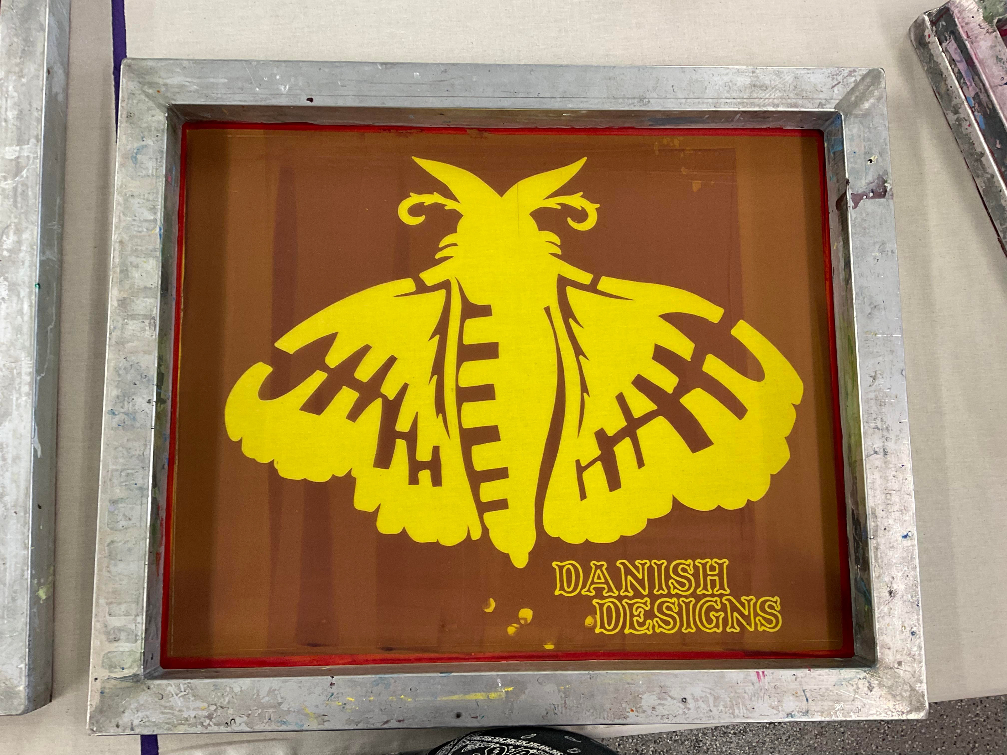
Following the creation of my designs, my next undertaking was to generate separate layers for the red and black elements. This segmentation was essential for a sequential printing process during screen printing. Once the layers were isolated, I proceeded to print them onto acetate, facilitating their exposure onto mesh screens in preparation for the physical printing phase.
The images to the left depict the mesh screens, which are a variety of sizes in order to accommodate the designs and ensure correct orientations. Some screens were more expansive than others; I made this decision based on the design intention—one centered on a T-shirt, while the other spanned the entirety of the garment, resembling a full-sized print. The rationale behind this will become clearer when I present mock-ups of the anticipated outcome.
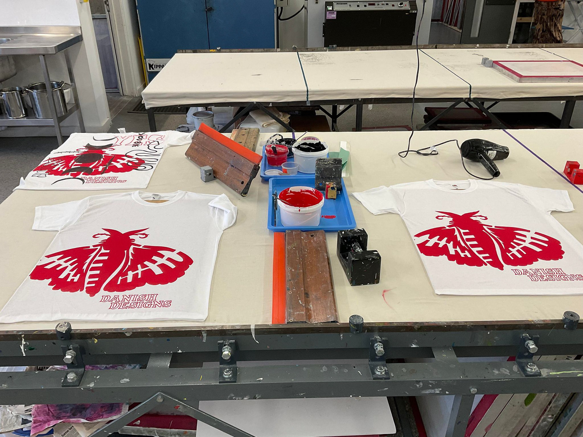
Subsequently, I transitioned into the printing process. For each design, I opted for both black and white T-shirt bases. Introducing an inverted design concept allowed for a dynamic appearance on the alternate T-shirts. This strategic choice broadened the target audience, offering diverse options for customers. Additionally, varying design sizes facilitated different pricing tiers, enhancing accessibility for a wider customer base.
The visuals below illustrate how I established a production line for my T-shirts, employing an assortment of tape and guidelines to ensure consistent design placement on each shirt. To streamline the process, I prepared the screen meticulously, marking out the precise locations for printing multiple shirts with that specific layer. After printing, I allowed the screen to dry before moving on to the next layer.
This method proved to be highly efficient for me, enabling the drying of T-shirts in between, or the setup of additional shirts for printing with different designs. It offered a systematic approach that maximised productivity in the creation of each piece.
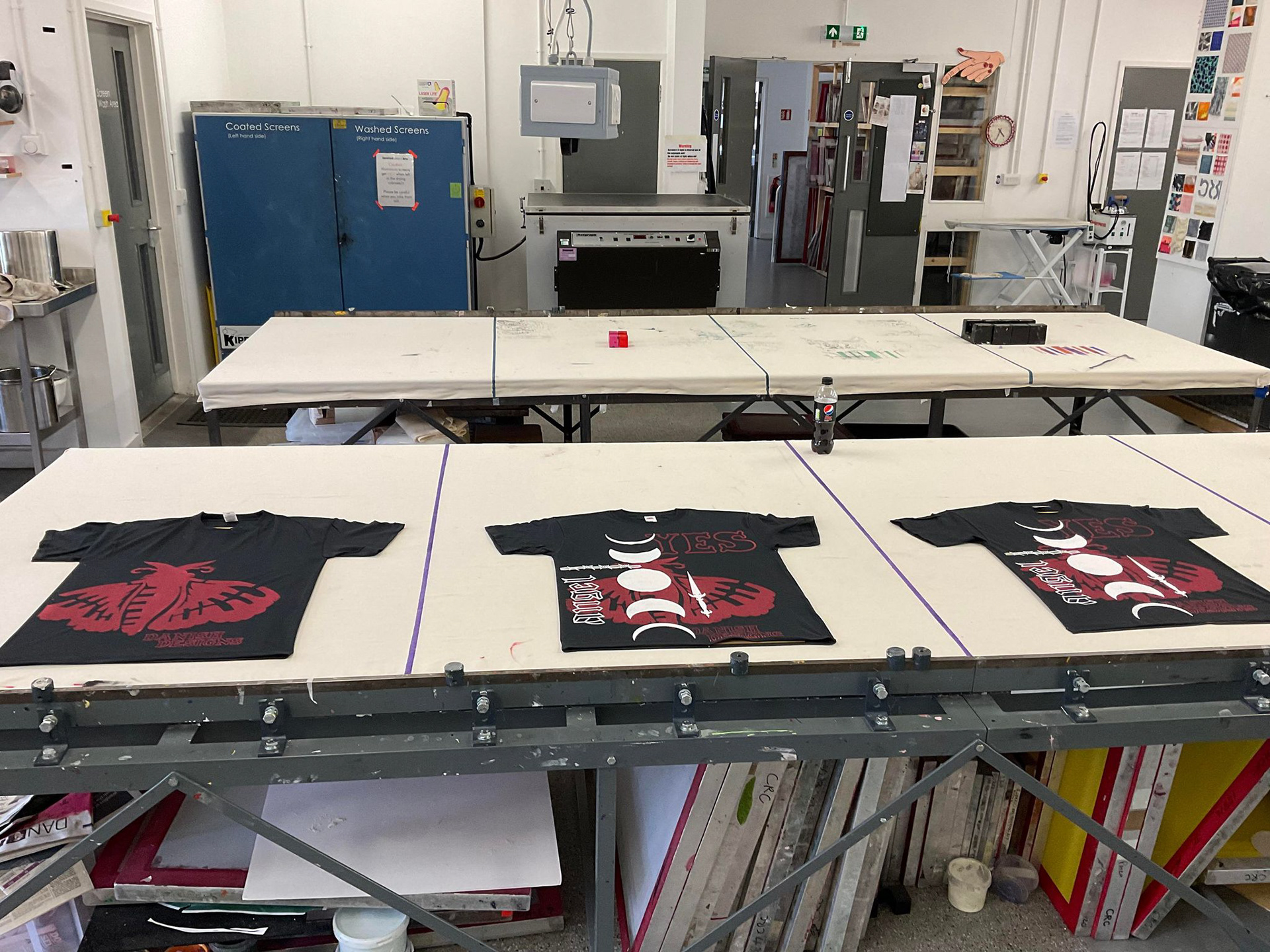
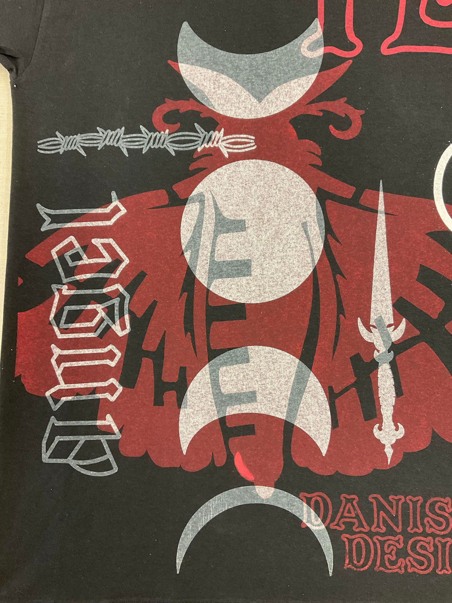

Through the progression, you can observe a few deviations from my initial plan, notably in this design, where an unexpected X-ray effect emerged as I layered white over red. The cause of this phenomenon was unclear, even though I used a highly opaque white. Surprisingly, this unplanned effect turned out to be visually striking.
Since this particular project, attempts to recreate this effect haven't been successful; it seems to have been a one-time ink glitch. Nevertheless, the unintended result garnered significant popularity.
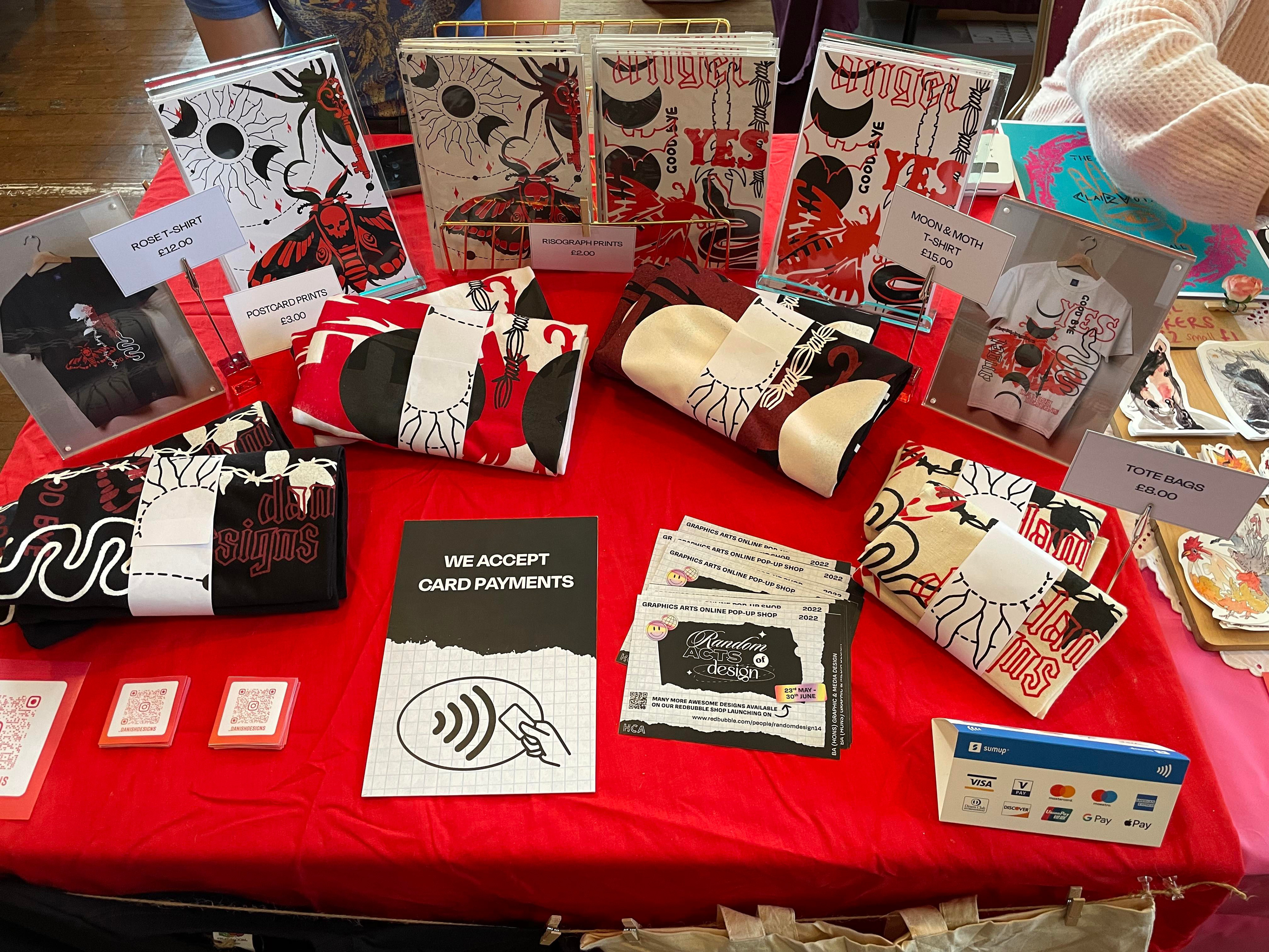
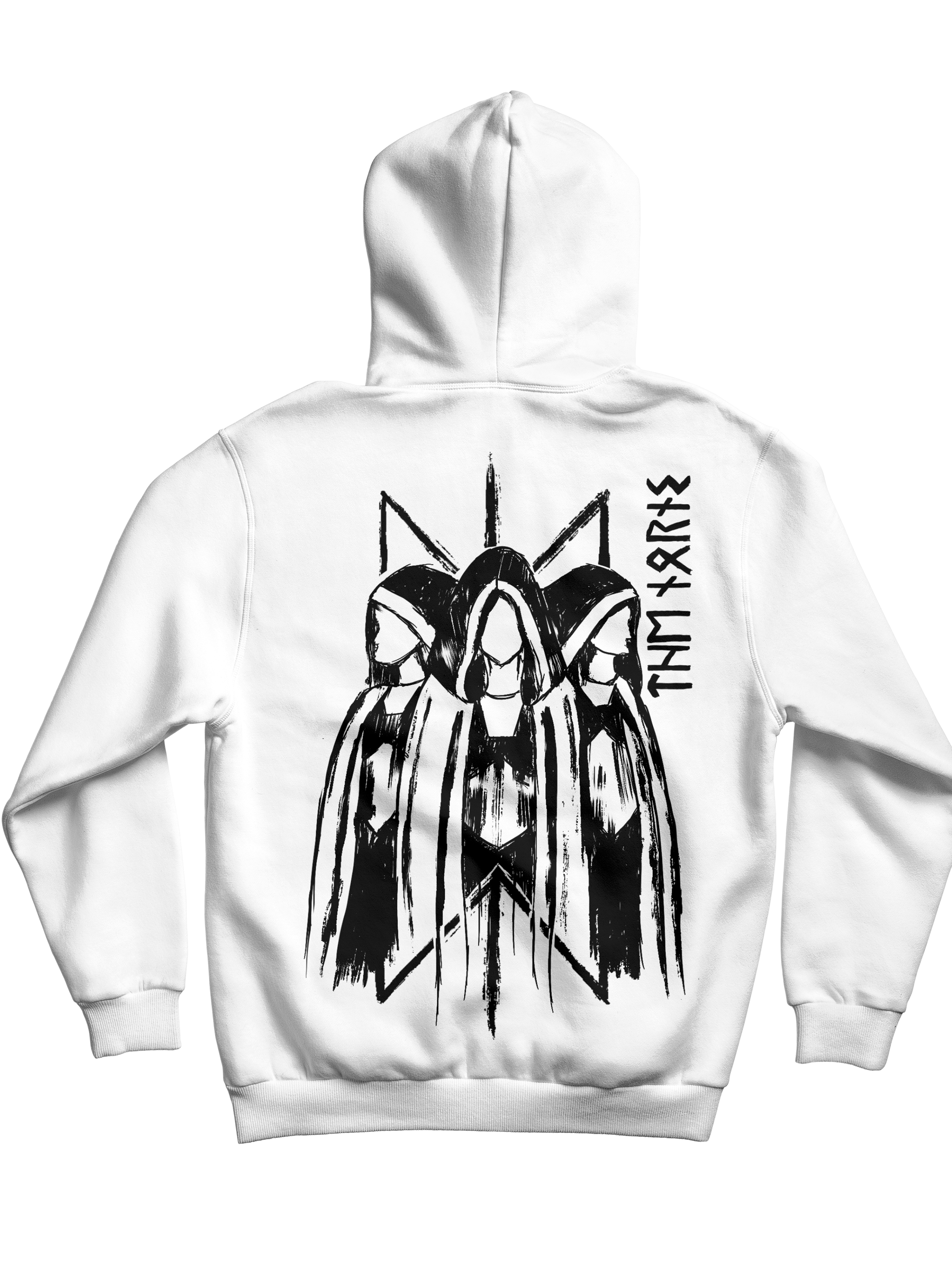
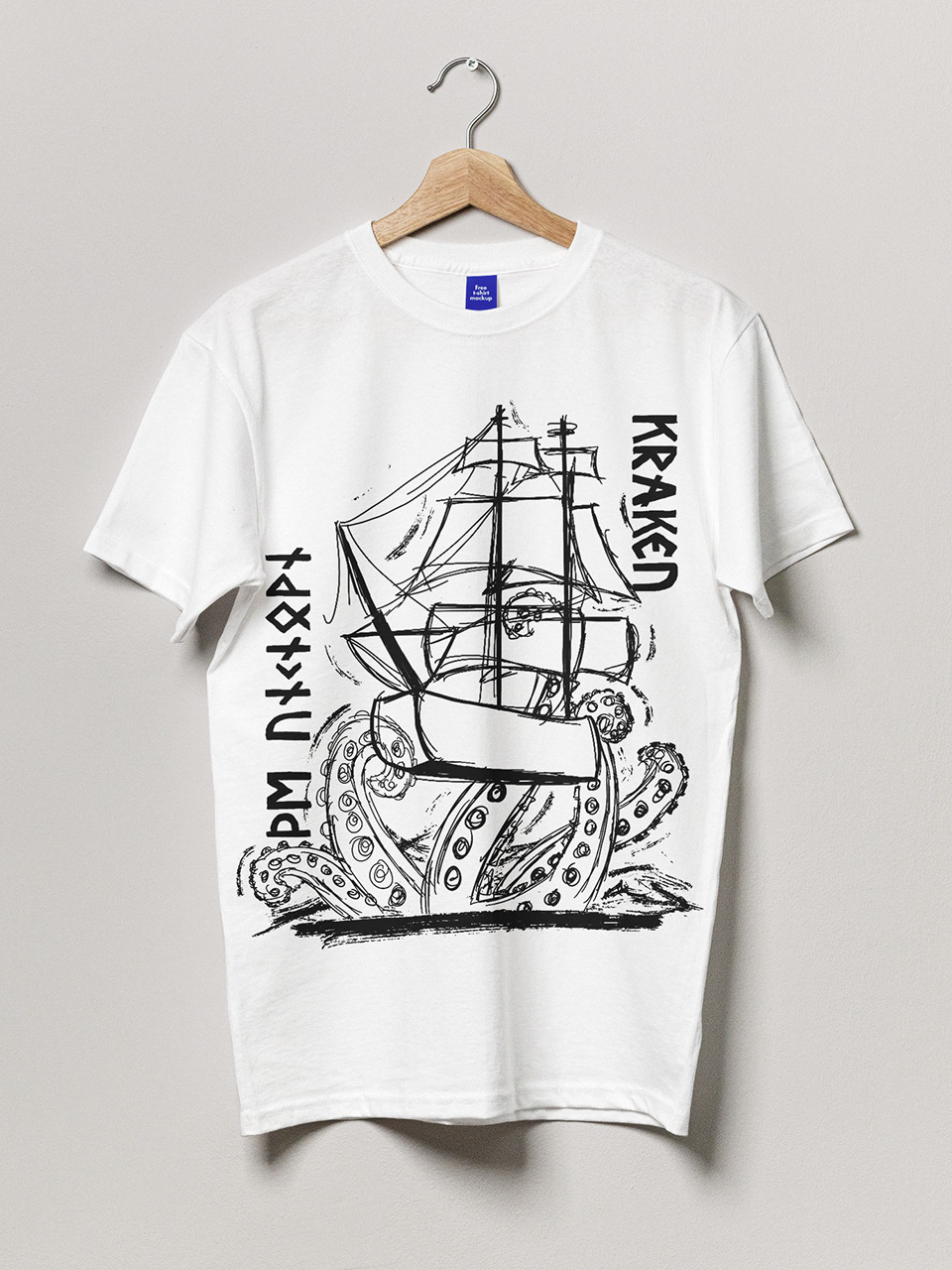
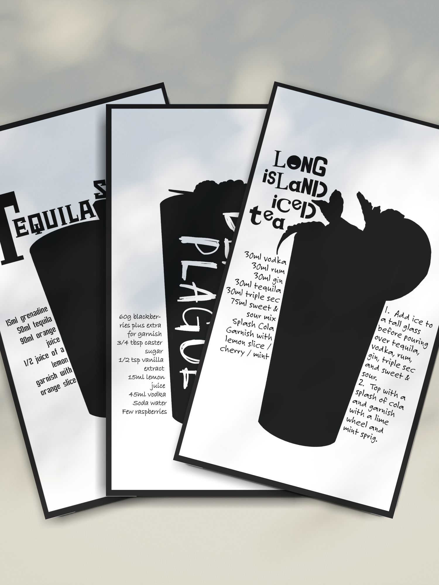
Below, you'll find the final designs that emerged from this creative journey. These designs were showcased and sold at an illustration festival.