Tasked with the design of a cookbook, I conceived the concept of a 'Tarot Card Cocktail' deck. This innovative approach retained the essence of a traditional cookbook but presented recipes succinctly on both sides of a card, mimicking the structure of a tarot deck. The portability of these cards, especially suitable for gatherings, coupled with their quick and easy reference, became a unique selling point. As the recipes were self-contained on each card, their order became inconsequential.
Facing the challenge of defining the visual direction, I pondered whether to adopt an illustrative, photographic, or typographic approach. To chart the course, I commenced with sketching out thumbnails, both manually and digitally, aiming to discern the most fitting direction for these distinctive recipe cards.
Initially conceptualised as a cocktail book rather than cards, I began with double-page spreads. Notably, most of my concepts featured a full-bleed page of imagery paired with a more illustrative or type-based element on the opposite side. The intention was to create a visual opposition between the two sides, with one being vibrant and colorful, and the other more stripped back in black and white. This deliberate contrast aimed to ensure each side had its distinct visual appeal without competing with the other.
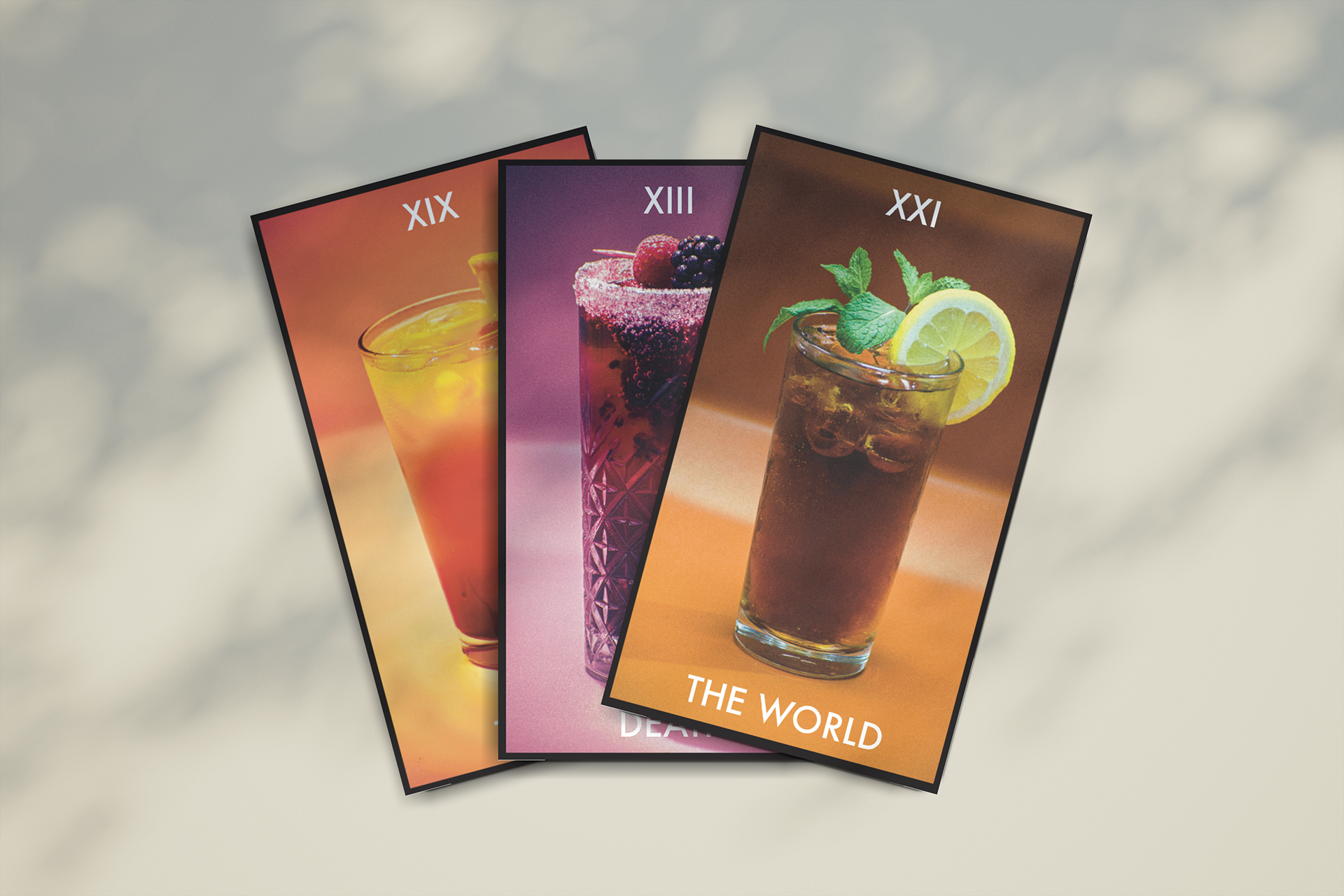
As the concept evolved into tarot cards, I embraced the idea of having one side that was visually stunning, colorful, and photographic, while the reverse side would be simpler, more stripped back, with a primary focus on typography.
Taking these concepts forward, I proceeded to mock up some tarot card designs. Opting for a hands-on approach, I created them manually as it provided a more tangible feel and allowed me to assess the sizes, shapes, and overall design in a real-life context.
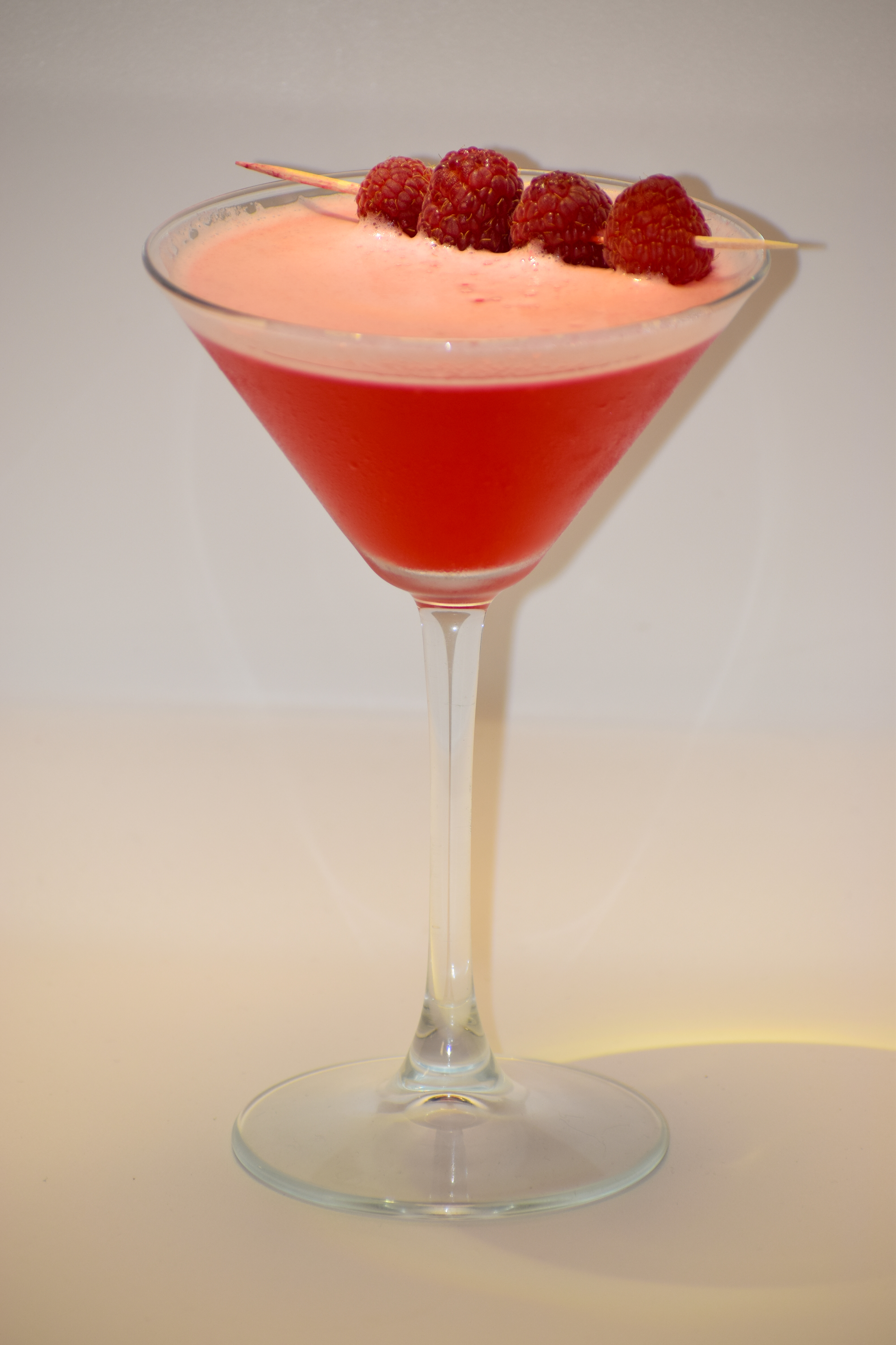
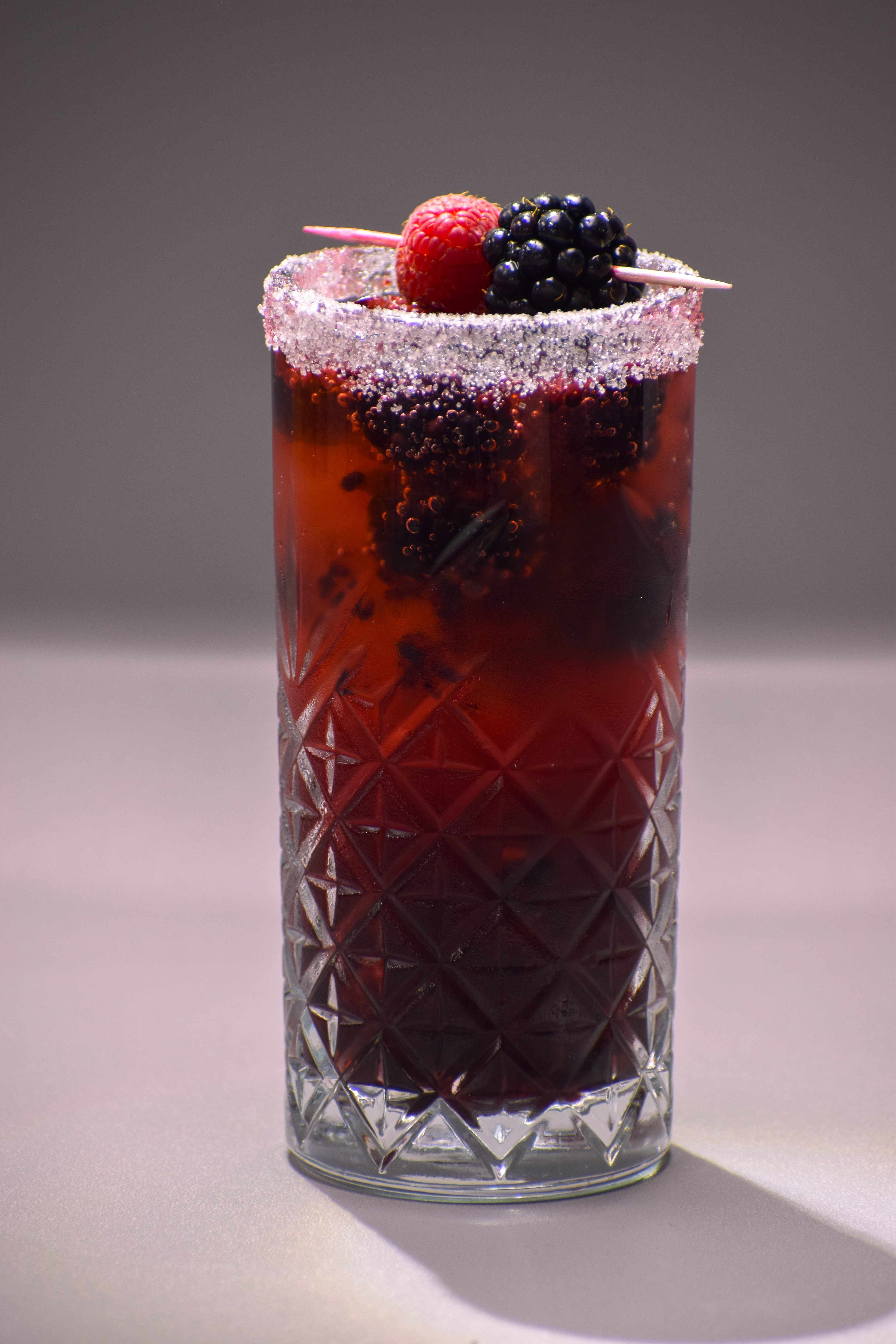
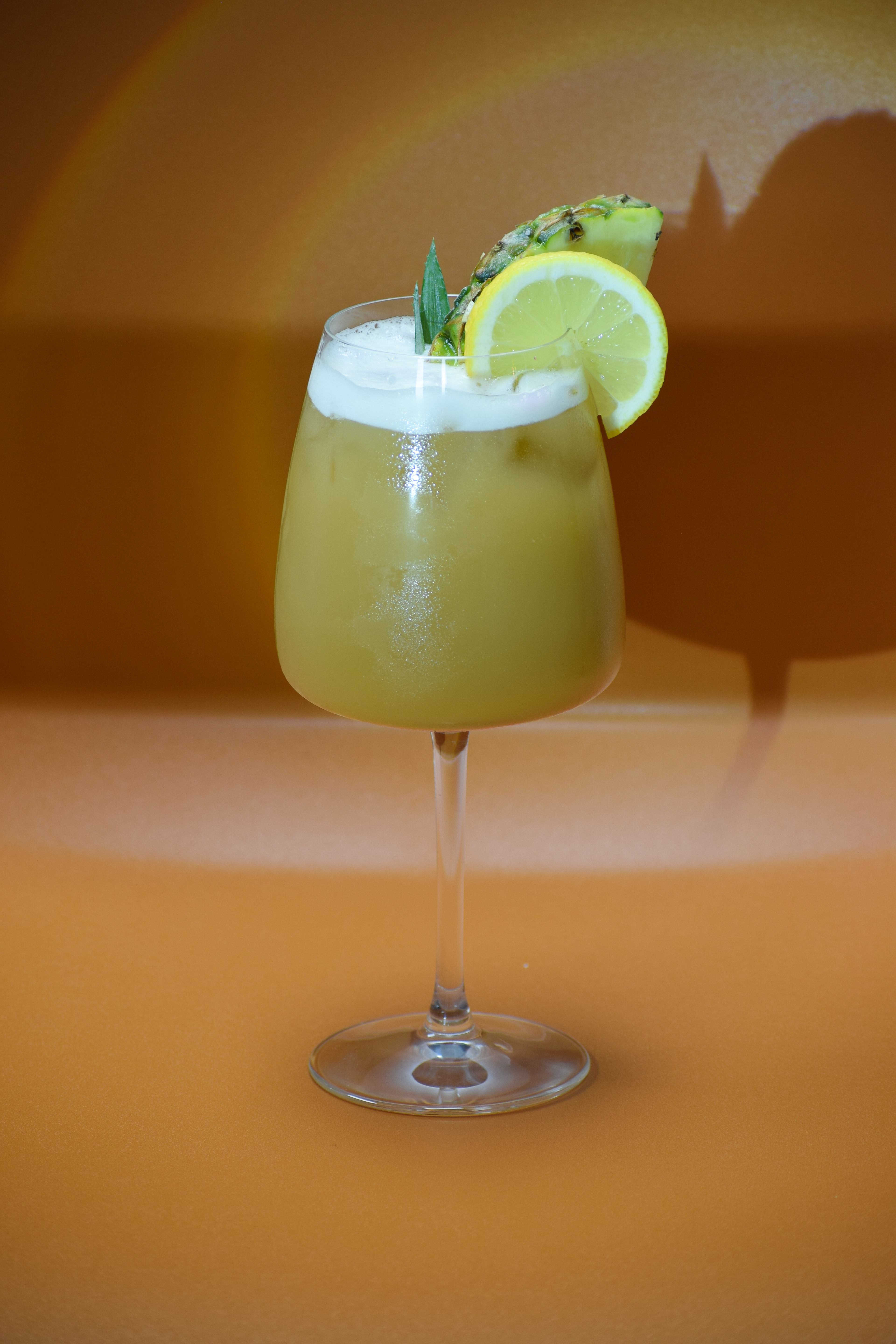
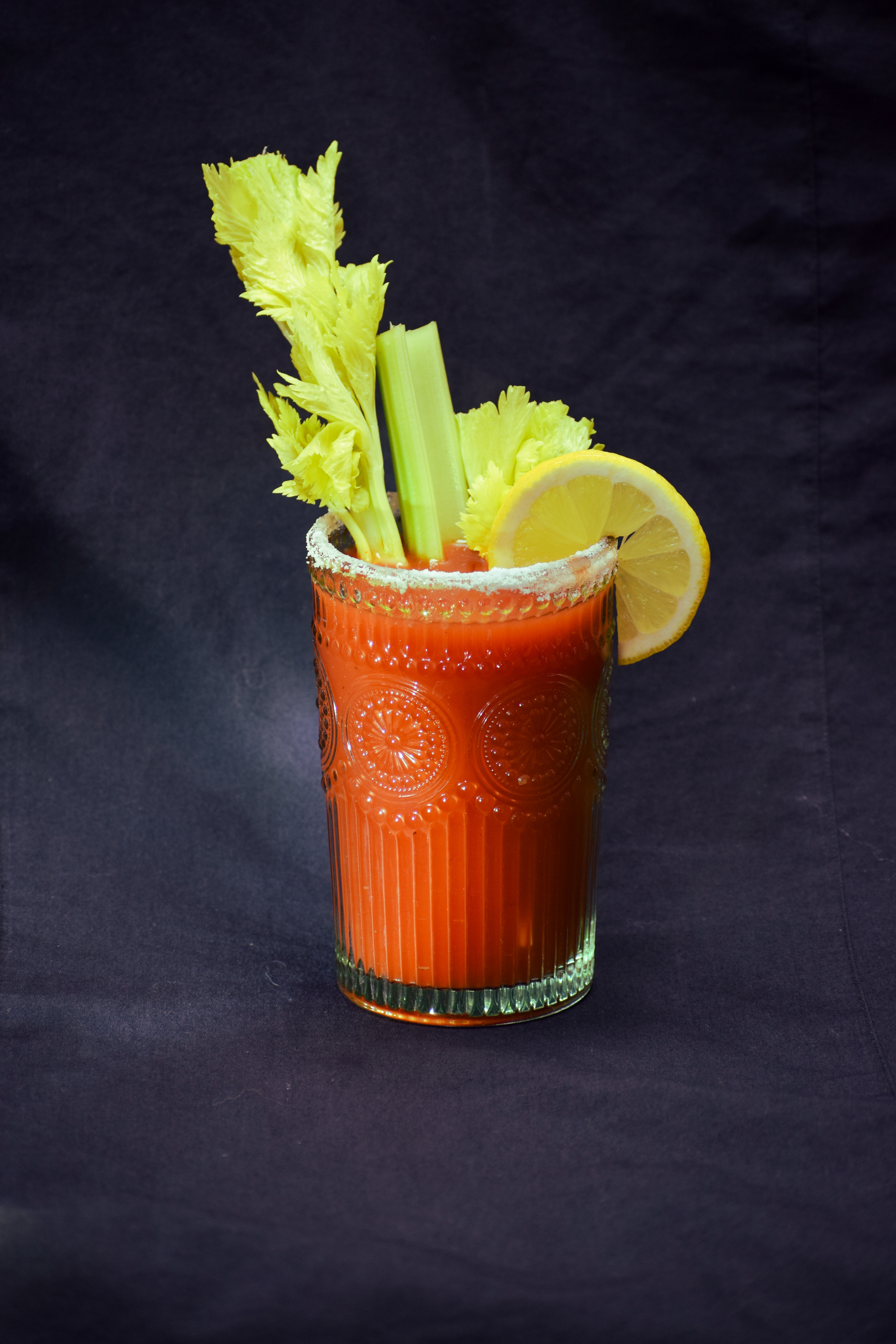
At this point, my plan was to conduct a personal photoshoot, capturing a diverse array of cocktails in various glasses. However, before delving into this process, I conducted online research to gather a collection of cocktail images. This served as a reference point, allowing me to discern the desired direction for my own photoshoot. I aimed to avoid investing effort into a photoshoot only to realise later that the images might not suit tarot cards in terms of size, orientation, shape, or lighting.
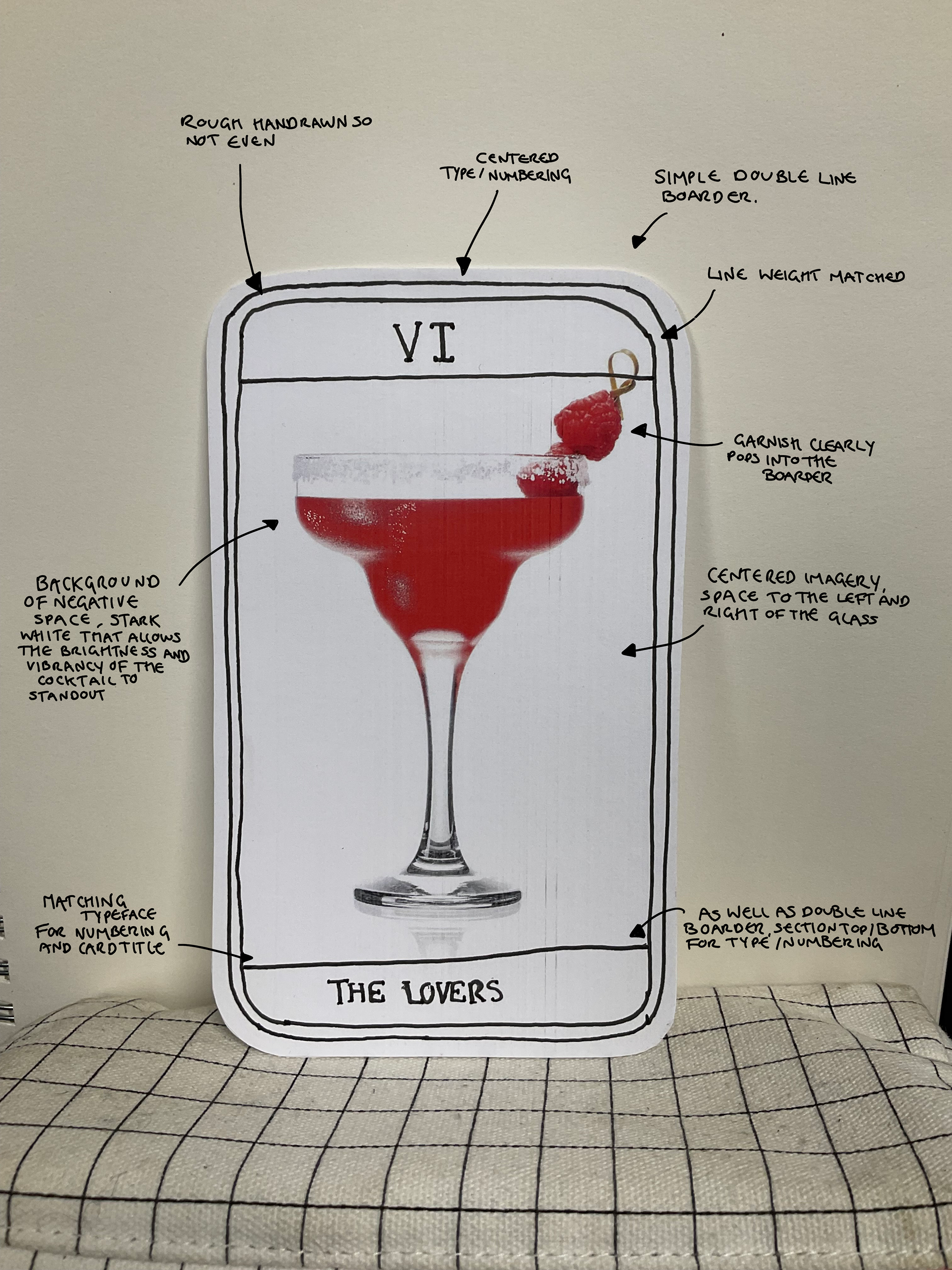
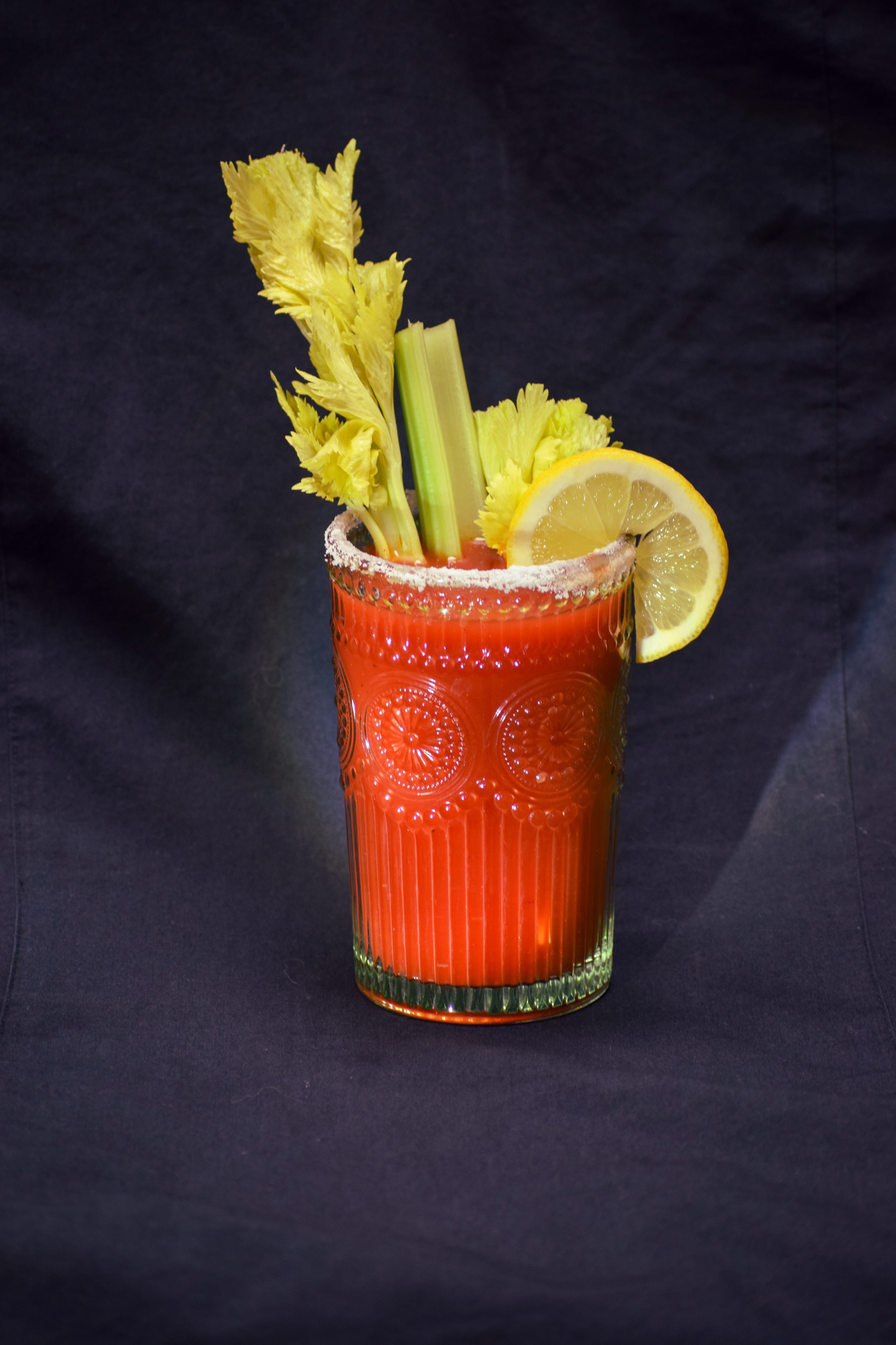
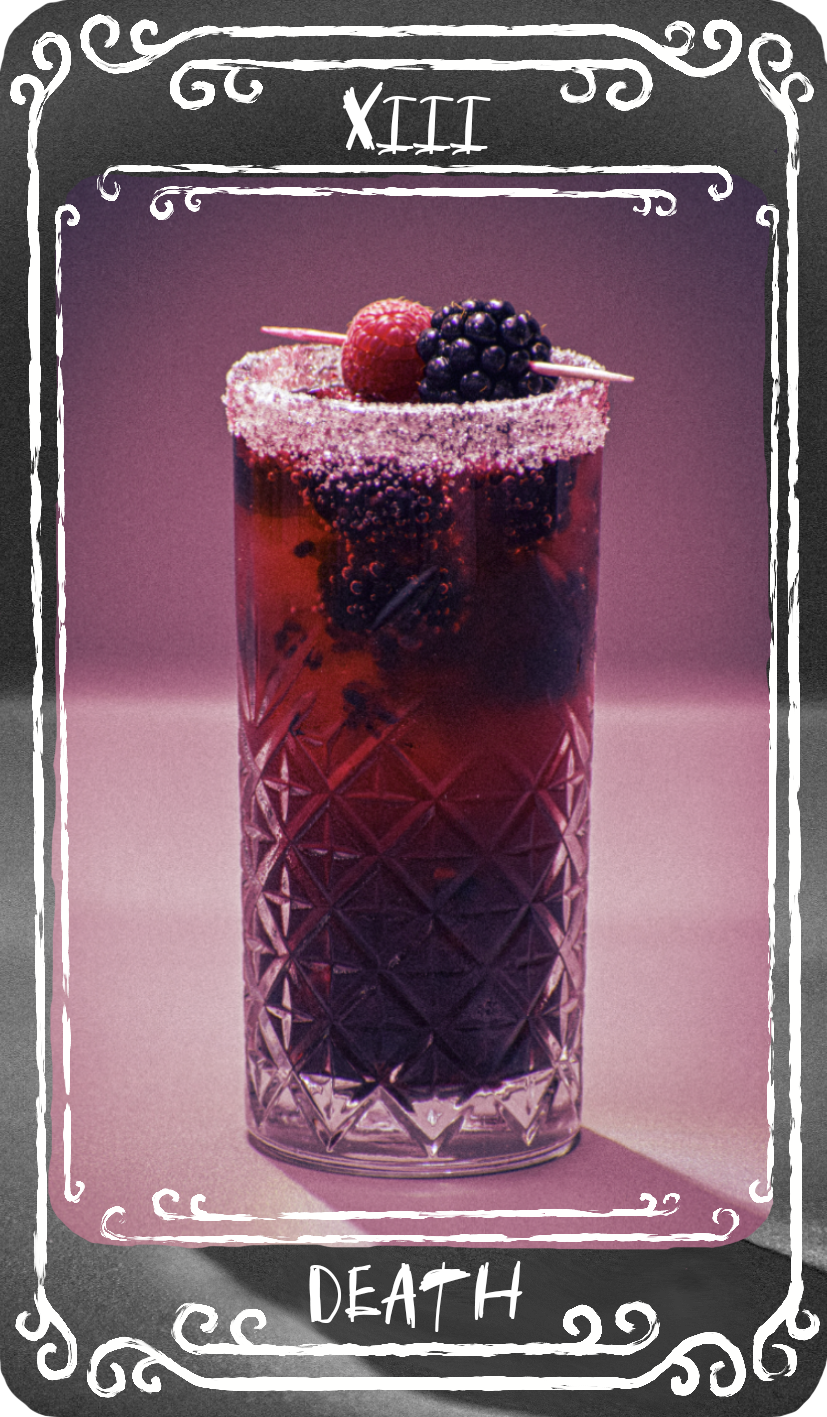
For instance, in the photo used for this initial card mockup, the cocktail's height, width, and color were well-suited. Yet, when it came to adding the border and name on the face of the card—a customary element in tarot cards—the garnish extended too high, as evident in the design.
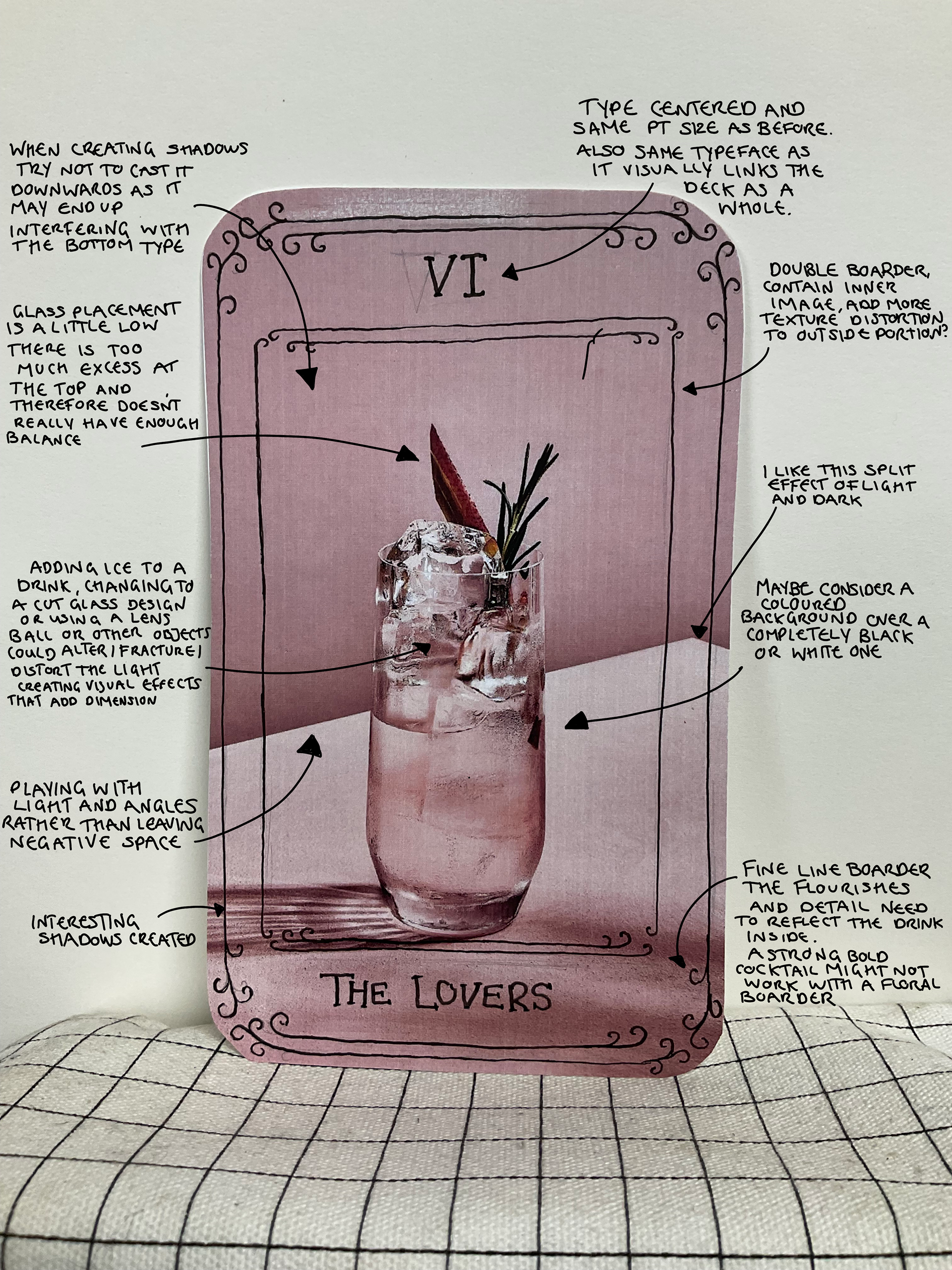
Following this process with a diverse range of images and drinks, I meticulously annotated the cards, identifying elements that I believed would work and those that might not. Subsequently, armed with insights from this evaluation, I embarked on planning my own photoshoot. This involved planning the drinks I would create, selecting the appropriate glasses, and deciding on the ideal setting. With the plan in motion, I set out to conduct the shoot and obtained the following images as a result.
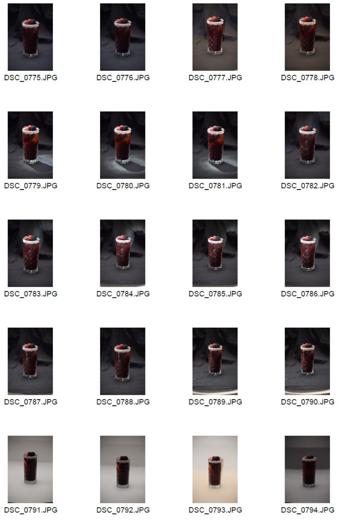
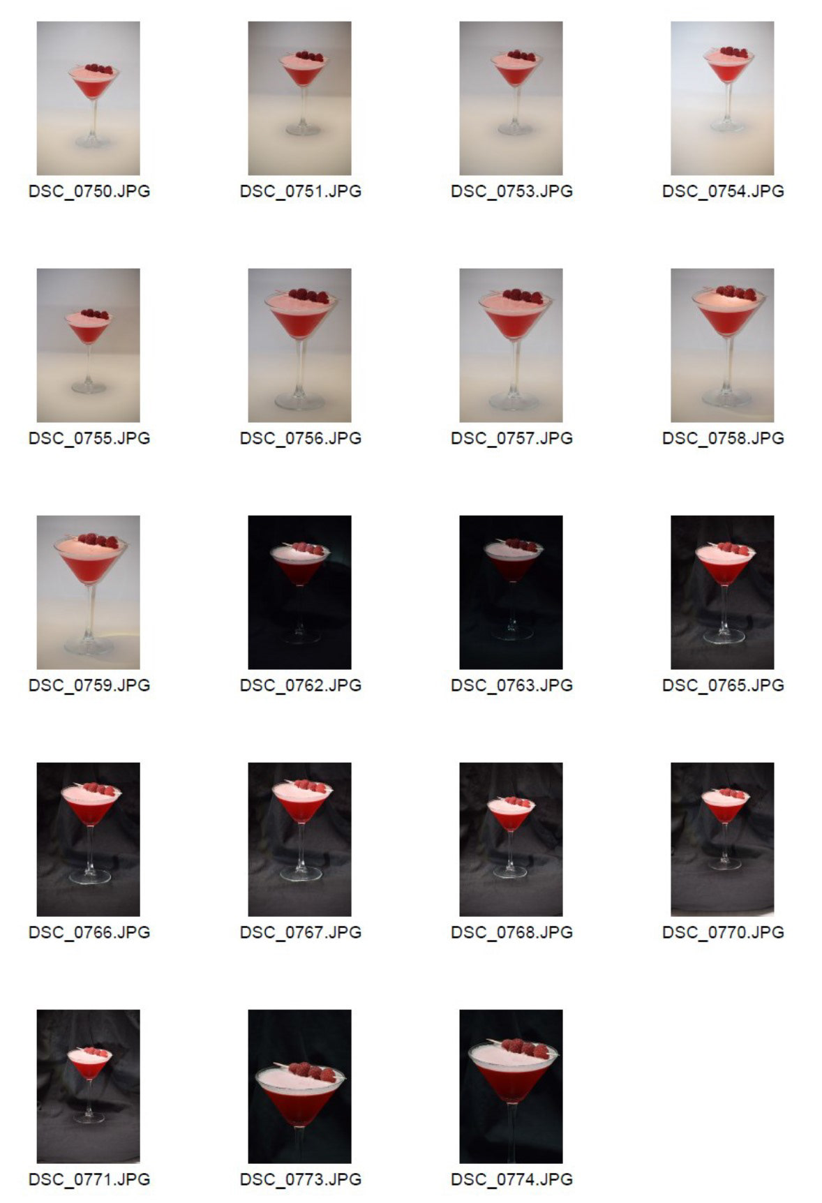
I find it incredibly useful to evaluate my photoshoots through the contact sheets I create. These sheets simplify the process of identifying elements I appreciate and those I might not in each image, particularly crucial if I plan on reshooting for improved results.
While I managed to capture the desired images in this photoshoot on the first attempt, there have been instances in the past where I wanted to redo shoots. In those cases, referring to my annotated contact sheets proved invaluable for making necessary alterations the second time around.
From the pool of images obtained in this shoot, I selected a few for each drink that resonated with me. You can view these selections below before I proceeded to edit them to align with the visual aesthetic I envisioned for the tarot cards.
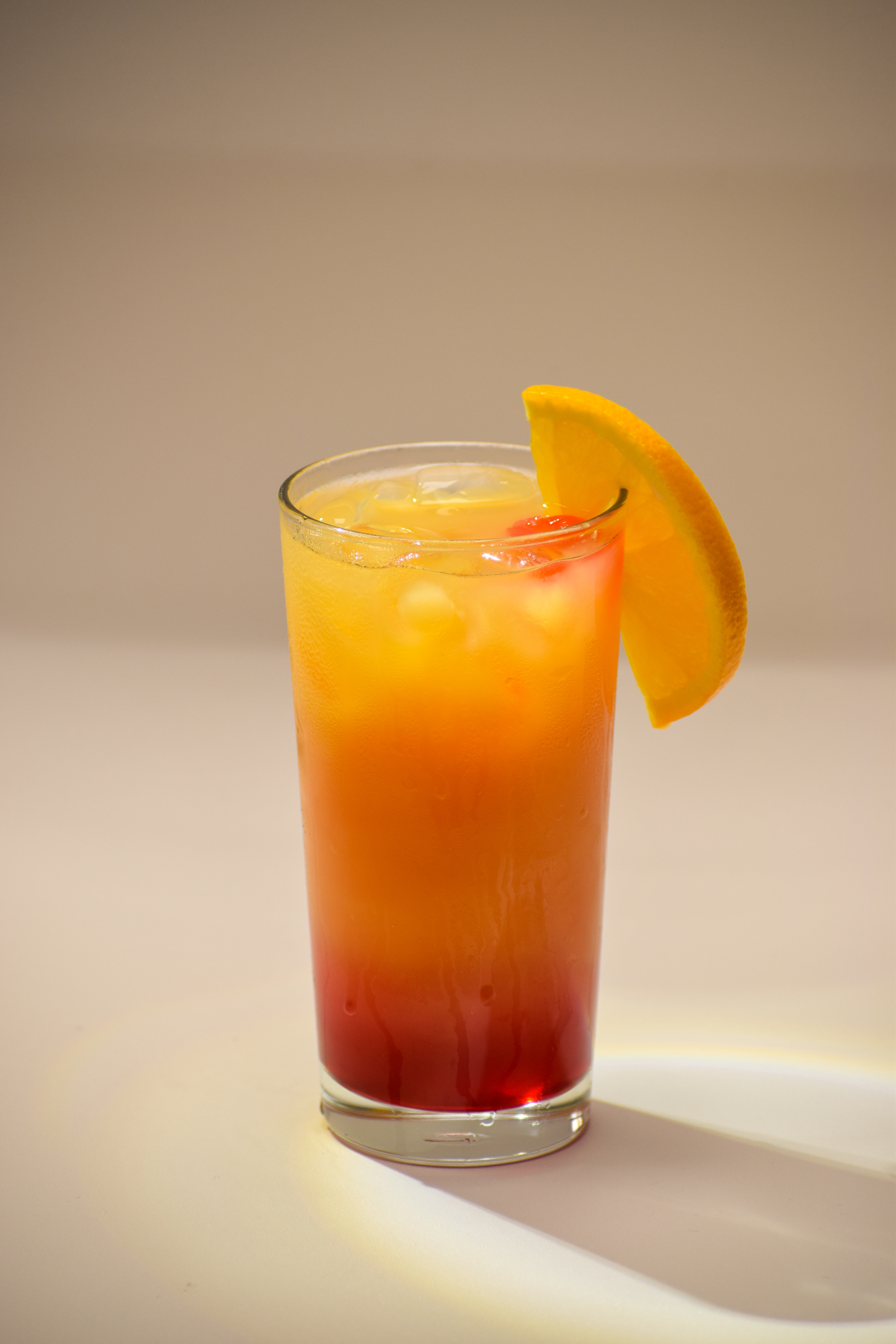
Above are the initial images with some subtle editing.
Below, you can observe how I further refined these images, introducing vibrant colours to align them more closely with the envisioned style of the tarot cards. It was crucial to strike a balance, ensuring that one side exuded vibrancy, visual appeal, and power, while the other remained elegantly simplistic in black and white.
Explore the effect of these vibrant colours on the drinks, providing a glimpse into the envisioned realm of the cards. I experimented with various borders to observe their impact on the standalone photograph, transforming it into an authentic tarot card design.
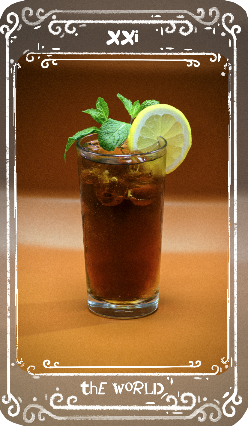
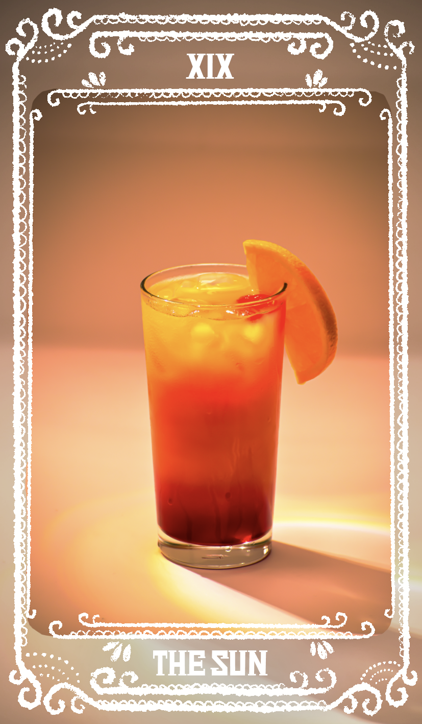
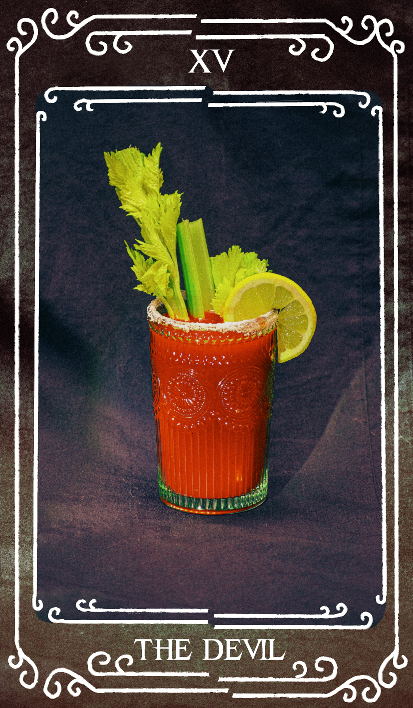
It's worth noting that when initially selecting cocktails for this project, I delved deep into tarot card research, familiarising myself with the diverse types, including both the major and minor arcana cards. For this specific project, I opted to focus solely on the major arcana cards, narrowing it down to a selection of five. The choice of cocktails and cards was a deliberate process, intertwining their significance. The connection will become more evident as the card titles and recipe names are seamlessly incorporated into the designs.
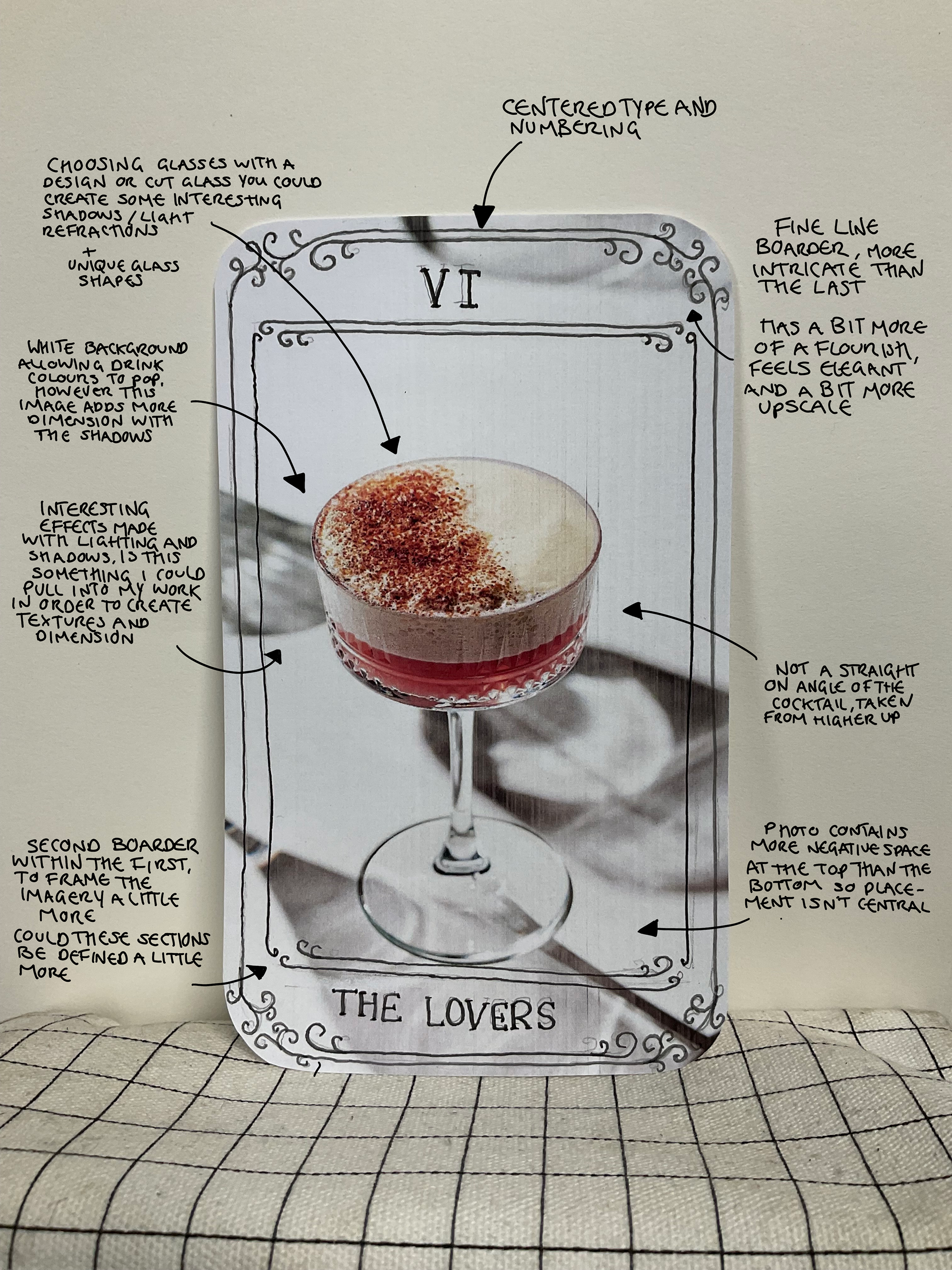
I engaged in experimentation with various border styles, evolving from the initial trials seen at the top of this page.
At the project's outset, I envisioned a more intricate and ornate border, as evident in those initial card trials. However, as the project unfolded, I recognised that my design style had gravitated towards a cleaner and more modern aesthetic. Consequently, the ornate style no longer aligned with the overall design aesthetic.
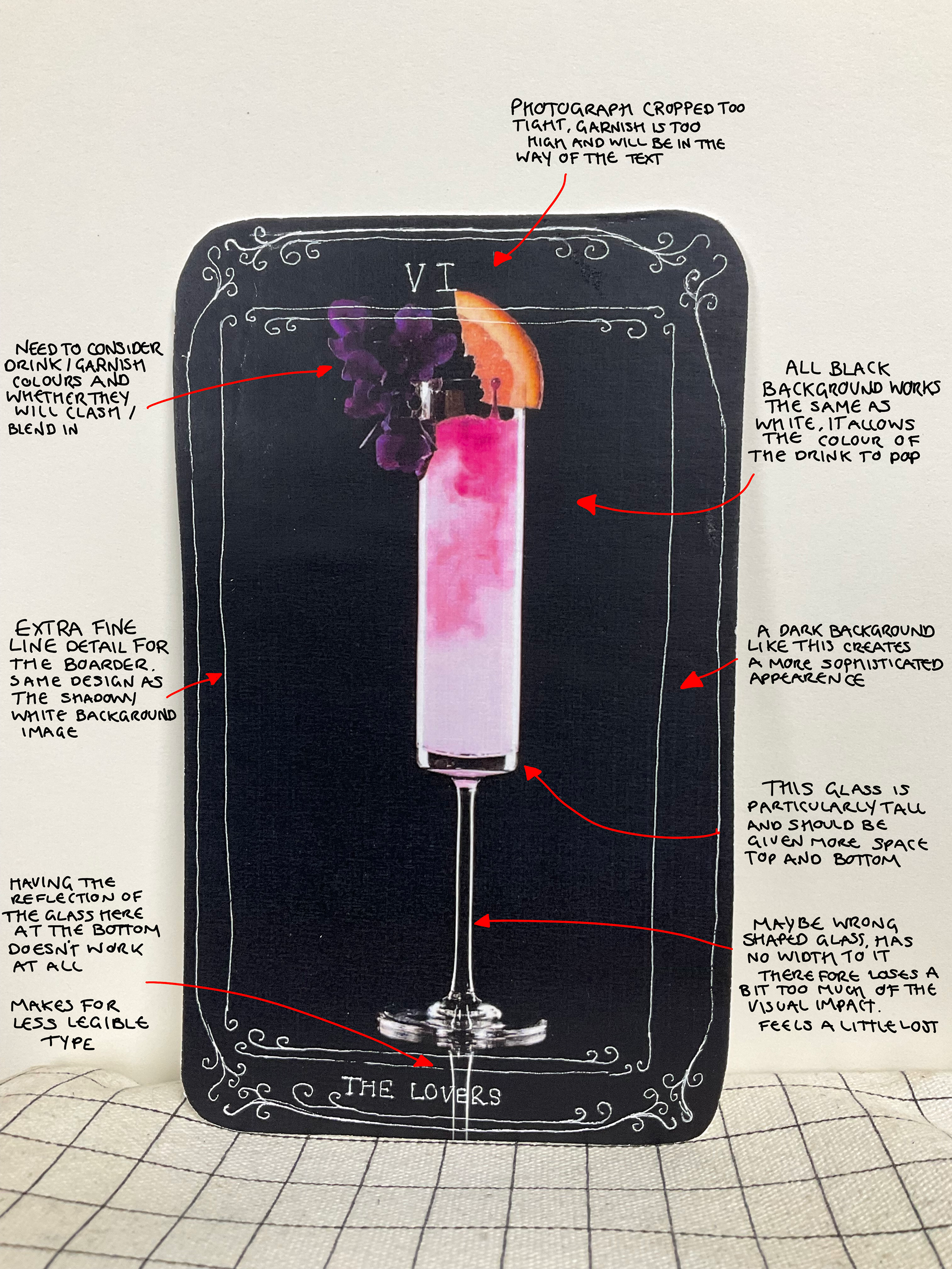
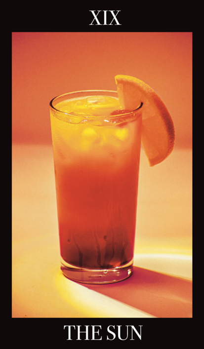
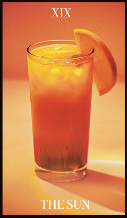
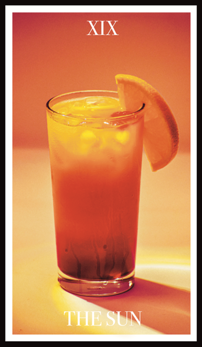
In the images below, you can observe my attempt to introduce variety by incorporating slightly different borders for each card. While this concept added an interesting dimension, it proved impractical given the extensive number of cards in a tarot deck (78). I subsequently transitioned towards a more streamlined and modern approach.
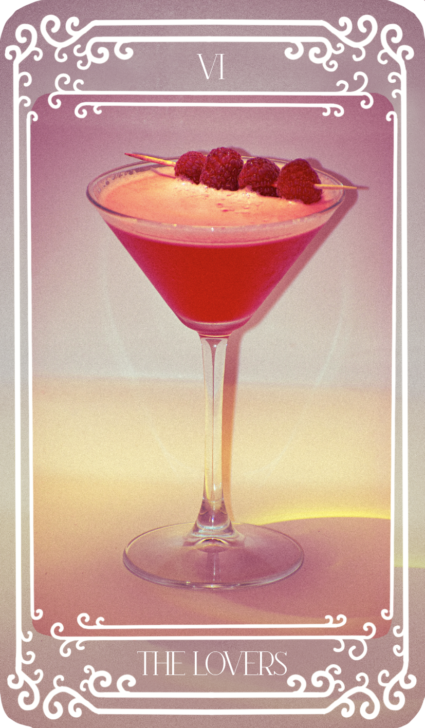
Below, you can observe my venture into experimenting with a more contemporary and minimalist style for borders and typography. This led me to opt for straight lines and sharp corners. While I'm still deliberating on whether to change this typeface, it currently aligns with my design direction. The primary objective was to determine which option allowed for the most legible type and enhanced the vibrancy of colours.
The decision for sharp corners was motivated by the desire for a more modern aesthetic. Considering the shift in my card design towards a distinctly modern look, this adjustment felt essential.
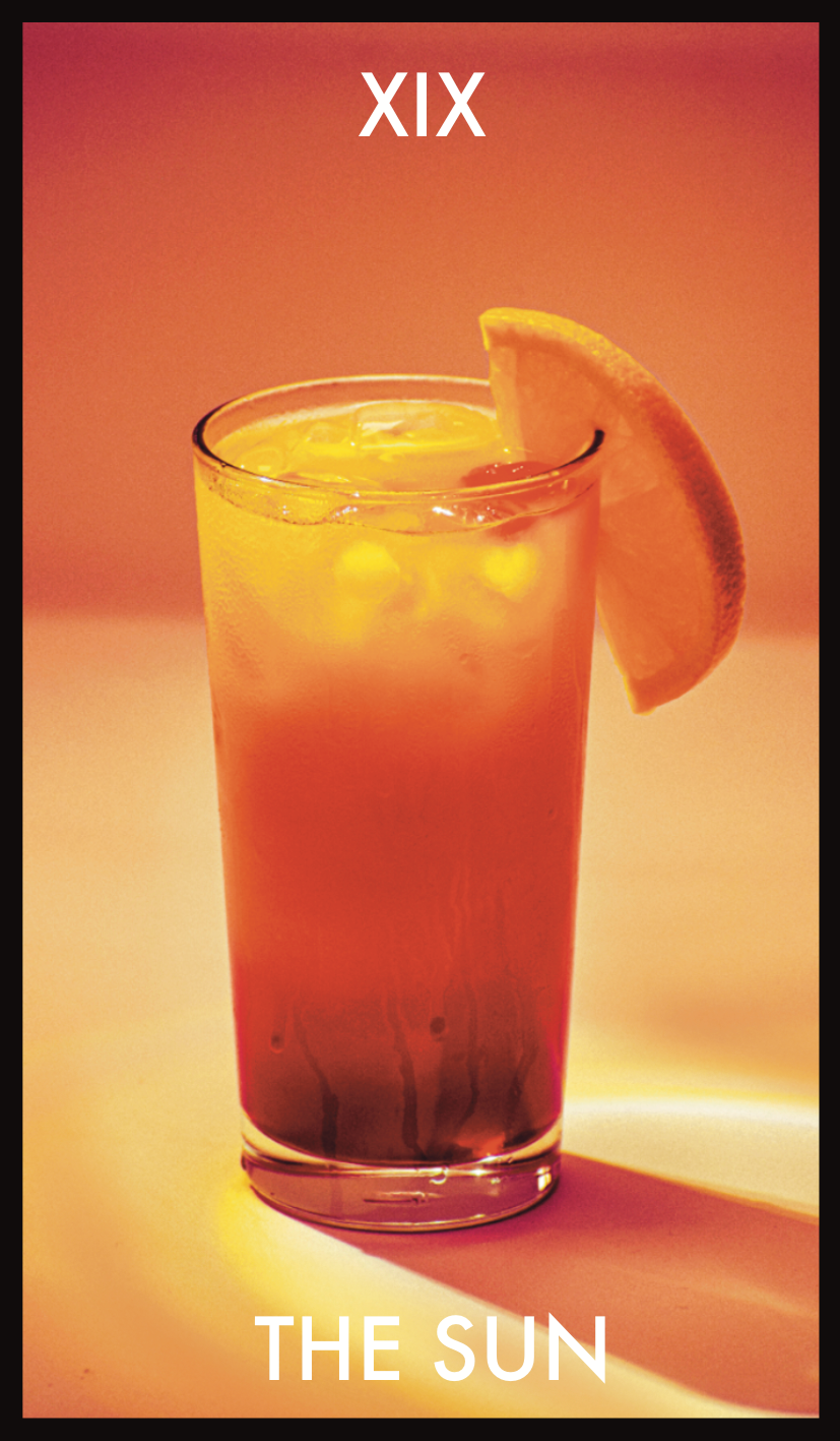
Concerning what you see below, I found that thinner borders worked best, ensuring they didn't overshadow the card, particularly since I intended for the photograph to be the focal point. Image 2 below illustrates the chosen approach—a thin black border with white type. The subsequent step involved fine-tuning the typeface, determining its size, and adjusting its weight.

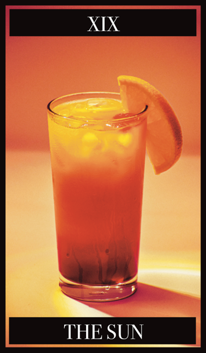


Once again, steering towards a more futuristic and contemporary style, I delved into experimenting with two primary typefaces: Futura and Helvetica. I found that these two options encapsulated the essence I envisioned for my collection of cards.
A challenge surfaced concerning the legibility of the type when the background was slightly lighter. While this nudged me towards opting for thicker typefaces for better clarity, I decided on the mid-weight typeface (Futura, left image). Instead of altering the type itself, I revisited the photograph, strategically darkening the specific area behind the type where readability posed a challenge.
Now that I have established the design template for the card's face, the project's midpoint steered the primary focus toward typographic designs.
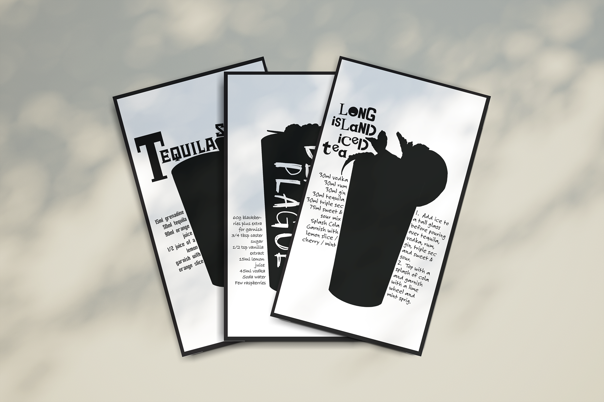
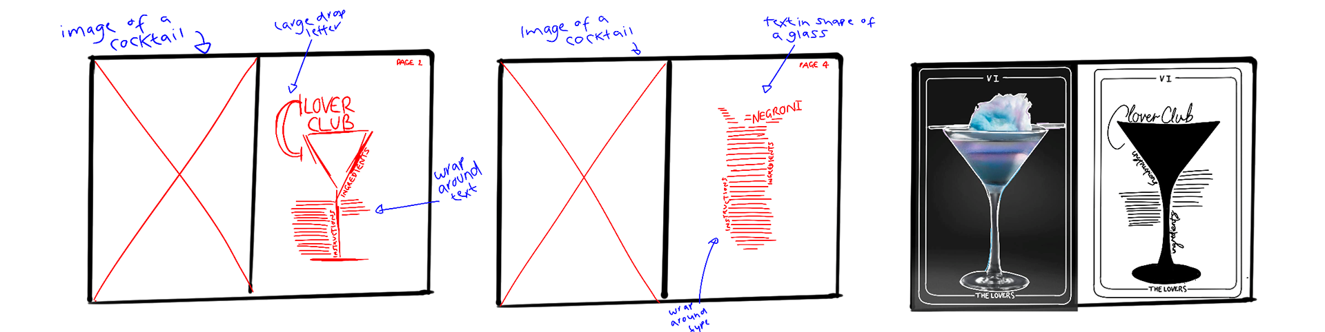
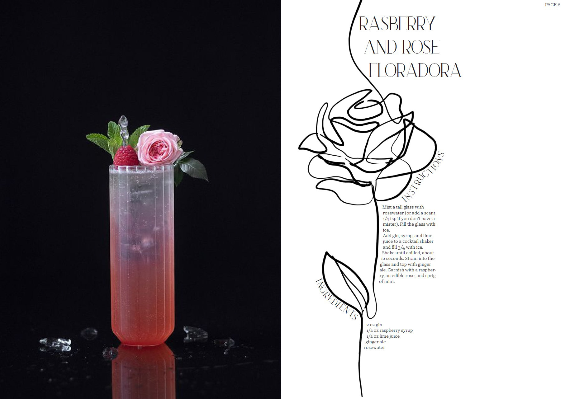
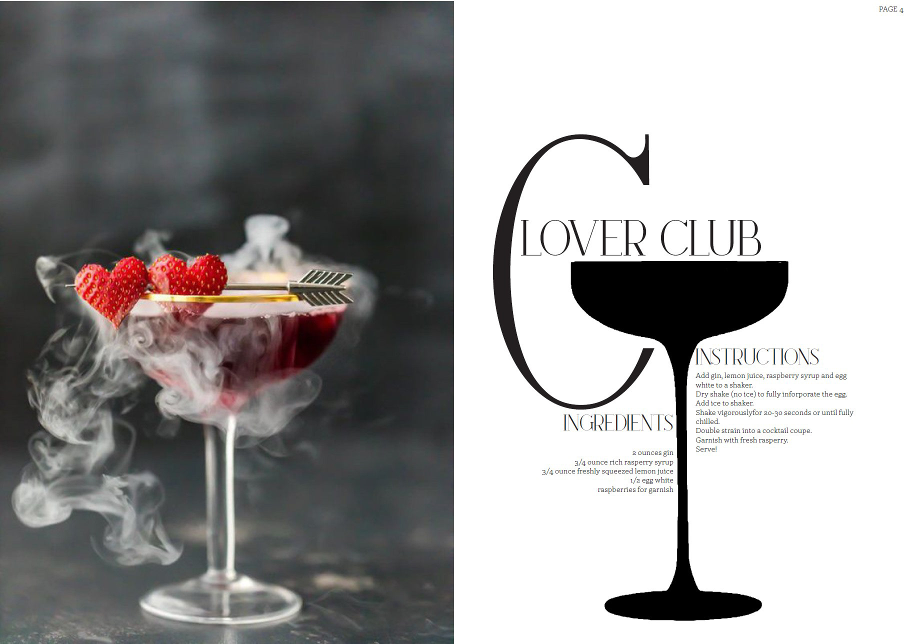
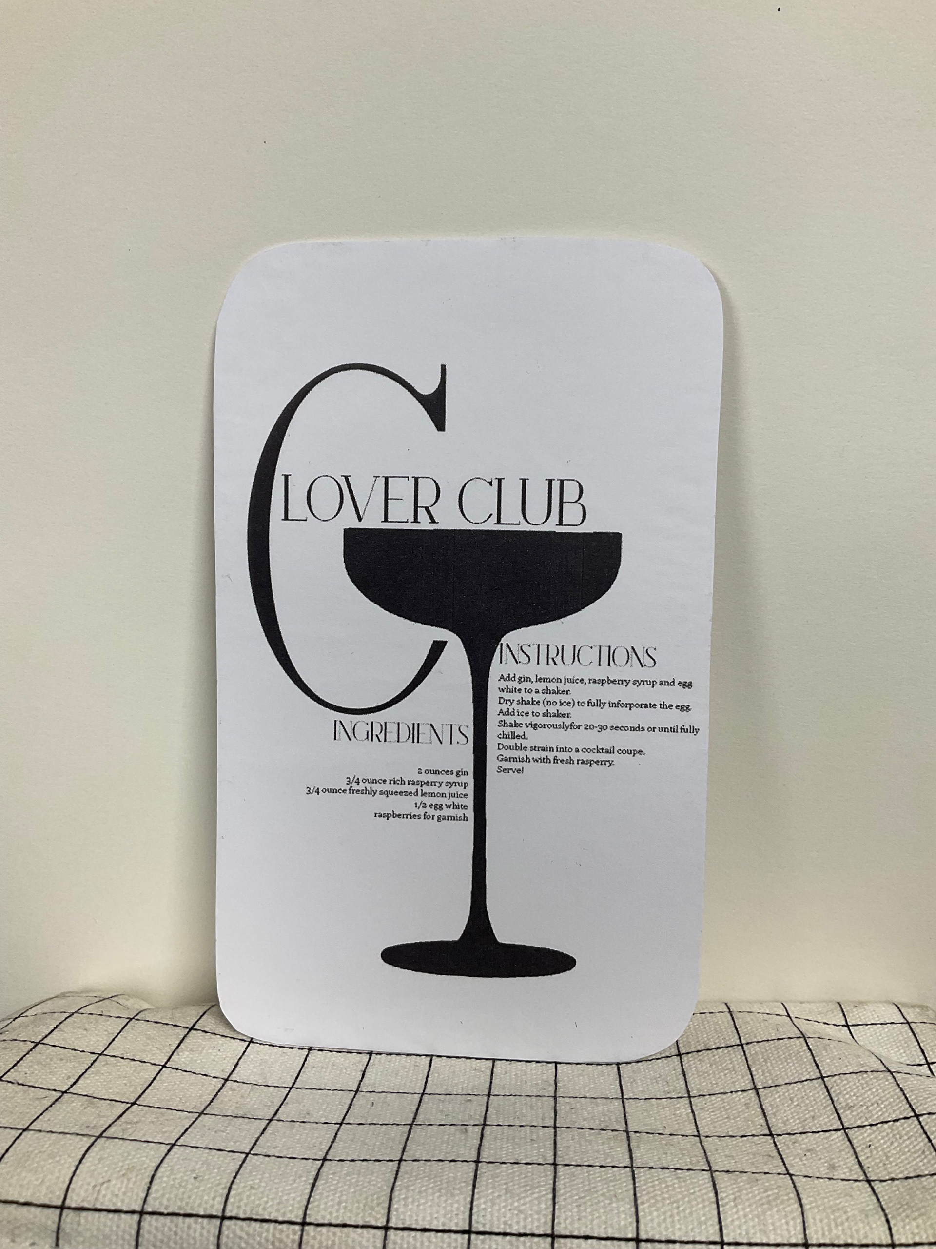
My initial approach involved attempting to use the recipes to construct the glass shape. However, this proved challenging, as cocktail recipes tend to be succinct, leaving the glass shape only partially filled. Consequently, I pivoted to featuring silhouettes of each glass showcased on the card's face. This choice enhanced the symmetry when the card is flipped over. Though it demanded precise placement alignment, the outcome was aesthetically pleasing. Subsequently, I aimed to manipulate the type around the silhouette, crafting an intriguing typographic layout unique to each card.


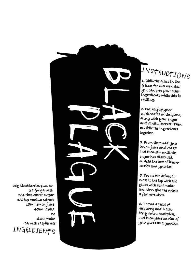
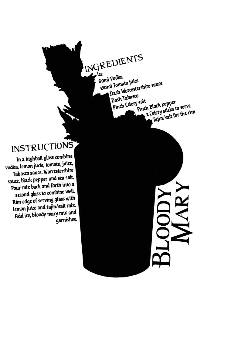
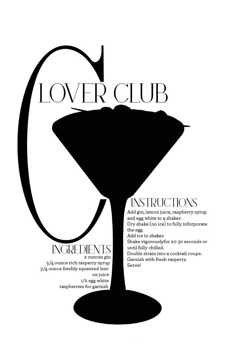
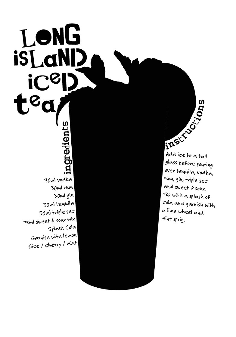
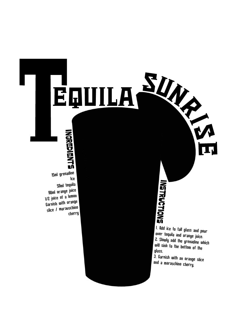
See the seamless fusion of recipes and typography within the silhouette, where carefully chosen fonts effortlessly complement the cocktail imagery and recipes, creating a harmonious connection between information and visuals.
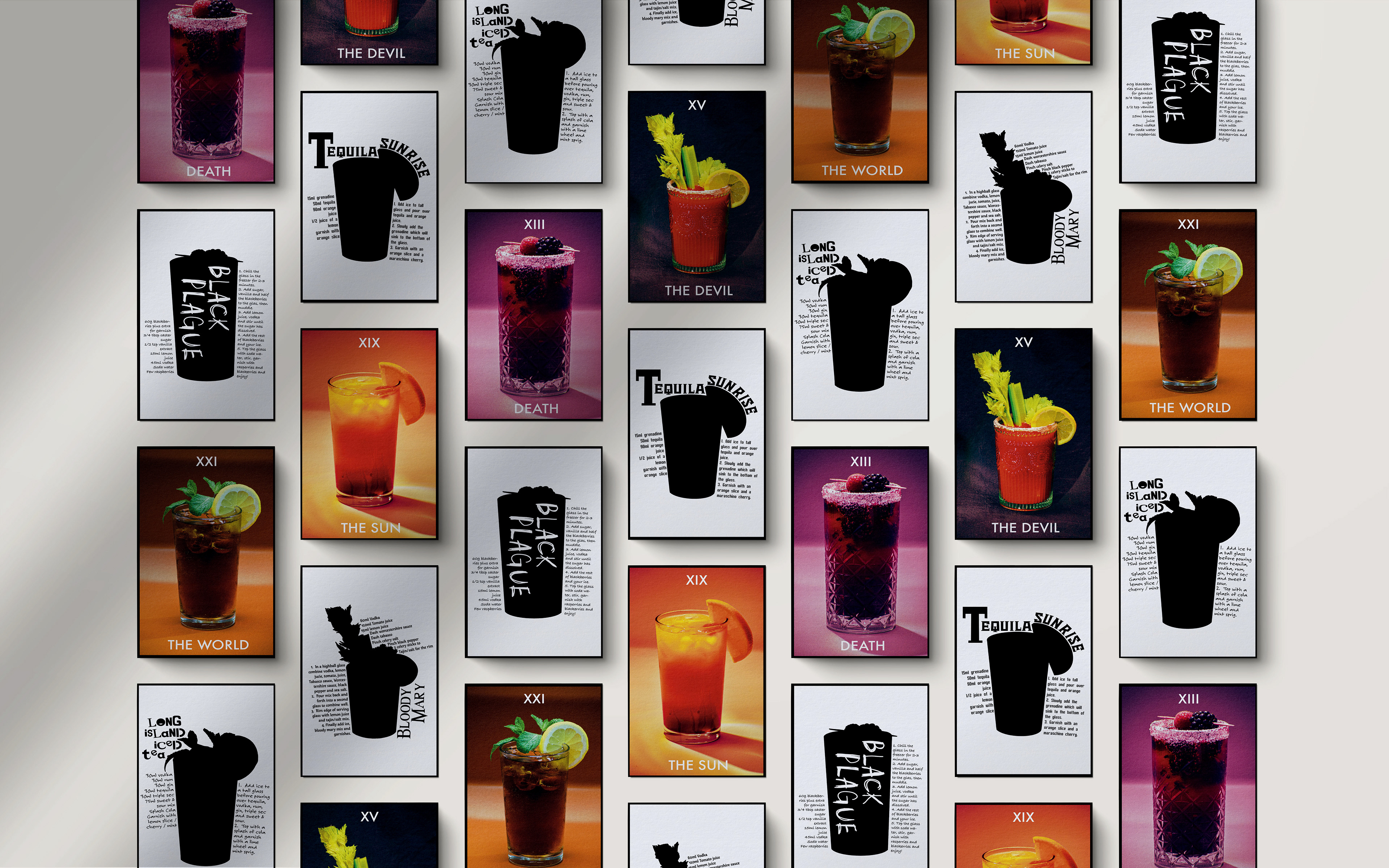
Moving forward, the cards were printed—front and back—then meticulously assembled to create tangible cards. This physical representation allowed for a comprehensive review, essential for identifying and rectifying any issues. As previously mentioned, having a tangible design is crucial for evaluating legibility and pinpointing focal elements. During the initial printing phase, it became apparent that legibility was compromised, especially with some recipes appearing too small and overwhelmed with text. Immediate adjustments were required, a challenge given the limited width of the cards.
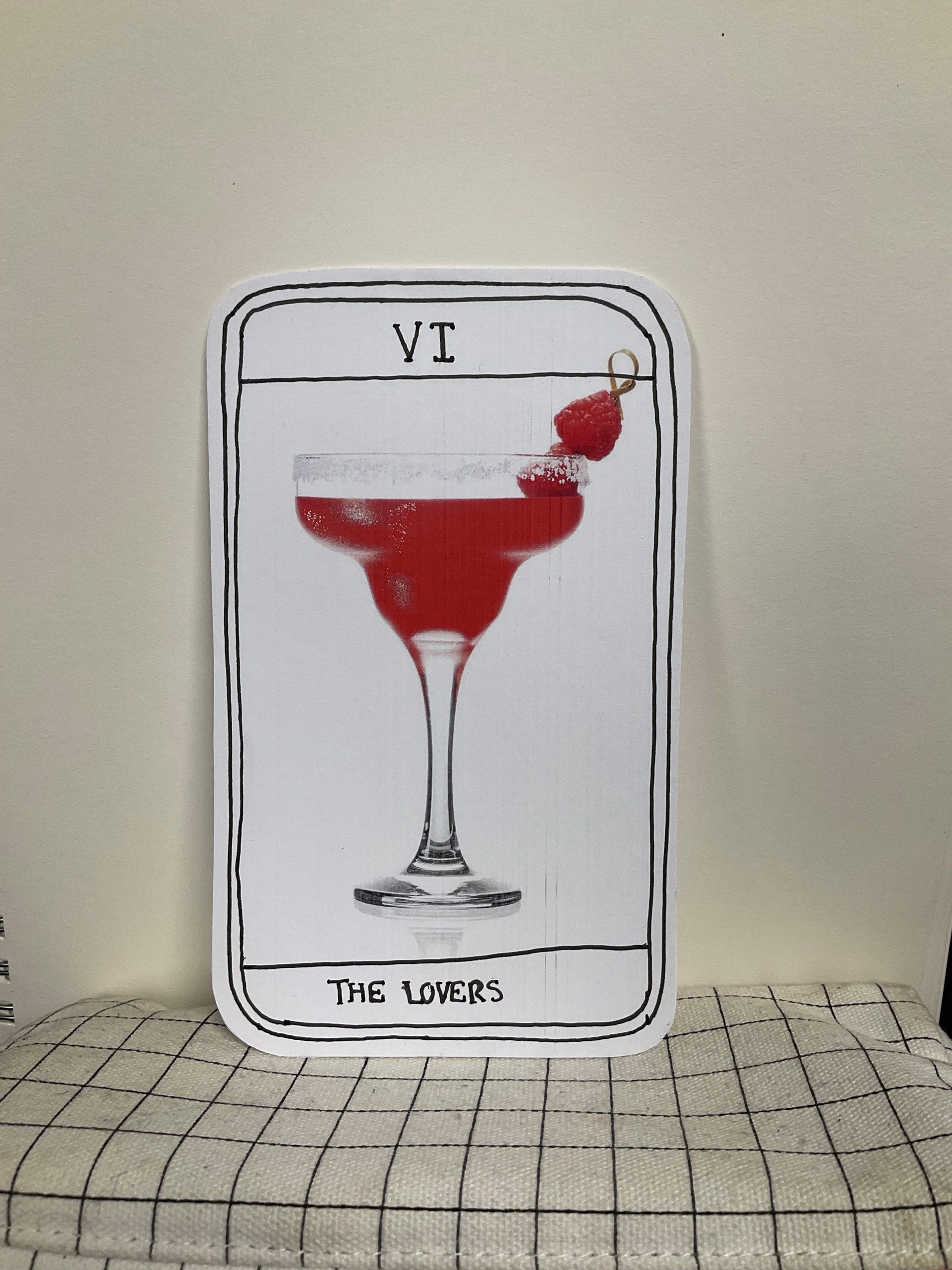
Below, explore the final card designs—five unique cards, each featuring a front and back design. Encased in a holographic rainbow foil peeking box, this carefully crafted packaging conceals the vibrant contents within. The box, predominantly black and white with a subtle hint of reflective rainbow, adds an element of mystery to the overall presentation.