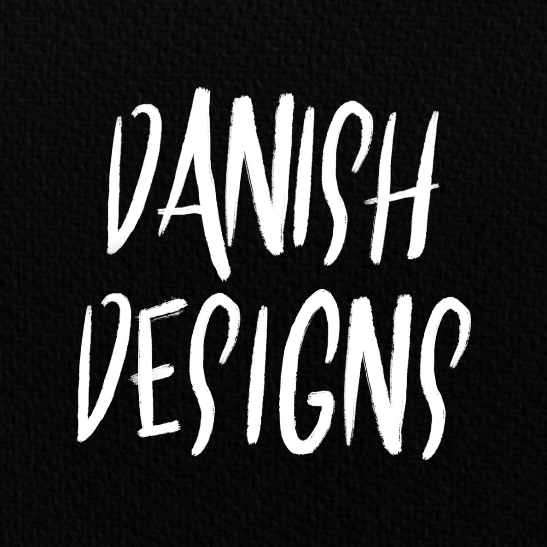
As I approached the end of my design degree, I noticed that my personal style became increasingly prominent within my work. Consequently, I realised the importance of establishing a cohesive brand identity to represent myself effectively. While I had previously used the brand name "Danish Designs" to reflect my heritage, I decided it was time to develop a visual identity that would complement the handwritten logotype.
In previous design attempts, I experimented with portrait business cards that showcased a popular illustration I had created a few years ago, while maintaining the same logotype. Although this approach had some initial success, I felt that it did not effectively convey me as a professional designer. Therefore, when revisiting the branding this year, I made the decision to refine it, aiming for more of a professional image while still embodying my identity as a creative graphic artist rather than adopting a corporate aesthetic.
For my new brand identity, I recognised the need for a pattern that could be utilised across various platforms such as social media, packaging, and business cards. I firmly believed that incorporating a pattern into the visual identity would be a valuable addition. I began by focusing on creating a pattern before proceeding to design a new business card.
Here is the pattern I developed, aiming to capture my personal style while maintaining a balance between complexity and simplicity. Personally, I find the organic nature of this pattern quite appealing. It goes beyond mere repetition, and the subtle grain effect adds a touch of grunge aligning with my artwork.
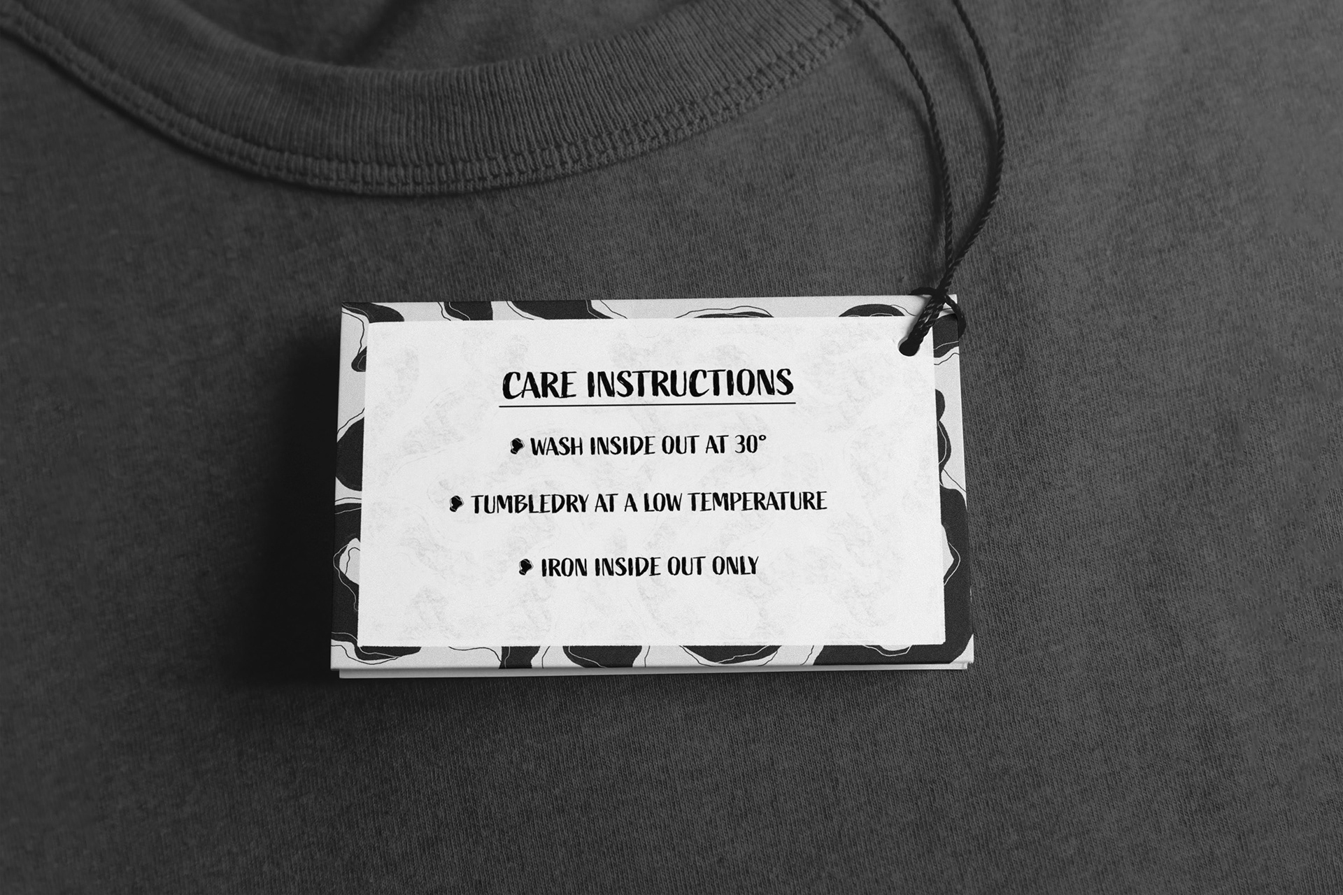
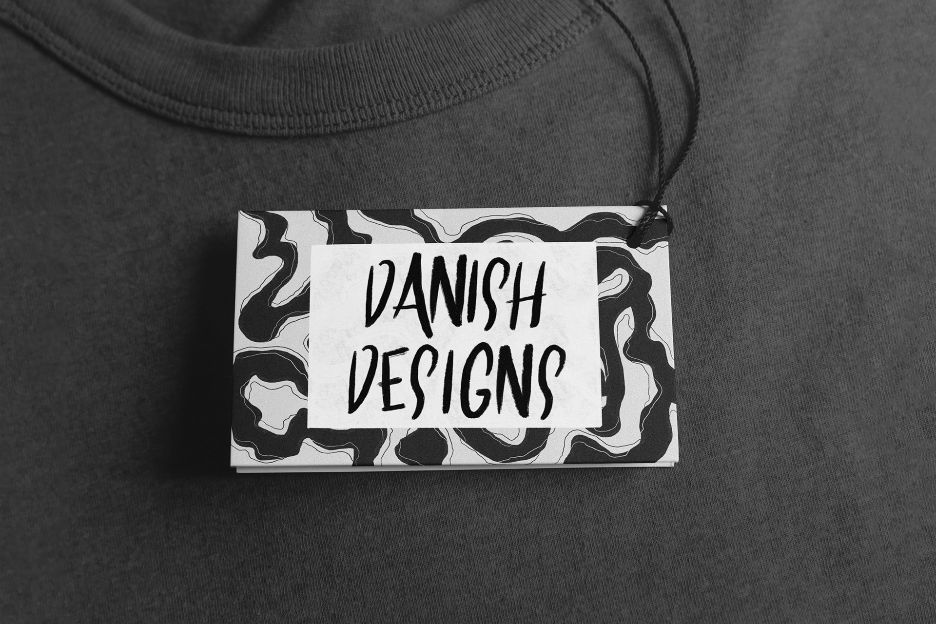
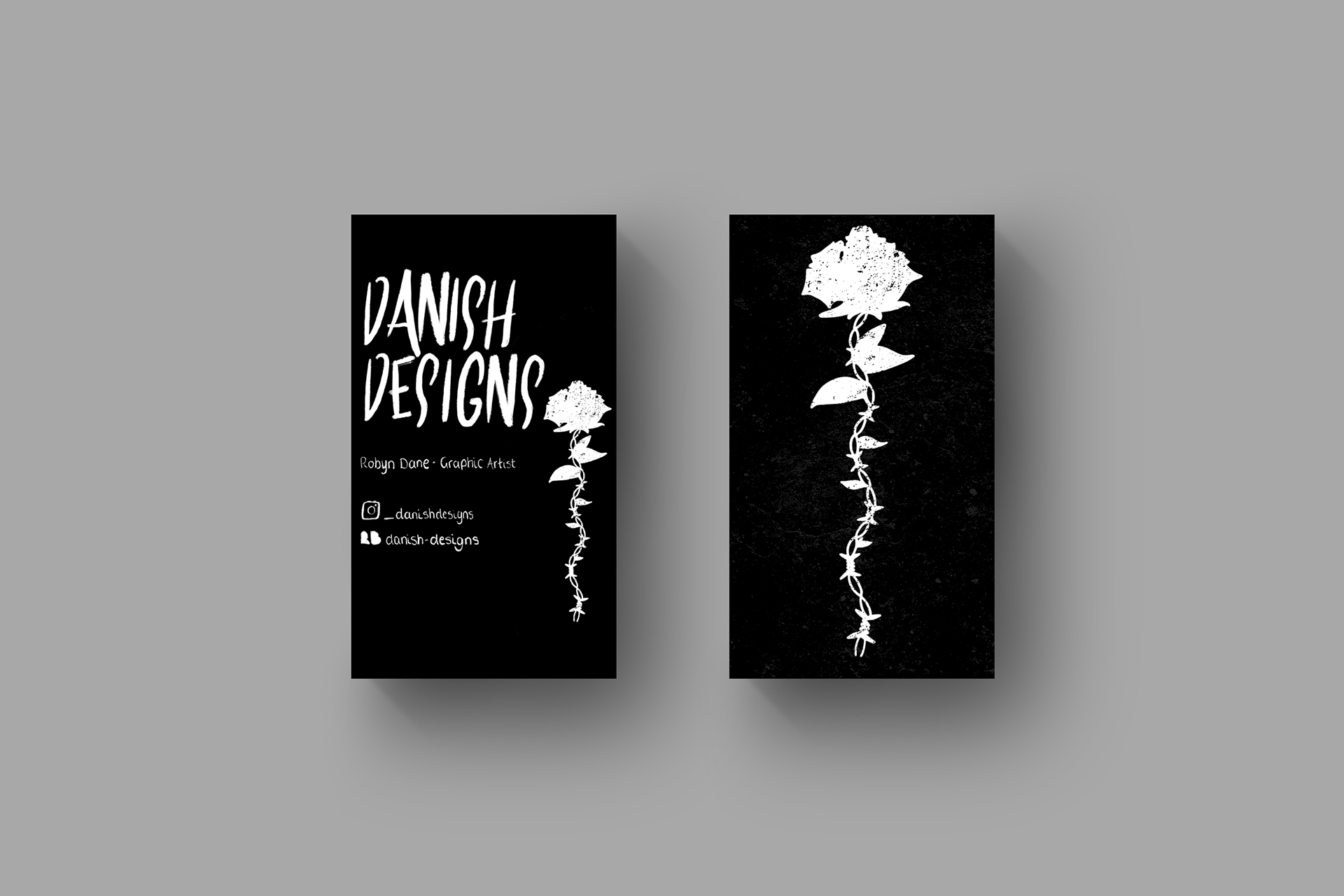
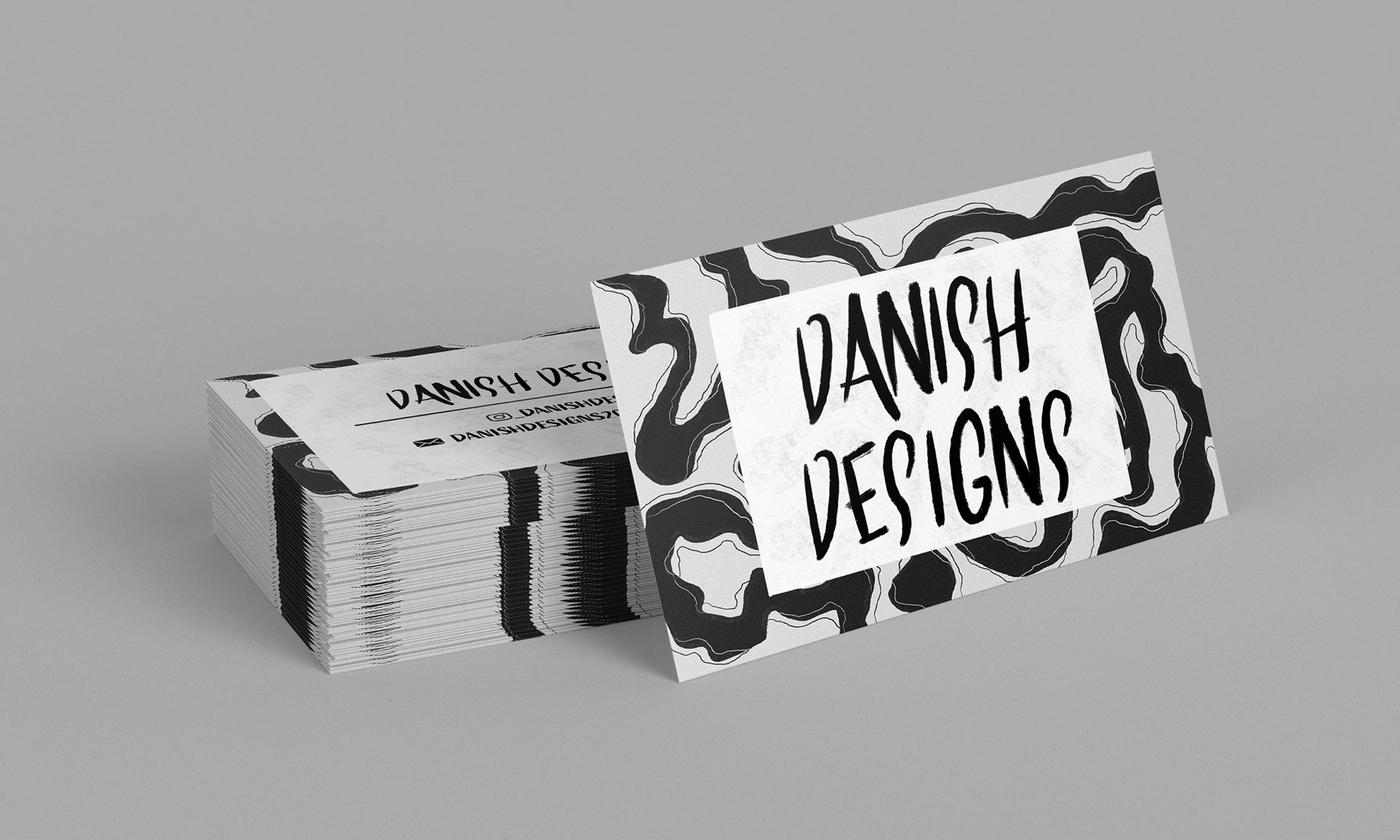
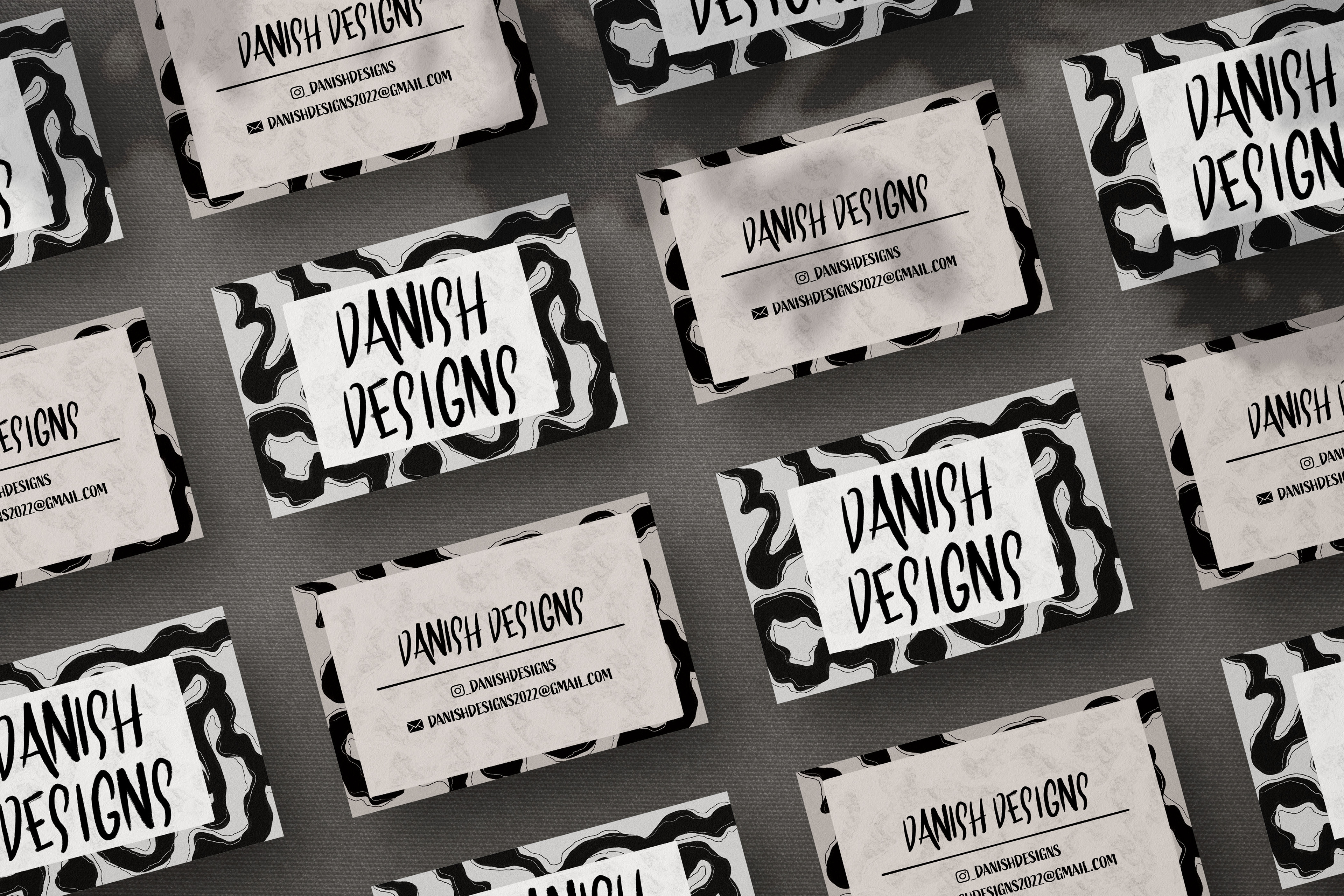
Displayed below are the newly crafted business cards that incorporate the recently developed pattern. I aimed to maintain simplicity and legibility in the designs. On the front side, I prominently placed the logo with a slightly transparent textured box as a background element. Similarly, on the back of the card, I repeated this design but on a larger scale, allowing more space for additional details.

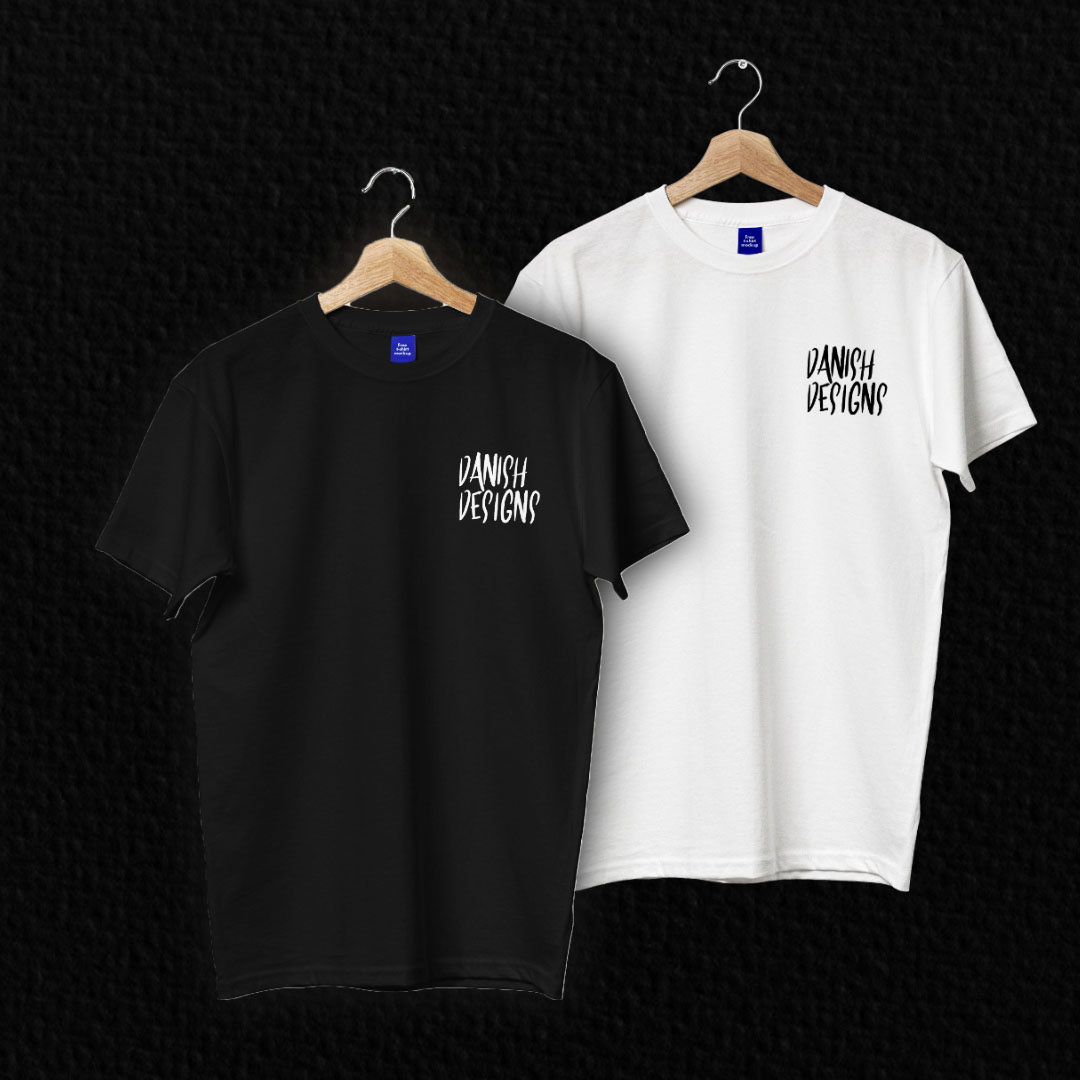
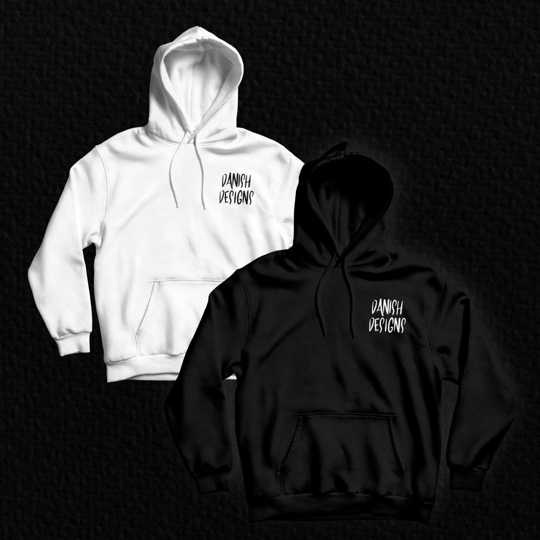
To complement the business cards, I developed a comprehensive brand identity package to demonstrate the application of this identity within the business. Below, you can observe how the repeat pattern is utilized across various elements such as business cards, artwork, and social media graphics.
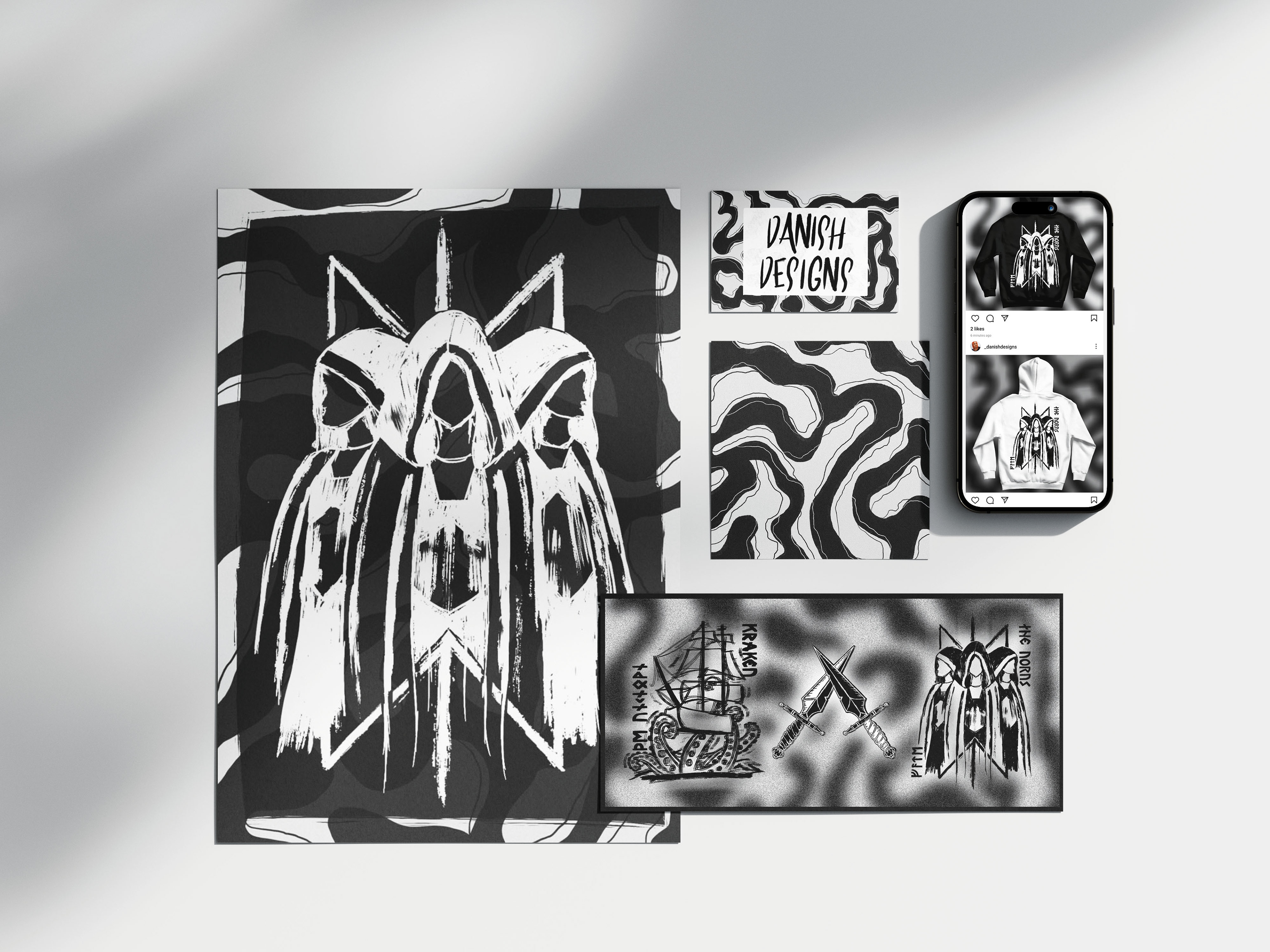
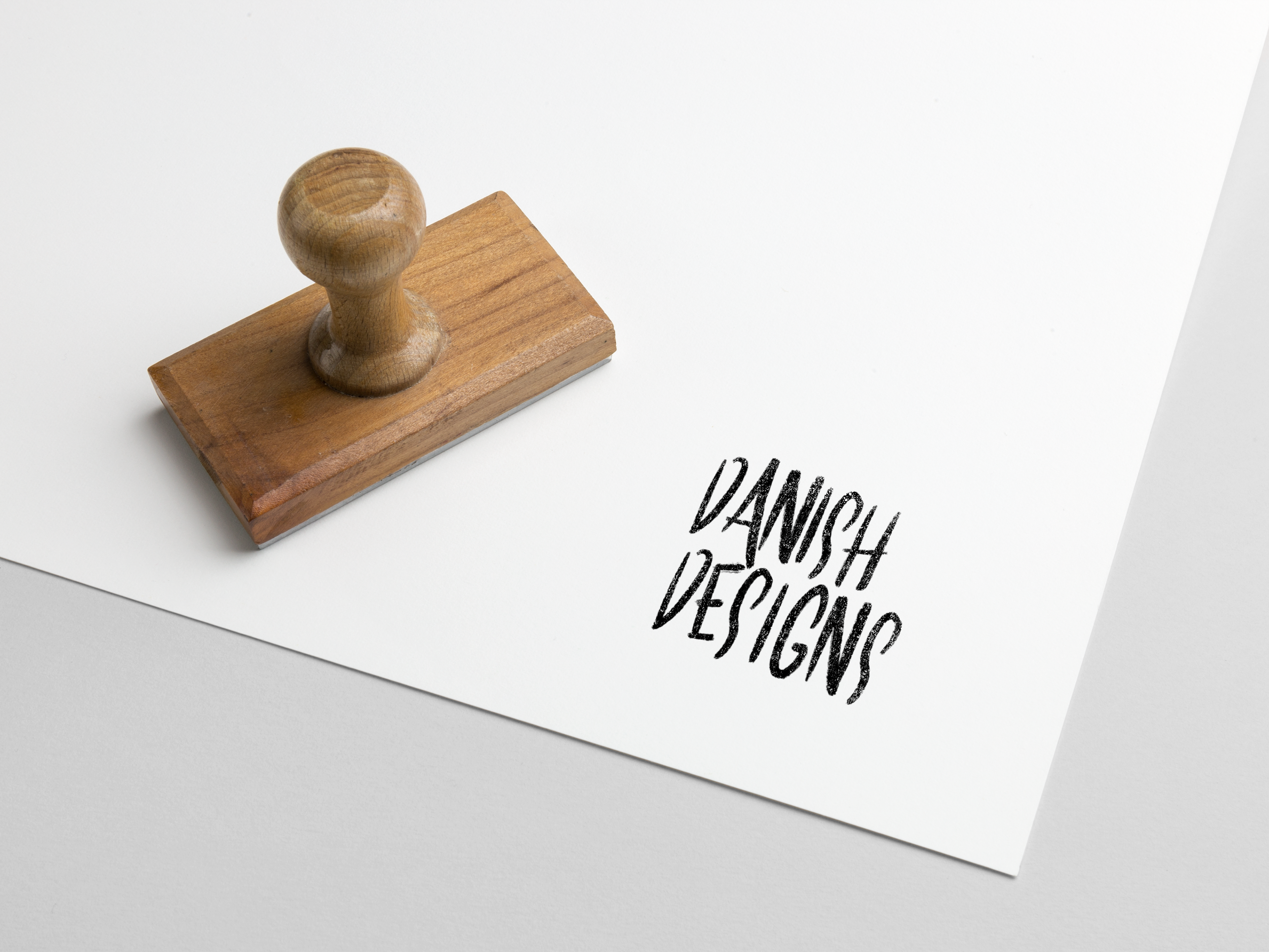
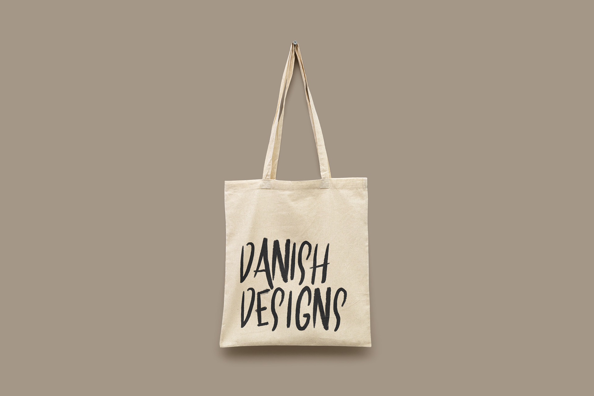
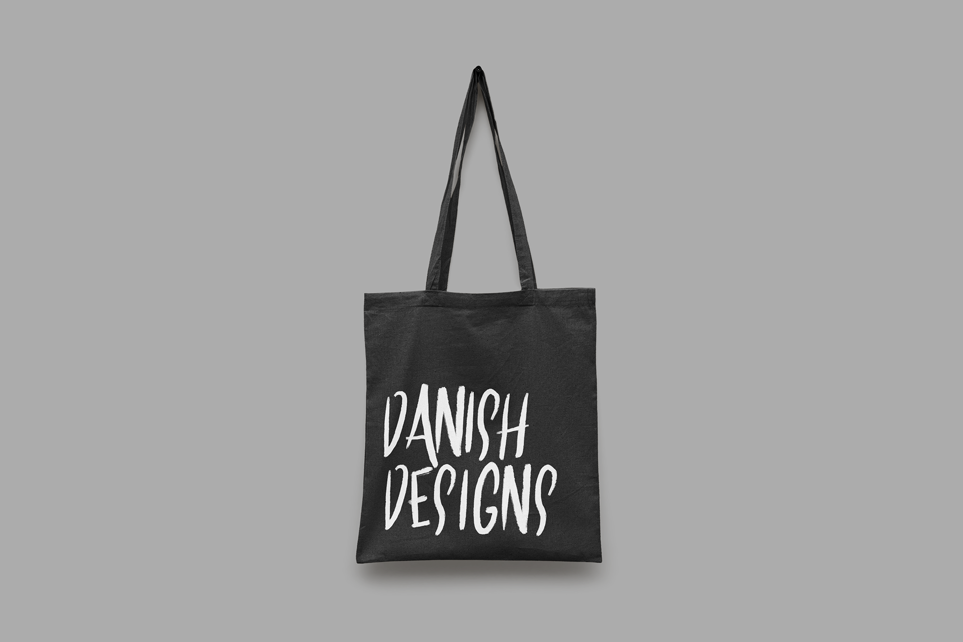
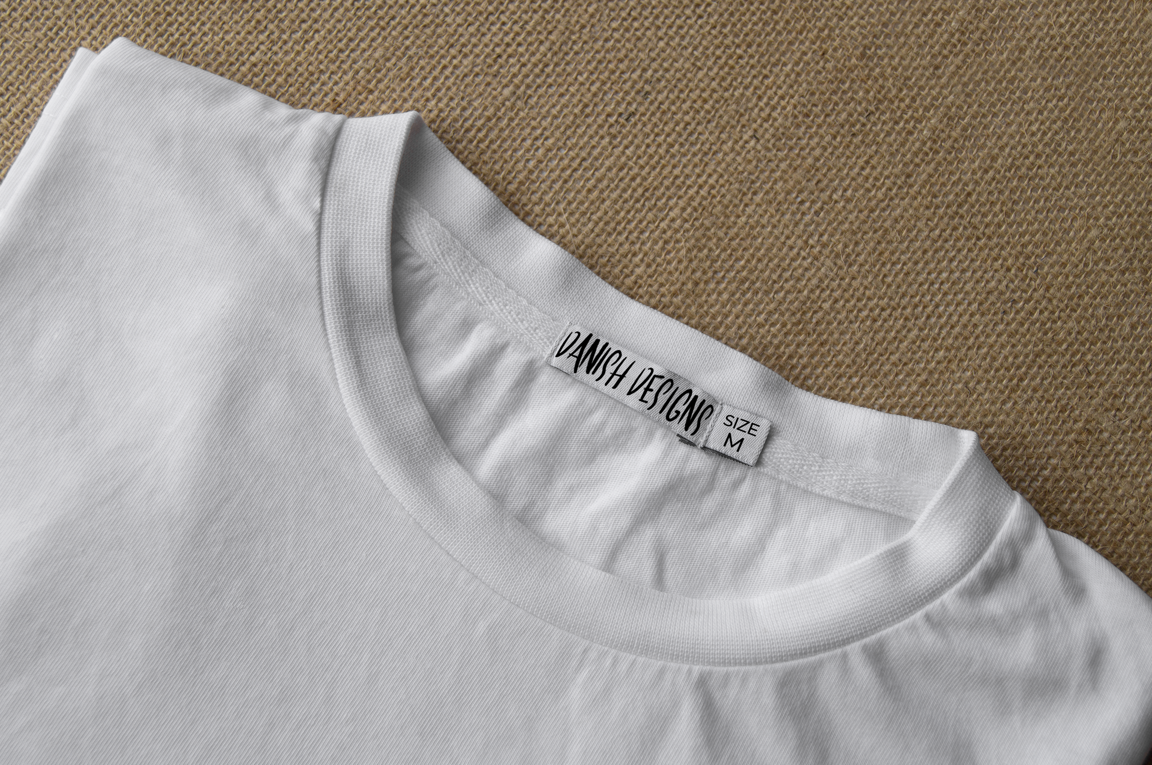
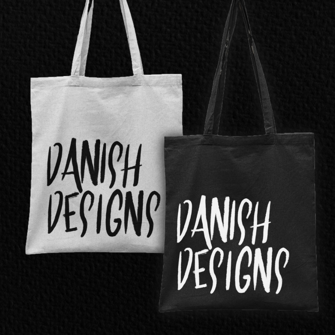
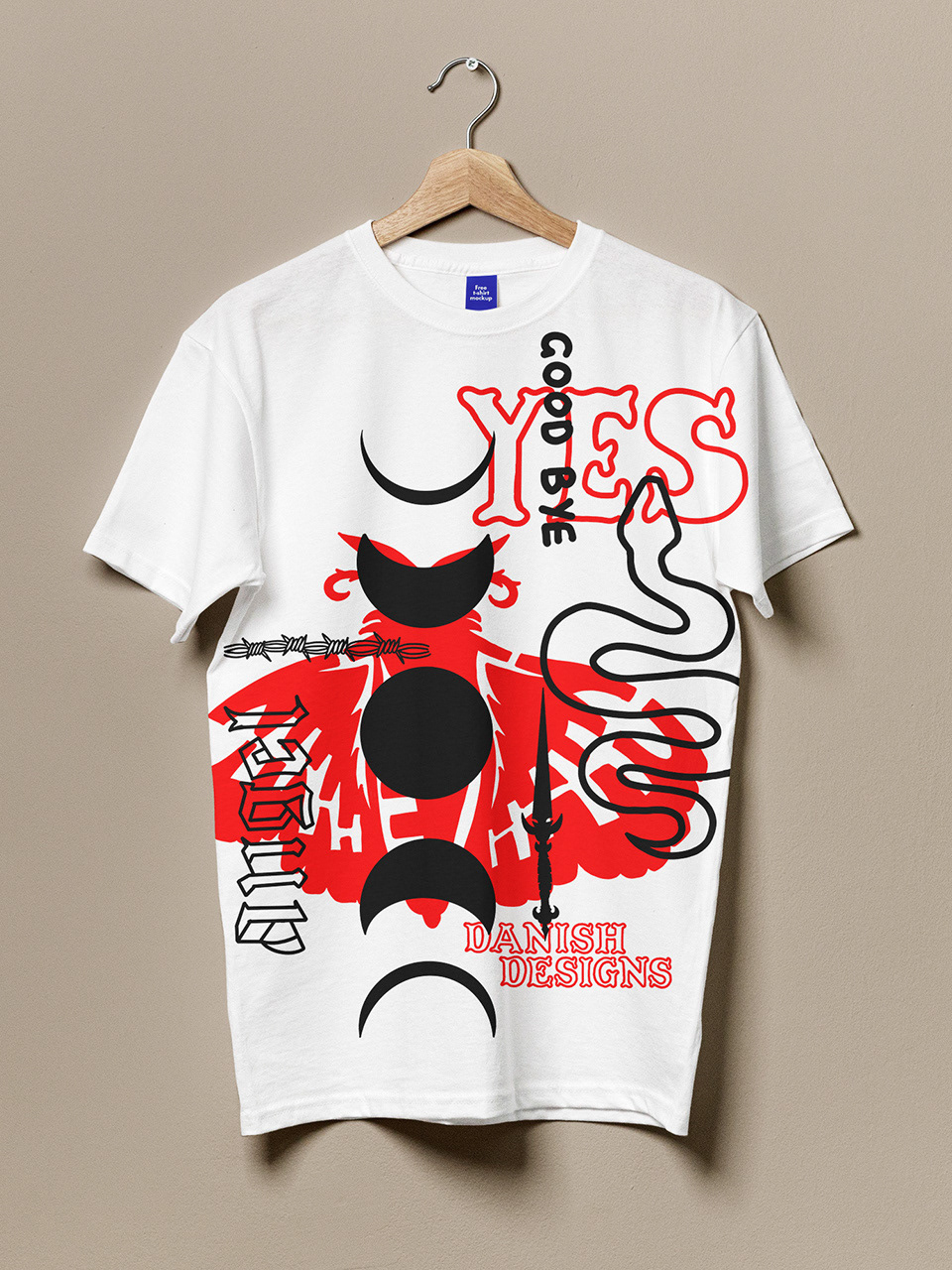
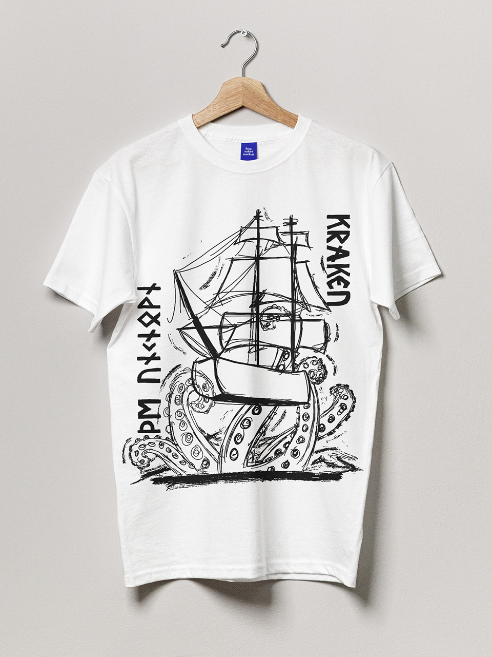
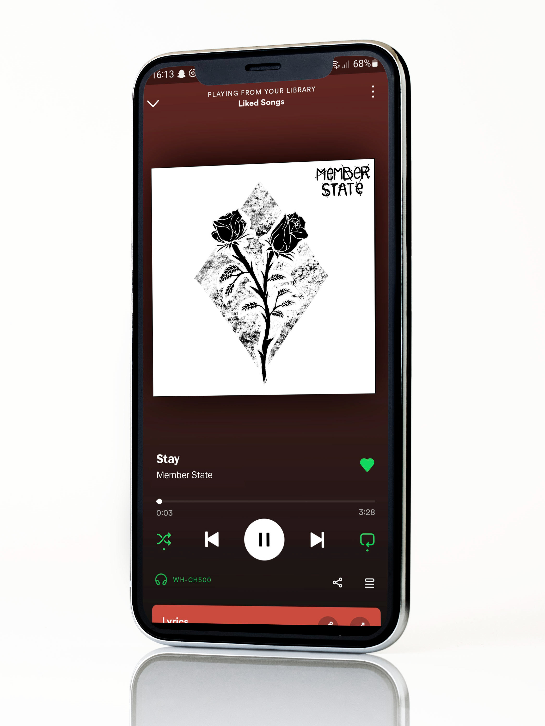
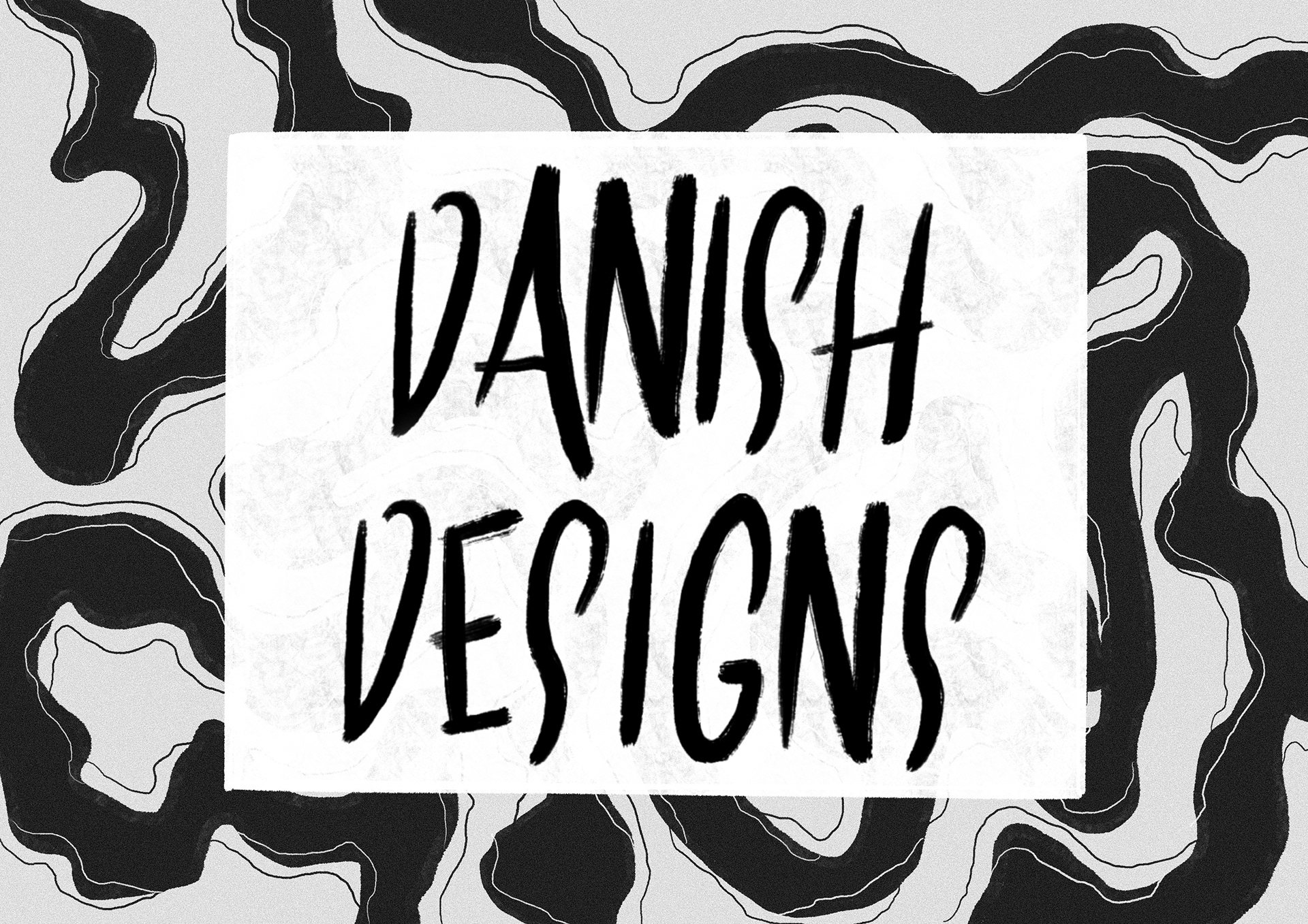
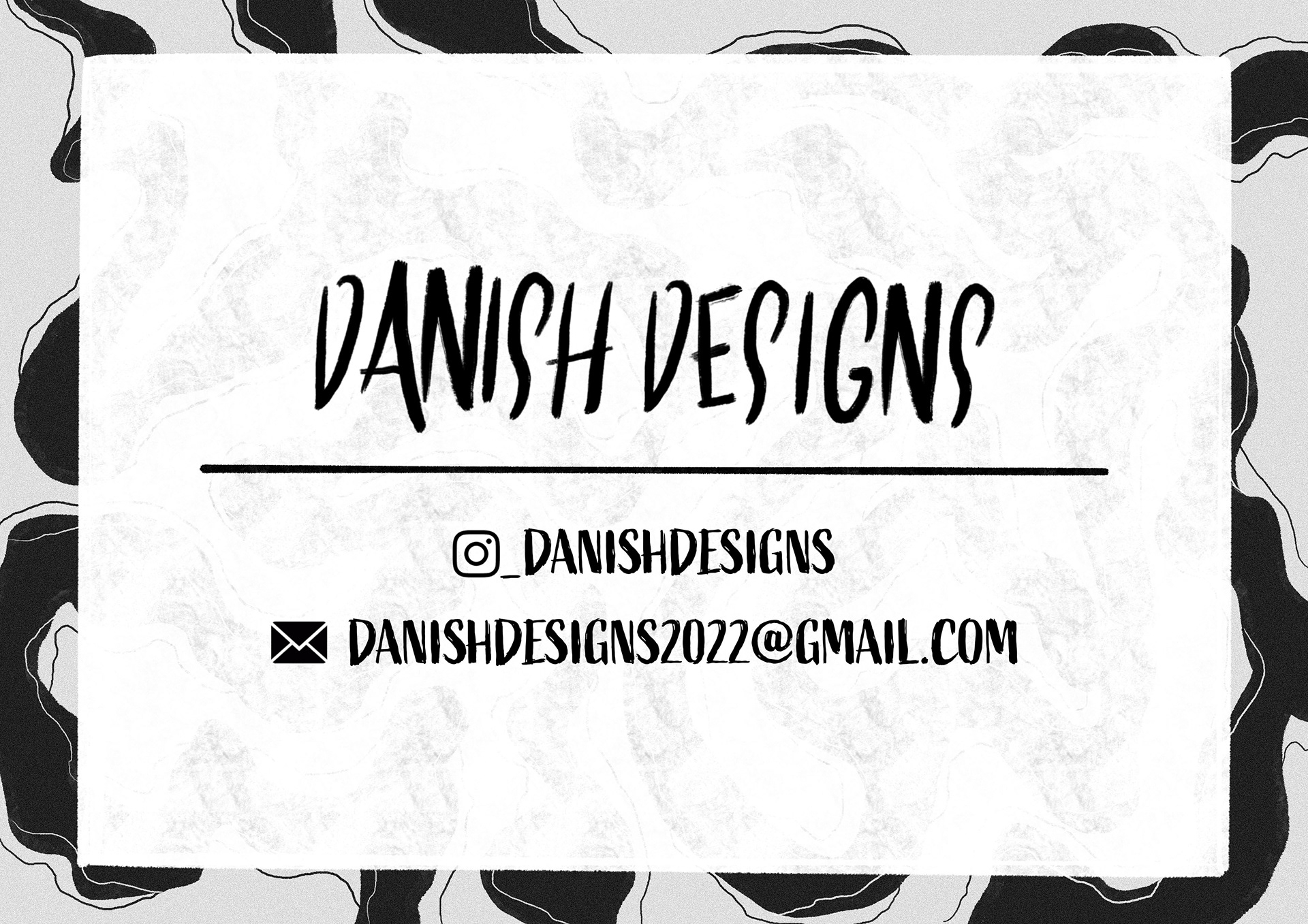
Furthermore, below you will discover a collection of examples highlighting the use of the logotype across a wide range of platforms. This serves to strengthen the overall brand presence and reinforce the consistent visual identity.